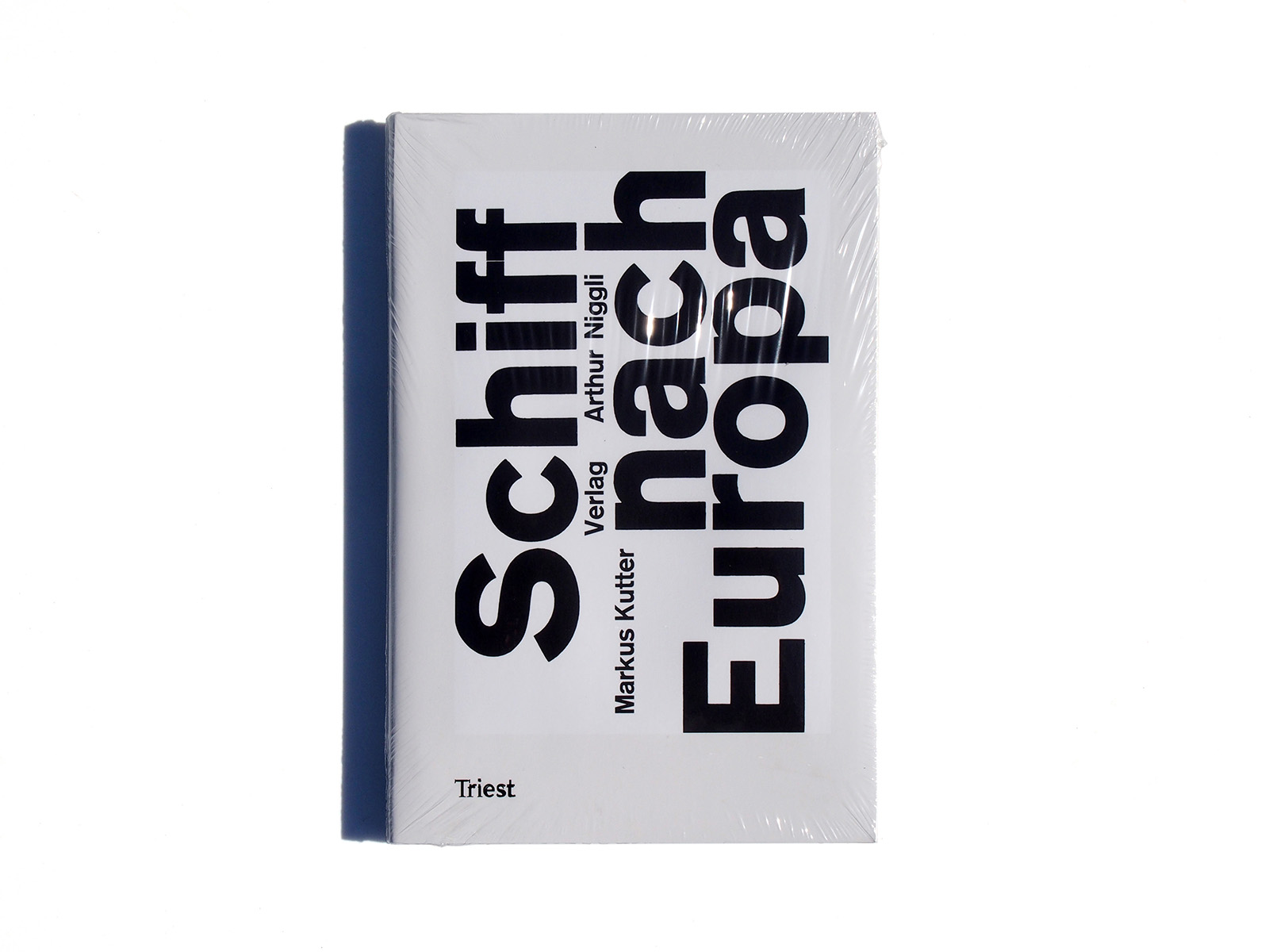


Publisher: Triest
Language: German
ISBN-10: 3038630012
ISBN-13: 978-3-03863-000-5
Product Dimensions: 24 x 14 cm
Release Date: 2015
Price: sold
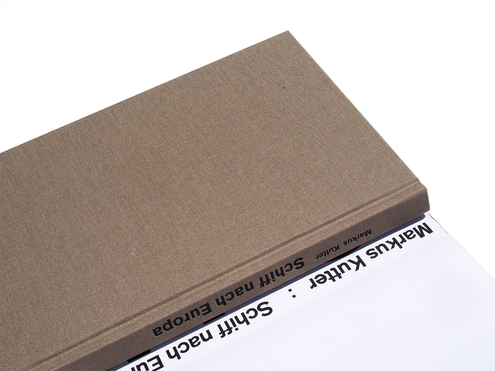
clothbound with a dust-jacket
printed on both sides
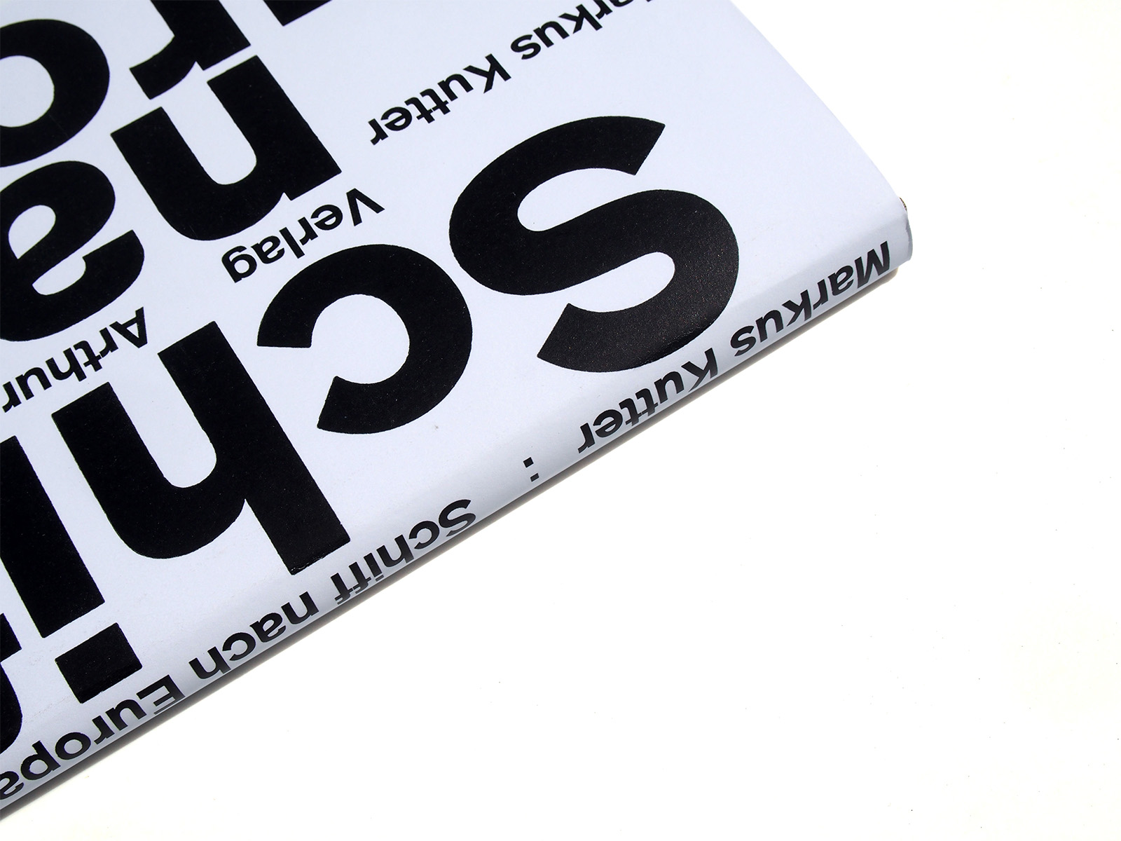
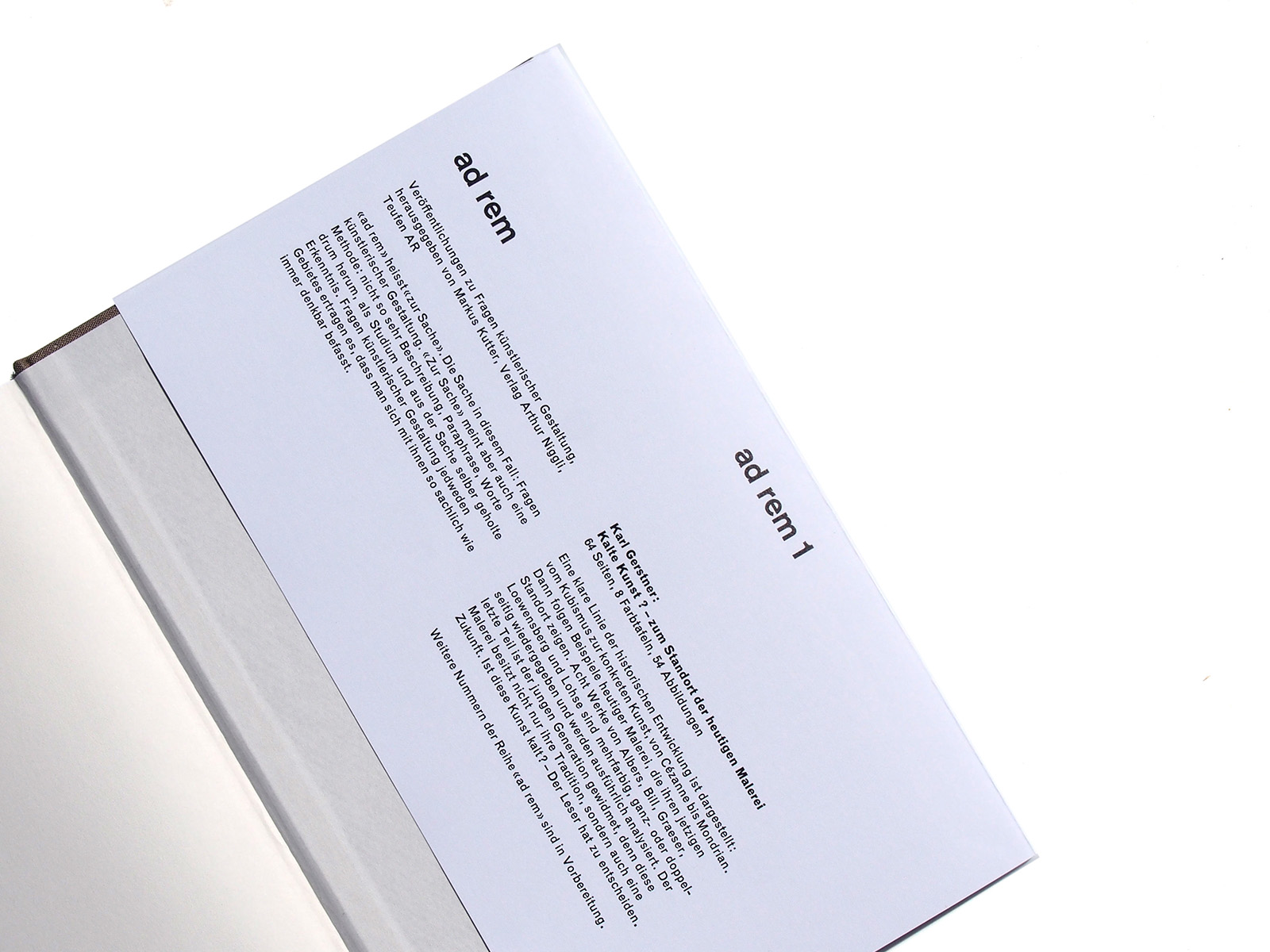
Book design: Karl Gerstner
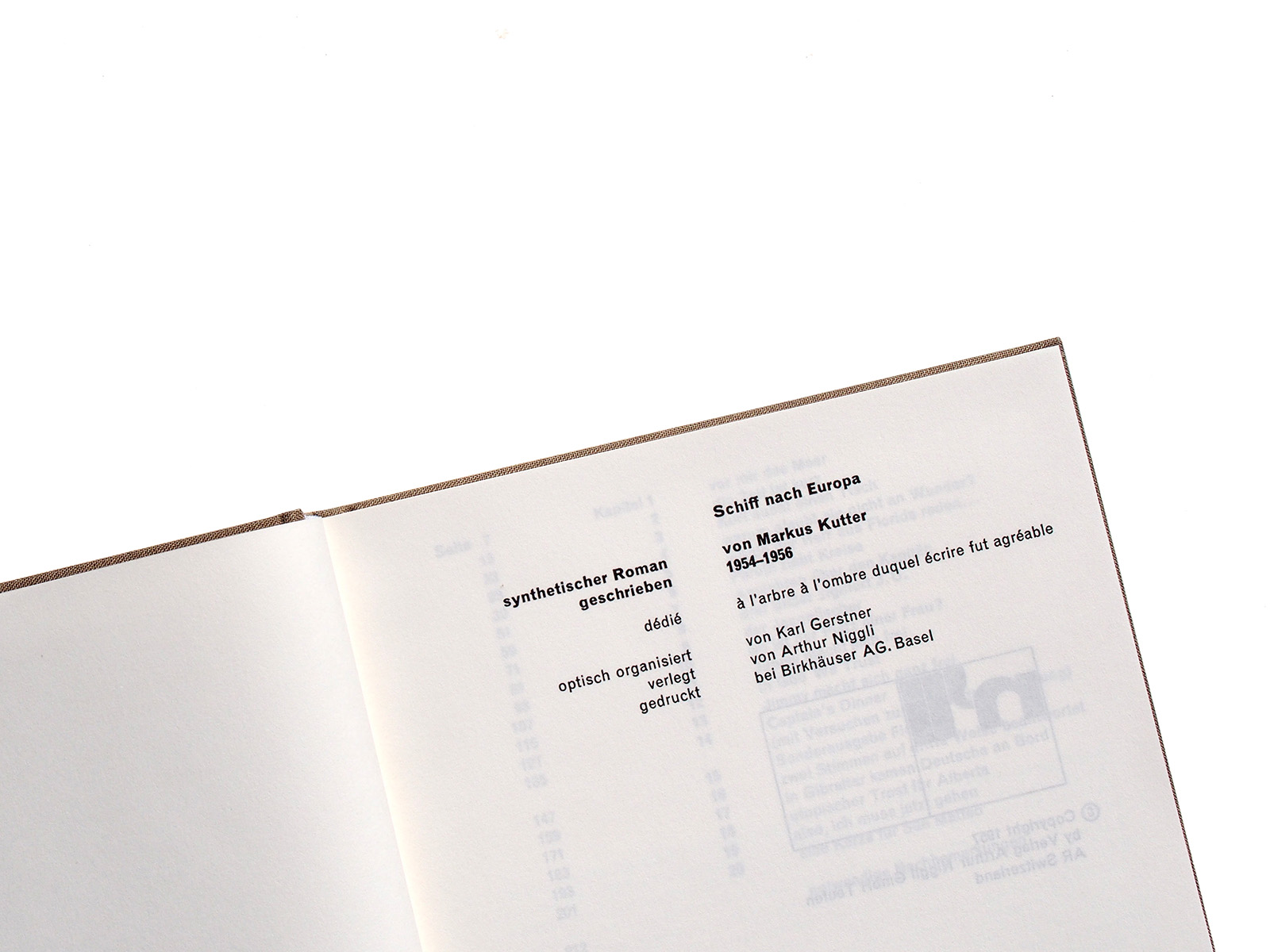
Author: Markus Kutter


Reprint of a cult book
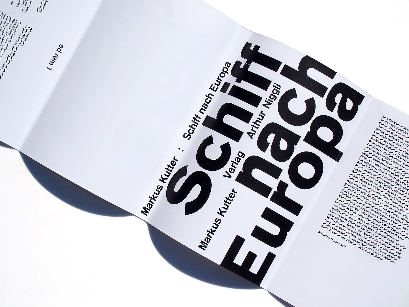
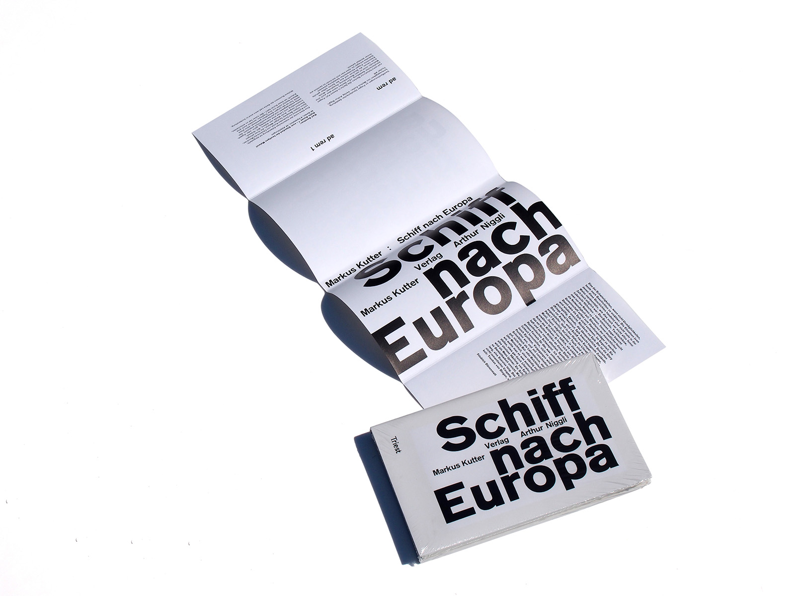
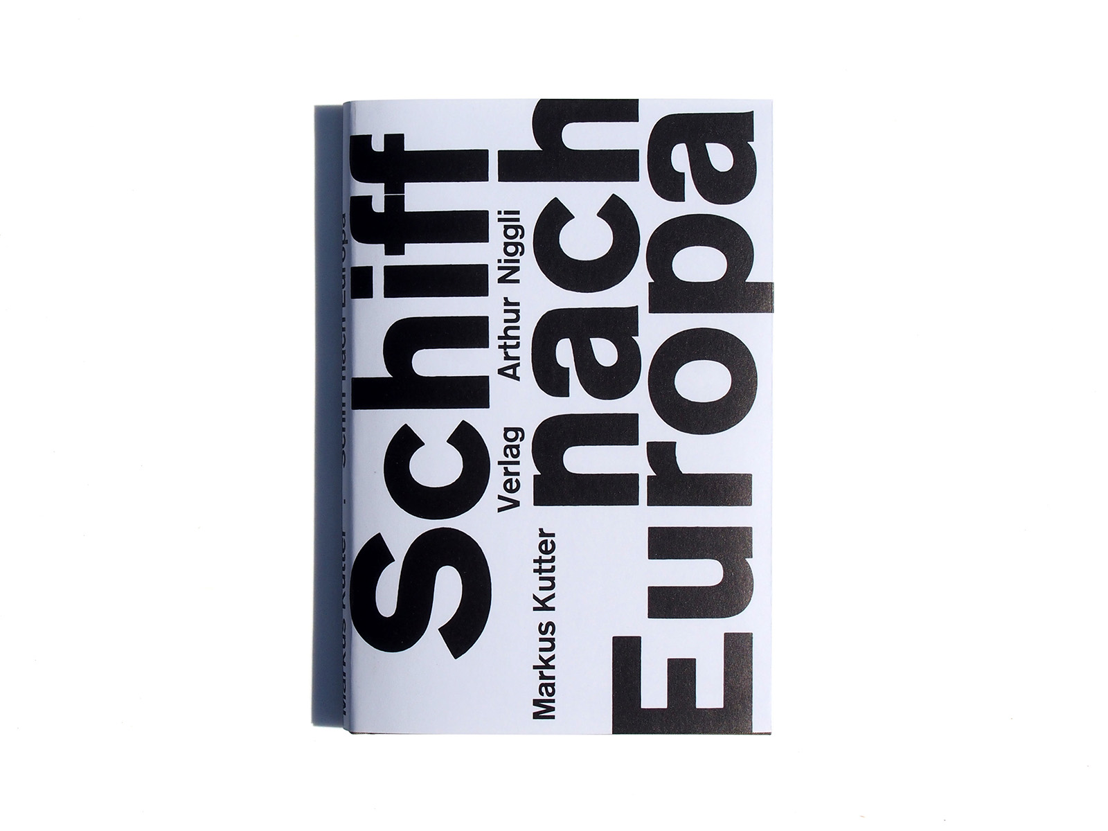
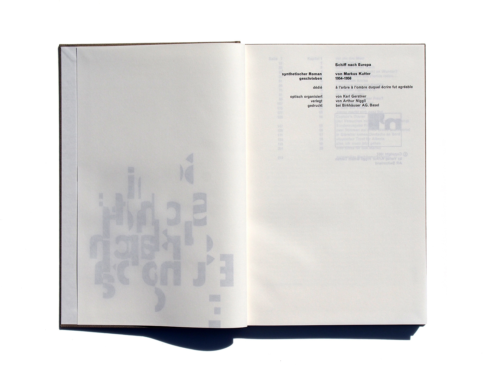
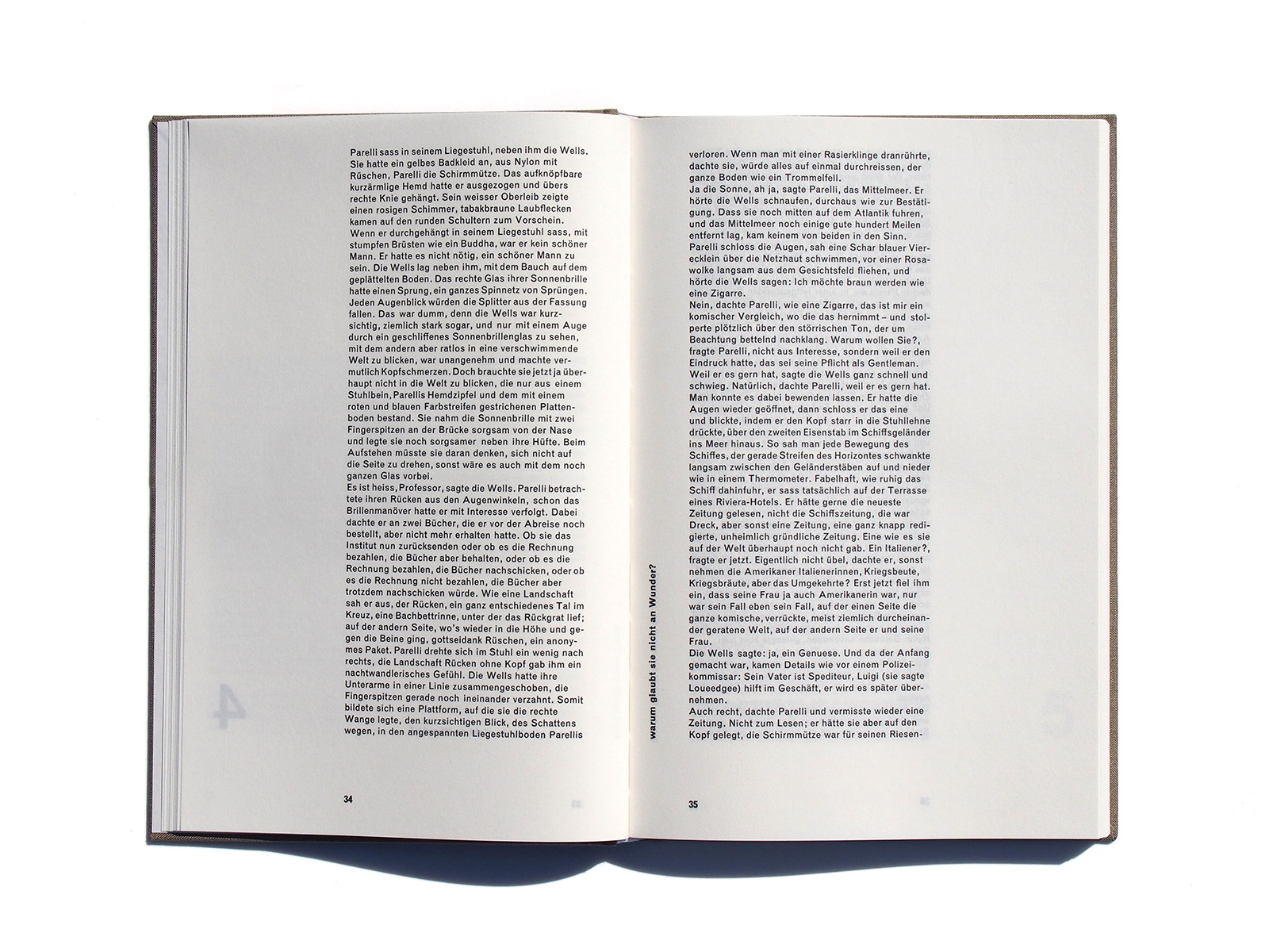
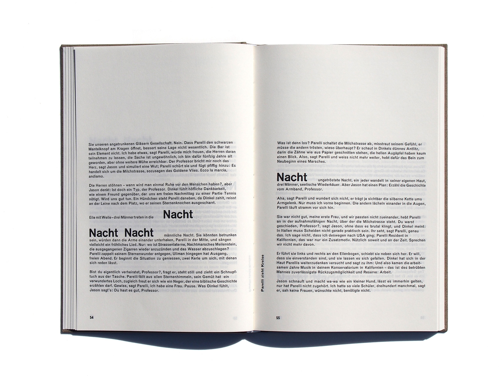
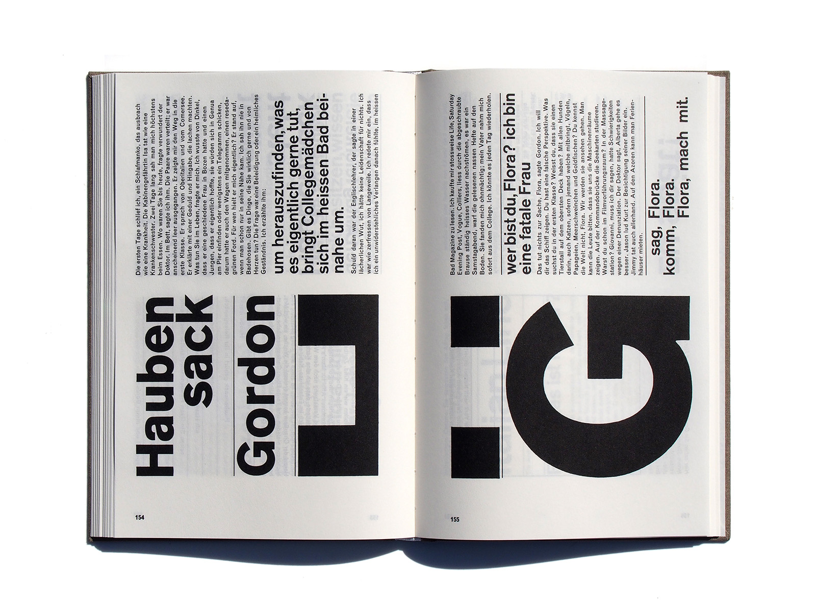
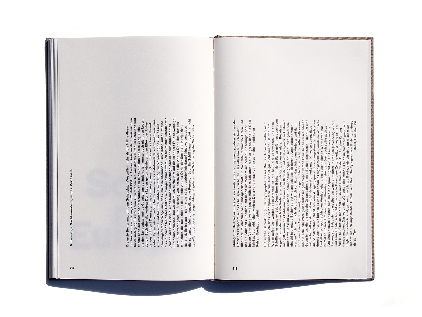
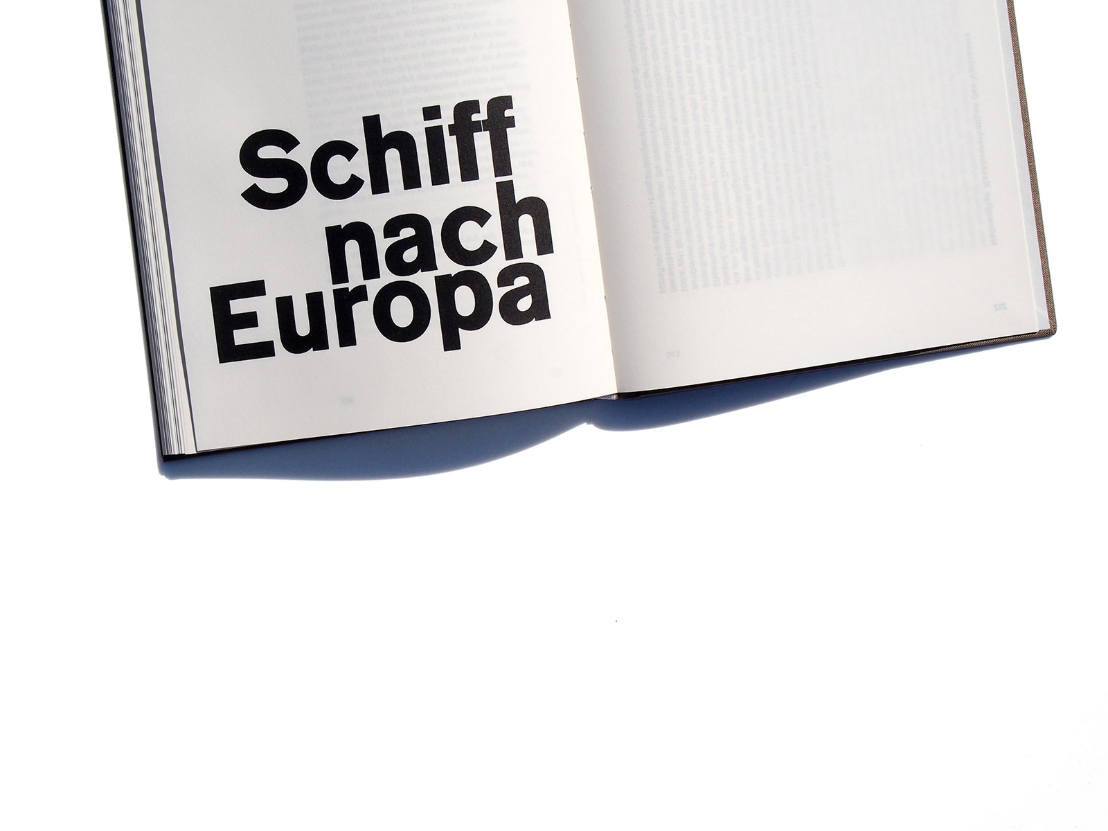
Markus Kutter’s novel Schiff nach Europa – “visually orga- nised” by Karl Gerstner – “assumes an early experimental position that will become generally established in book design only several years later”, wrote François Rappo. By dint of
its typography matching the text, it can be seen as a milestone in Swiss book design and was awarded the Most Beautiful Swiss Book prize in 1957.
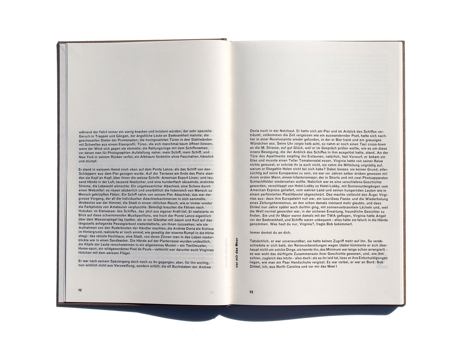
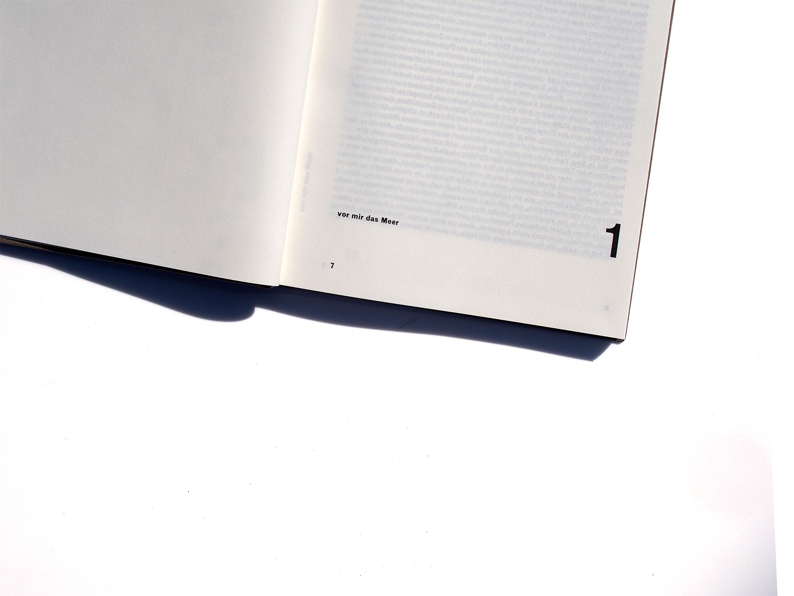
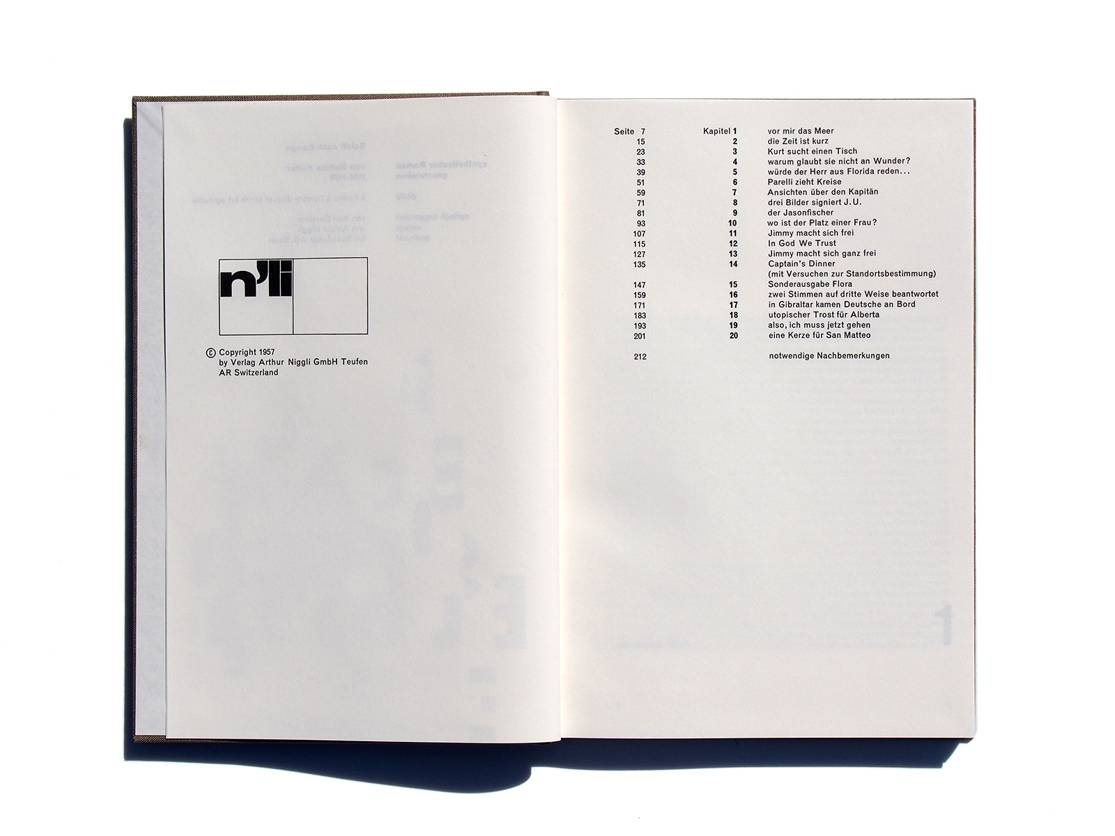
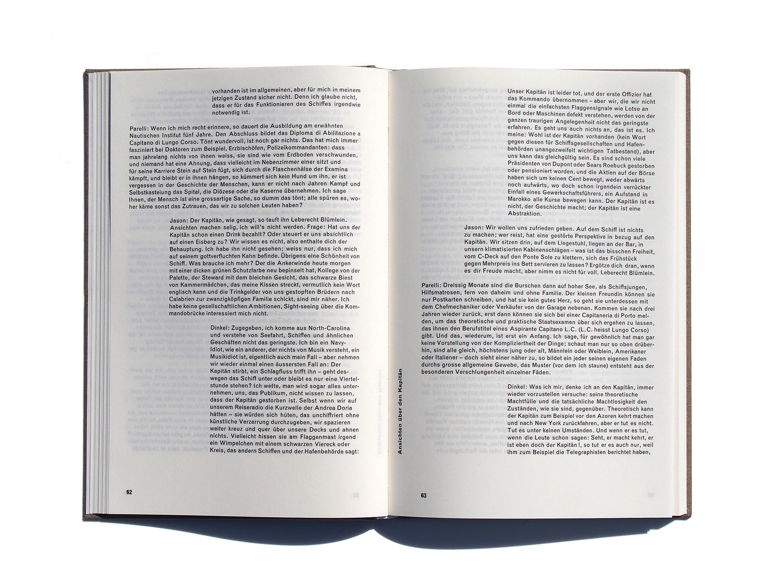
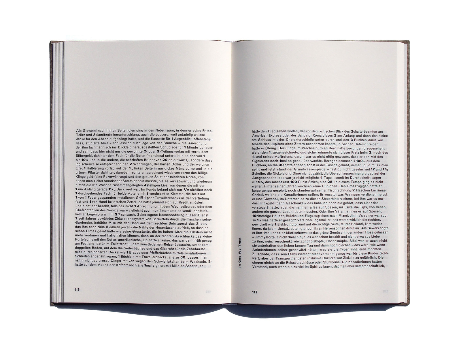
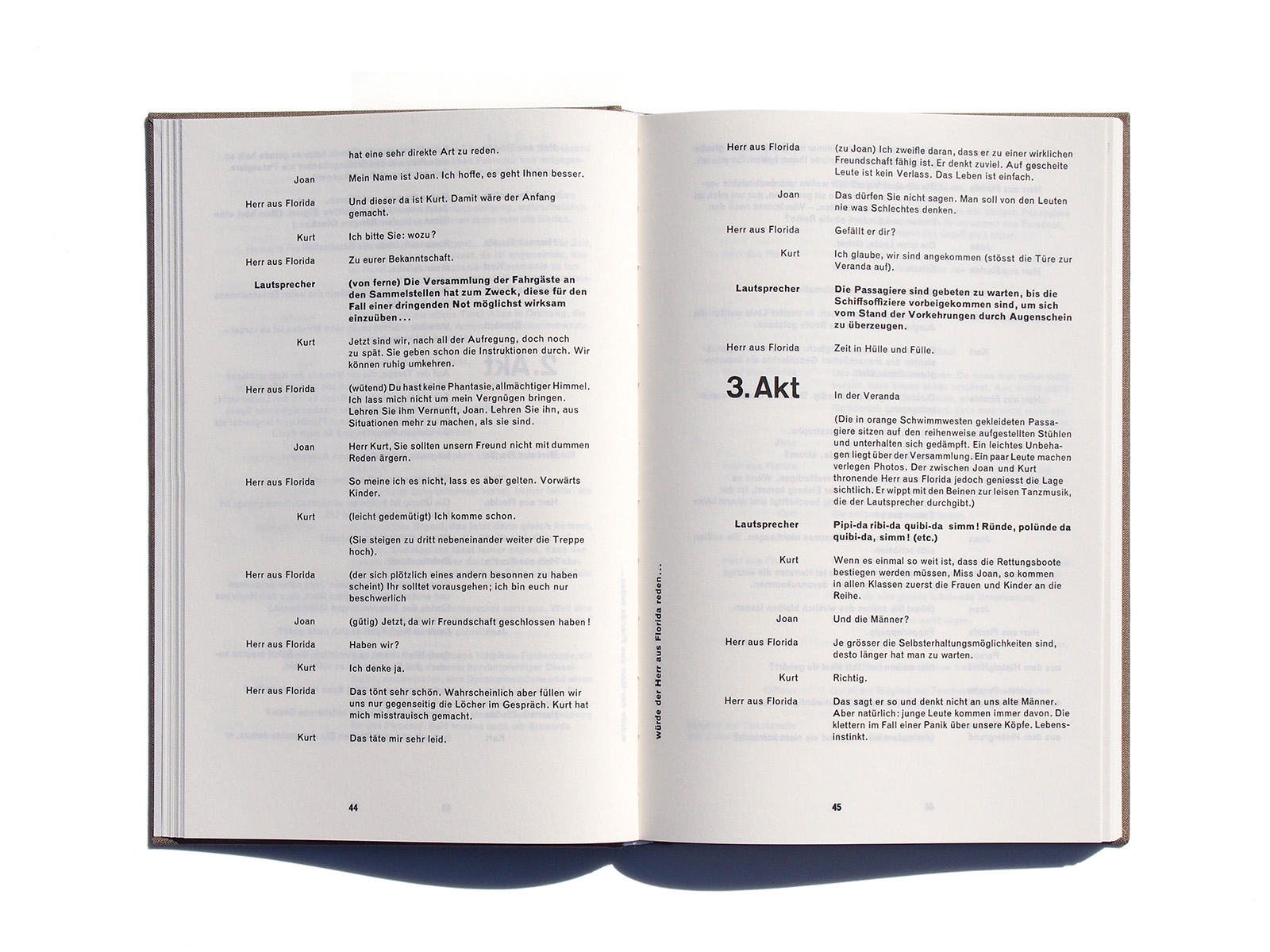
The “synthetic novel” plot (a passage from New York
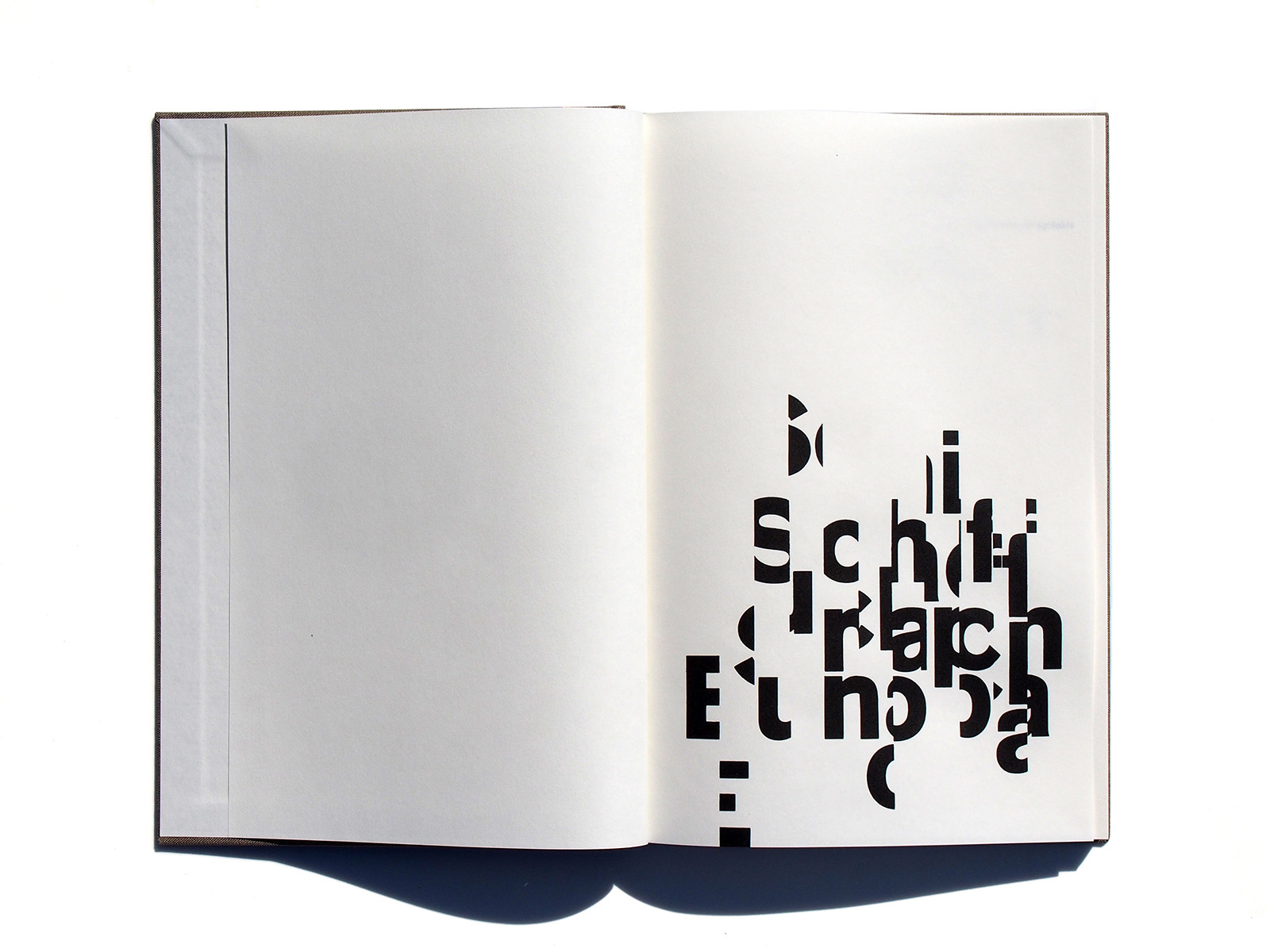
to Europe on the Andrea Doria, later to sink) consists of dif- ferent types of text – narrative, drama, conversation and monologue. Even while writing, Markus Kutter envisaged the text having to be staged by means of the appropriate typography. Karl Gerstner described this task as a “personal experiment” and a “special treat”.
Looking at the book, you can sense the gratification at having realised “integral typography”, and it communicates itself to the reader.
The book has been out of print for years and is much sought- after by collectors. The reprint gives many readers the opportunity to finally hold this cult book in their own hands for the first time. The reprint is true to the original, a dust- jacket printed on both sides features both the original cover and the updated version with a commentary by Felix Wiedler.
A novel as a homage to Akzidenz-Grotesk
Felix Wiedler studied German Studies and History of Art, wrote about information technology topics as a journalist and editor, and about art and graphic design as a book author. He blogs about his collection of modern 20th-century book design at wiedler.ch/felix/books. Lives with his family in
Winterthur, in a house full of books, guitars and songs.
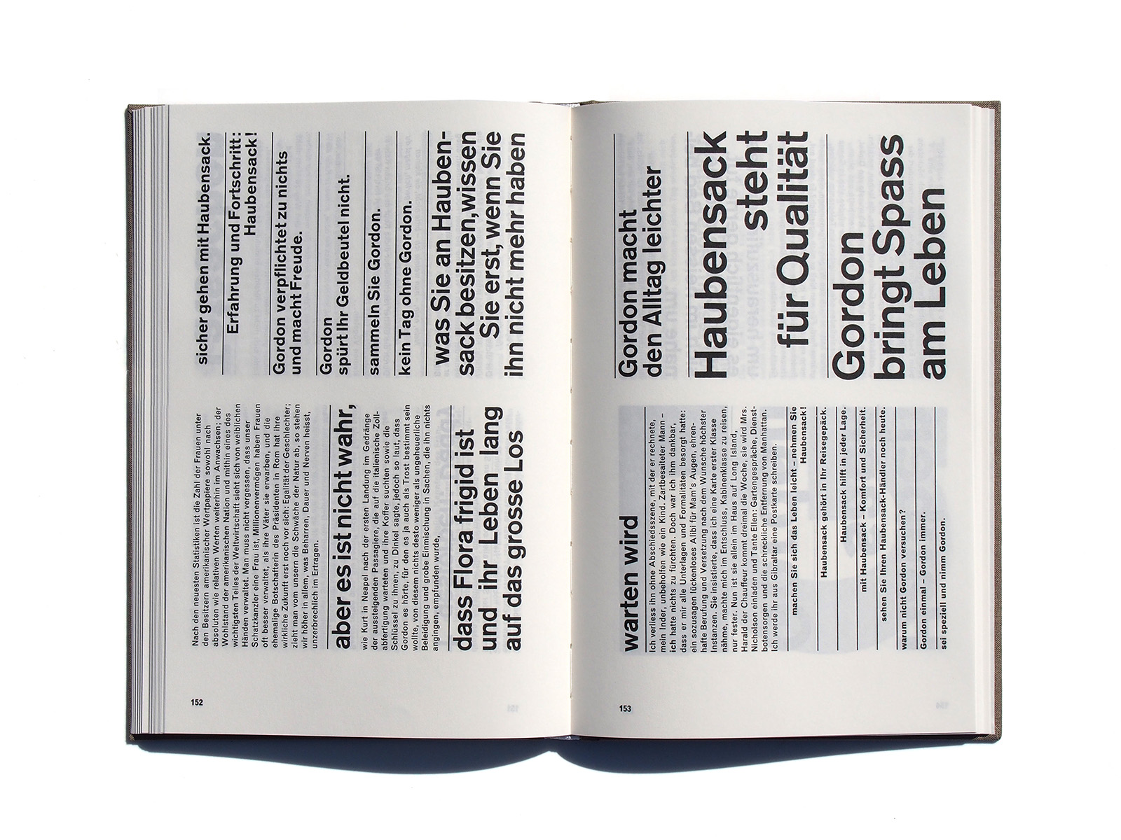
One can sometimes rather lose track of the characters and their stories in Kutter’s novel, with its montage-style mix of different forms of text. The focus is all the more on the book’s secret protagonist, who – literally! – takes centre stage even on the cover: it’s name is Berthold Akzidenz-Grotesk. Now large, now smaller, now bold, now semi-bold, in a constantly changing grid layout, now upright, now sideways, but always strictly asymmetric down to the page numbers. […]
Schiff nach Europa is actually a typographical novel that is above all about Akzidenz-Grotesk. (Monotype Grotesk plays a walk-on part as running text.)
From the preface by Felix Wiedler
‘Integration of typography and language means that the typographic images optically orchestrates the play and harmonizes the various stylistic instruments used by author; novel, reporting, theatre play, news paper, etc’
Karl Gerstner
Basel 1956
世界中の造形者が待ちわびたKarl GerstnerによるAkzidenz-Groteskへのオマージュを込めたありとあらゆるタイポグラフィの叡智が詰まった一冊が60年以上の時を経てスイスの出版社Triestより完全復刻。
少ない冊数での復刻となりますので、またしても市場での高騰が予想されます。
「タイポグラフィの言語の統合とは、内容を視覚的に編曲することだ。
イメージは響き始め、作者によって使われる様々な様式の楽器(小説、レポート、戯曲、新聞などに)に調和する」
カール・ゲルストナー