


Publisher: Seibundo Shinkosha
Language: Japanese English
ASIN: –
Product Dimensions: 29.7 x 22.4 x 0.8 cm
Release Date: 1977
Price: sold
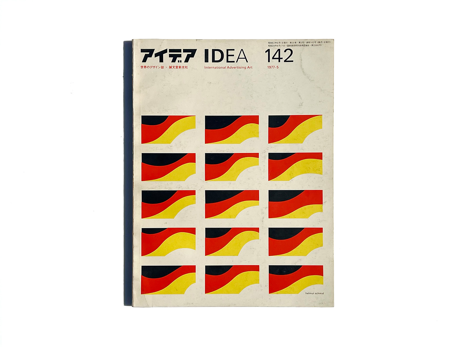
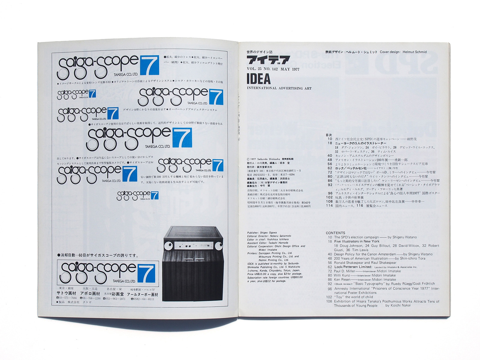
Cover Design: helmut schmid
The SPD’s election campaign Shigeru Watano
Five Illustrators in New York
Doug Johnson
Guy Billout
David Wilcox
Robert Giusti
Tim Lewis
Design Policy for the Canon Amsterdam Shigeru Watano
200 Years of American Illustration Shin’ichiro Tora
Ronald Shakespear and Raul Shakespear
Lock/Pettersen Limited Layout by Imatake & Associates Inc.
Paul D. Miller Interviewer: Midori Imatake
Willi Kunz Interviewer: Midori Imatake
Ken Resen Interviewer: Midori Imatake
“Basic Typography” by Ruedy Rüegg / Godi Fröhlich
Amnesty International “Prisoners of Conscience Year 1977” International Poster Exhibitions
“Toy” the world of child
Exhibition of Hisara Tanaka’s Posthumous Works Attracts Tens of Thousands of Young People Koichi Nakai
About the SPD’s election campaign By Shigeru Watano
In spite of an internationally accepted fact that Japanese graphic designers have skill in the art of visual expression and the advertising technique is excellent we have not heard of any example that a Japanese statesman has conducted ‘a successful political campaign by the use of a graphic designers or an advertising agency.
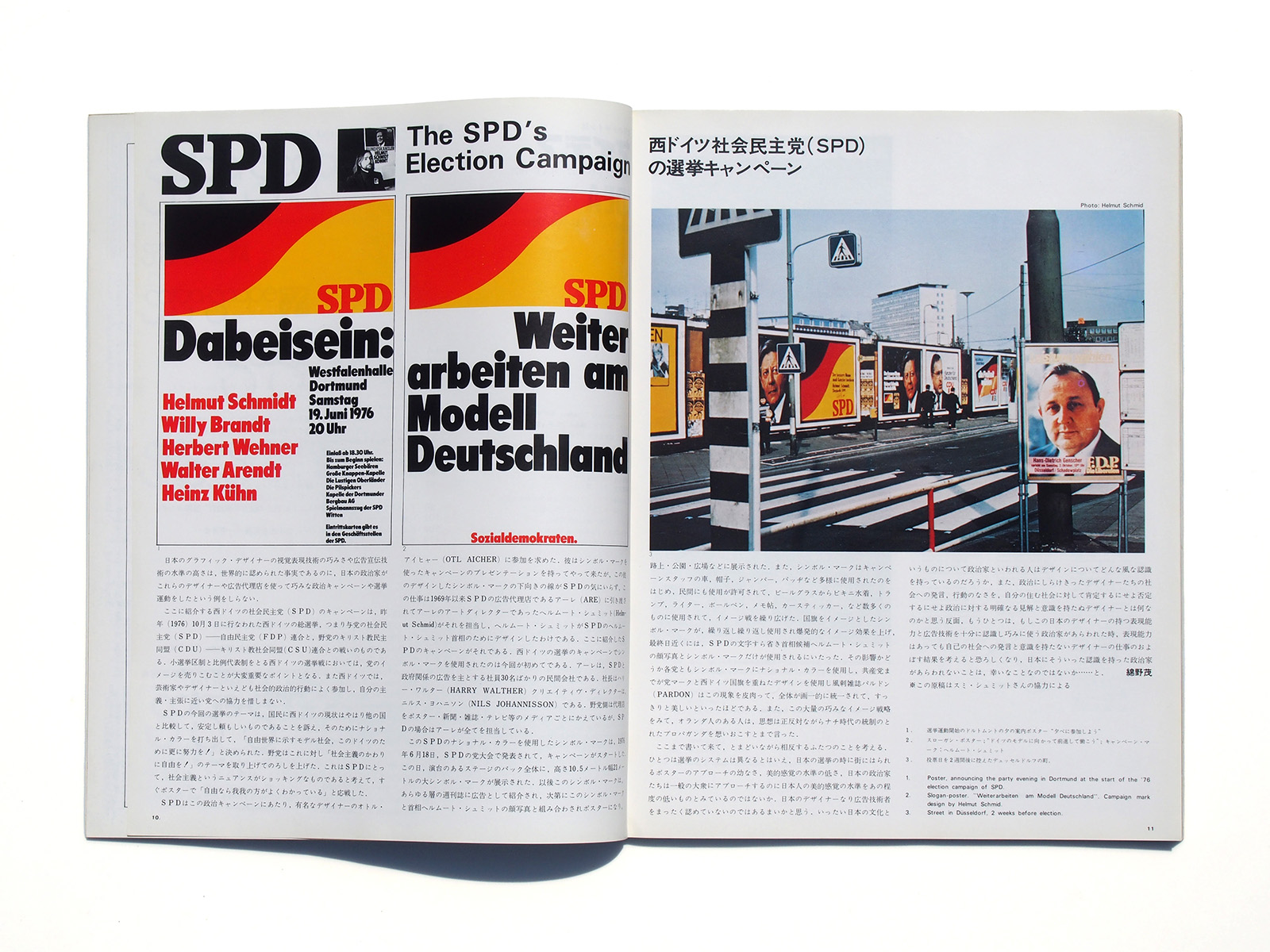
The campaign pieces for the Social Democratic Party of West Germany (SPD), which are included in these pages, were used for the general election in West Germany held on October 3rd last year, that is to say, for the campaign of the federation by the governmental parties of SPD and Free Democratic Party (FDP) against the federation by the non-governmental parties of Christian Democratic Union (CDU) and Christian Social Union.
To conduct an election campaign in West Germany Where the minor electorate system and the proportional representation system are adopted, it is very important to sell a party’s image to the people. Also the artists and designers in West Germany willingly participate in the social and political activities and lend their cooperation to a party of the principles or policies that they agree on.
As the theme for the election of this time SPD appealed to the nation that the present status of West Germany remained steady and reliable as compared With the other countries, adopted the national coloring to meet it, and decided a slogan as “Let us make further efforts for our Germany, a model society to the free World”.
The non-governmental parties started their campaign against them under their theme “Freedom instead of socialism”. SPD thought the nuance of the term of the socialism would be shocking and immediately took up the challenge to the latter by the poster with a phrase “We know freedom better”.
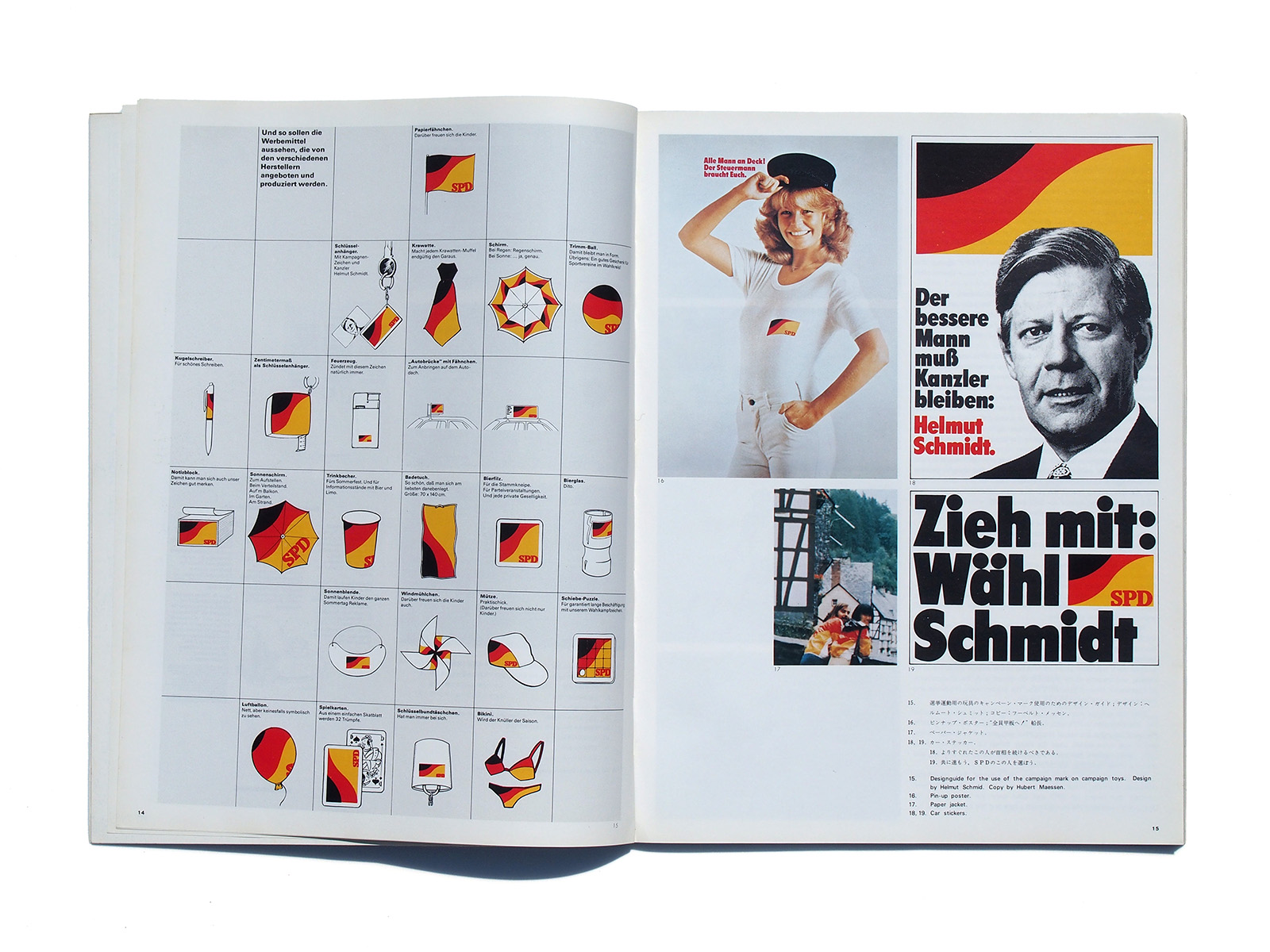
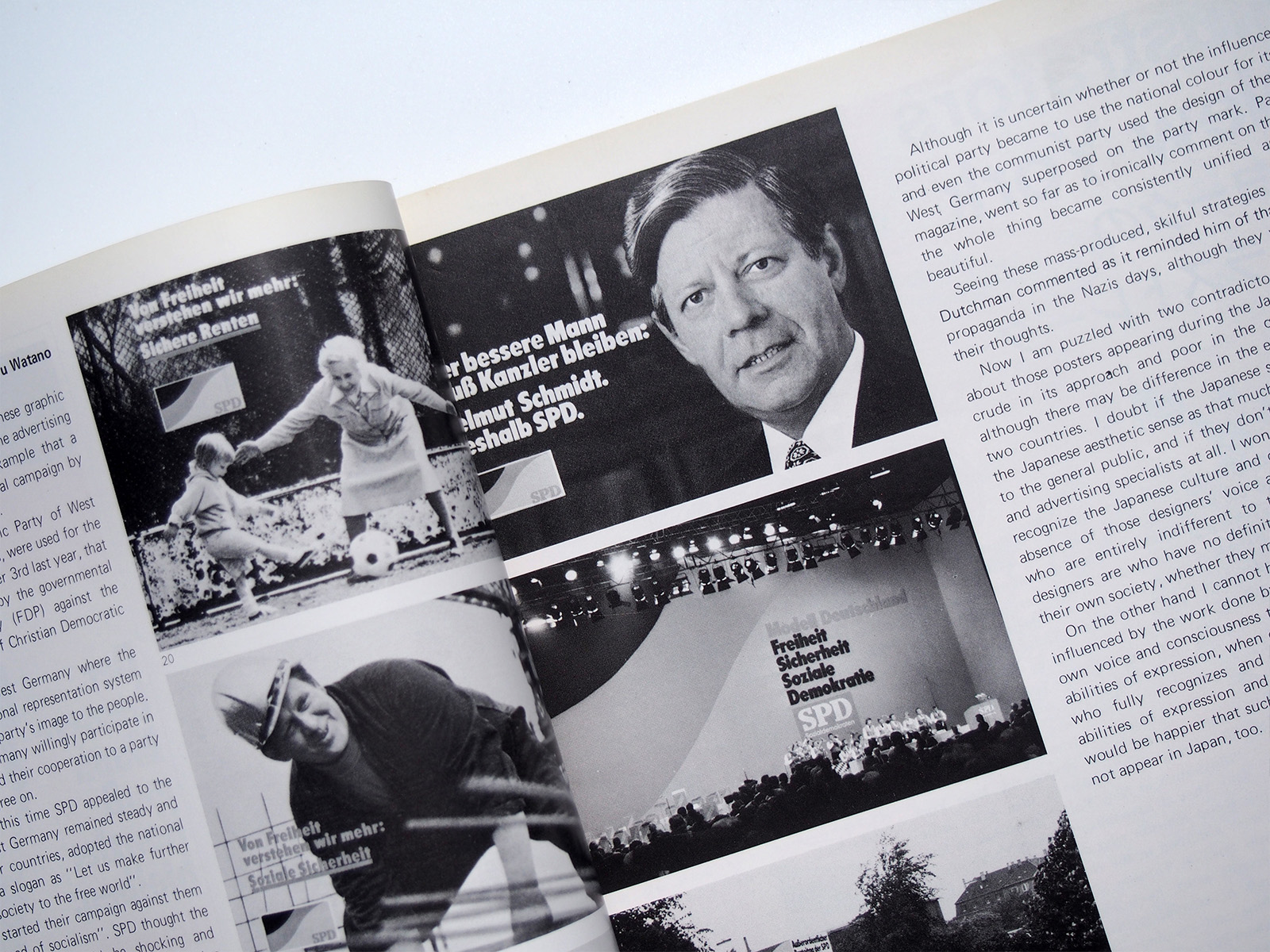
For the production of their political campaign SPD requested Otl Aicher, a notable designer, for the participation. The designer showed his campaign presentation using a symbol mark to SPD, who did not like the descending line of the symbol mark, and, instead, entrusted ARE, an advertising agency for SPD since 1969, with the task, which Helmut Schmid, then Art Director for ARE, undertook. In other words Helmut Schmid designed for Helmut Schmidt SPD.
The Work for the campaign is shown here. A symbol mark was used for the first time then in the history of an election campaign in West Germany‘
ARE is a private company With about 30 employees, mainly engaged in advertising for SPD and the government. President is Harry Walther and Creative Director is Nils Johannison. The non-governmental parties employ each different agency for each media like poster, newspapers, magazine television, etc, but in case of SPD ARE undertakes tasks for all of them.
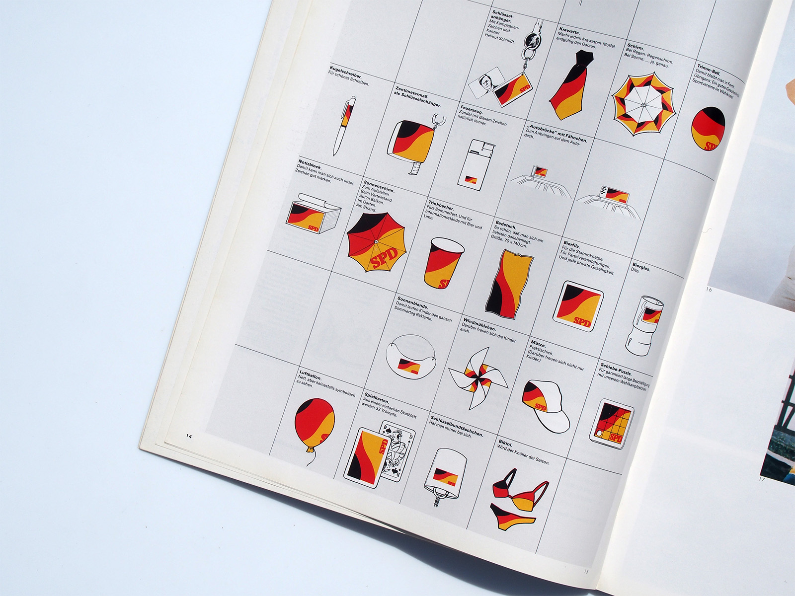
The SPD’s symbol mark using the national color was revealed at the SPD’s general meeting held on June 18th, 1976, when they started the campaign. A giant, 10.5 meter high, 21 meter Wide symbol mark appeared as the whole background of the stage‘ After that time this symbol mark was used as an advertising in the weekly magazine of all classes, and became to be gradually combined with the photography of Chancellor Helmut Schmidt’s face, the posters were produced and displayed on roads, parks and square etc.
Also the symbol mark was used in applications to various articles i.e., the campaign staff’s cars, hats, jackets, badges, etc., and besides the permission for the use of the symbol was granted to private hands, and it was more widely used for many things i.e. bikini swimming suits, cards, lighters, ball-point pens, memorandums, car stickers, and thus the image campaign was developed.
The symbol mark, which imaged the national flag, repeatedly produced dramatic image effects until, near the final day, they even omitted the letters of SPD and used only the photography of Chancellor candidate Helmut Schmidt’s face and the symbol mark.
Although it is uncertain whether or not the influence helped, every political party became to use the national colour for its symbol mark, and-even the communist party used the design of the national flag of West Germany superposed on the party mark. Pardon, a satirical magazine, went so far as to ironically comment on the phenomenon as the Whole thing became consistently unified and looked clearly beautiful.
Seeing these mass-produced, skilful strategies for images, a certain Dutchman commented as it reminded him of that tactfully controlled propaganda in the Nazis days, although they were quite contrary in their thoughts.
Now I am puzzled with two contradictory matters. One thing is about those posters appearing during the Japanese election which are crude in its approach and poor in the quality of aesthetic sense, although there may be difference in the election system between the two countries. I doubt if the Japanese statesmen regard the level of the Japanese aesthetic sense as that much as are seen in their approach to the general public, and if they don’t accept the Japanese designers and advertising specialists at all. l Wonder how the so-called statesmen recognize the Japanese culture and design. And to think about the absence of those designers’ voice and activity towards the society, who are entirely indifferent to the politics, i doubt what those designers are who have no definite opinion and consciousness about their own society, whether they may admit it or oppose it.
On the other hand I cannot help have a tear to think of the result influenced by the work done by those designers who don’t have their own voice and consciousness toward the society, although they have abilities of expression, when once any statesman appears in the world who fully recognizes and tactfully uses the ‘Japanese designers’ abilities of expression and advertising technique, and I imagine it would be happier that such a statesman with ‘such recognition would not appear in Japan, too.
Helmut Schmid
Born in Austria in 1942. He apprenticed as type compositer in Germany, and then studied under Emil Rude, Robert Büchler and Kurt Hauert at the Basel School of Design in Switzerland. He has worked in Sweden, Canada, Japan and Germany. He now designs in Osaka, Japan with the duality of informative and free form. He has been a contributor to the international typography journal, ‘Typographische Monatsblätter’ since 1967.
idea-mag.com
西ドイツ社会民主党(SPD)の選挙キャンペーン 綿野茂
ニューヨークの5人のイラストレーター
ダグ・ジョンソン
ガイ・ビラウト
デビッド・ウイル・コックス
ロバート・ギュスティ
ティム・ルイス
キヤノン・アムステルダムのデザインポリシー
アメリカン・イラストレーション200年展 虎新一郎
よりよきコミュニケーションと環境づくりを目指すシェークスピア兄弟
ロック/ペッテルセン社 レイアウト:(株)今竹
“デザインはマジックではない”ポール・D・ミラーへのインタビュー 今竹翠
“正誤は何もないのだ!”ウイリ・クンツへのインタビュー 今竹翠
“もっと美的な方面に注目したい”ケン・リーゼンへのインタビュー 今竹翠
<ブック・レビュー>スイスデザインの精神を見せてくれる「ベーシック・タイポグラフィ」ルエディ・ルエグ、ゴーディ・フローリッヒ共著
アムネスティ・インターナショナルによる”良人の囚人年間1977″国際ポスター
玩具:子供の世界展
数万人の若者を魅了した大正ロマン、田中比左良展 中井幸一
国内ニュース
展覧会ニュース
ヘルムート・シュミット
1942年,オーストリア生まれ。ドイツで植字工の徒弟期間終了後,スイスのバーゼル・スクール・オブ・デザインでエミール・ルーダー,ロベルト・ビュヒラー,クルト・ハウエルトの下で学ぶ。制作活動はスウェーデン,カナダ,日本,ドイツに渡る。現在は大阪で情報伝達とフリーフォルムという二元性に直面しながらデザイン活動に携わっている。「TM」誌には1967年から現在に至るまでタイポグラフィに関する記事を発表し続けている。