


Publisher: Birkhäuser
Language: German
ISBN-10: –
ISBN-13: –
Product Dimensions: 25 x 23 x 2.2 cm
Release Date: 1958
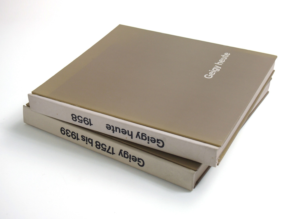
2 copies in 1 set
Author: Markus Kutter
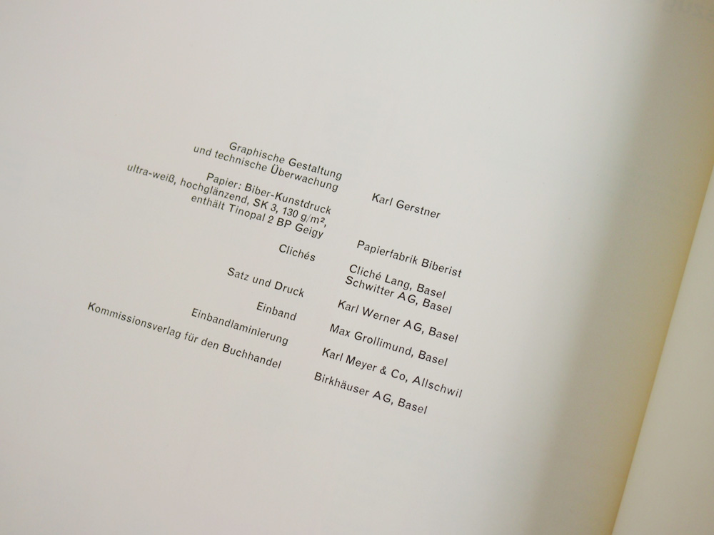
Design: Karl Gerstner
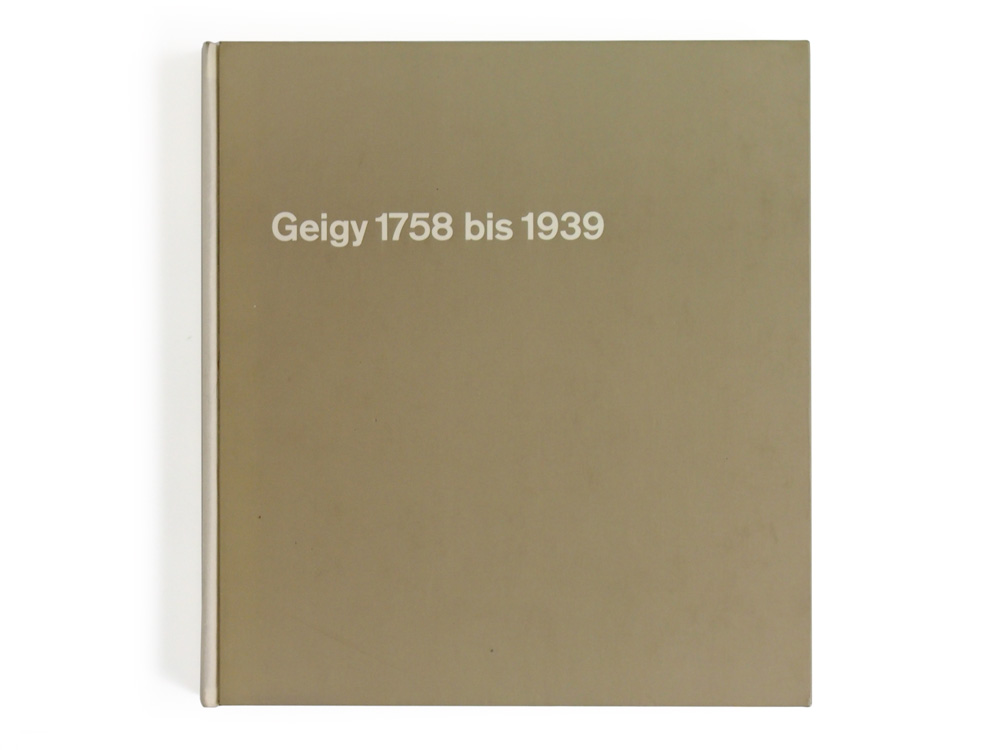
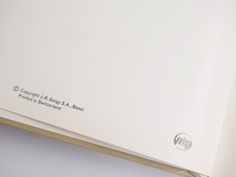
in basel, swiss typography is closely linked to the local chemical industries. in 1958 the geigy company (today: novartis) celebrated its 200-year anniversary with a two-volume publication designed by karl gerstner (*1930) and (partly) written by markus kutter (*1925) – a “dream team” that later founded ggk, a successful advertising agency.
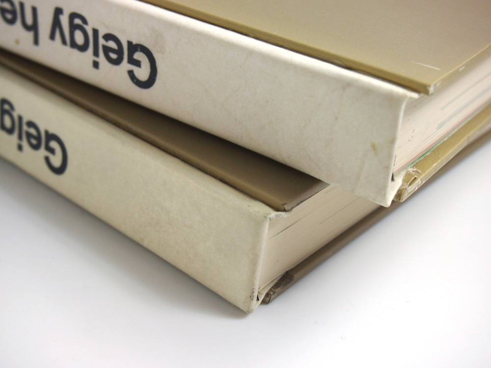
karl gerstner used his trademark square format with brownish card wrappers and a white spine – very similar to the books in stories 16 and 37). each volume has its own slipcase.
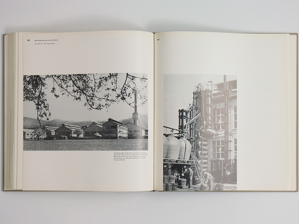
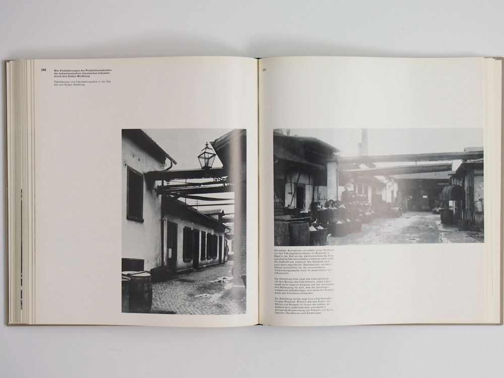
akzidenz-grotesk type, …
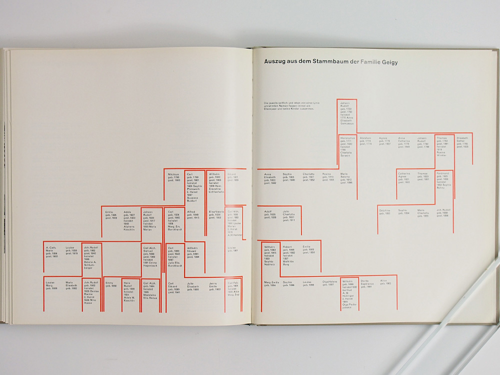
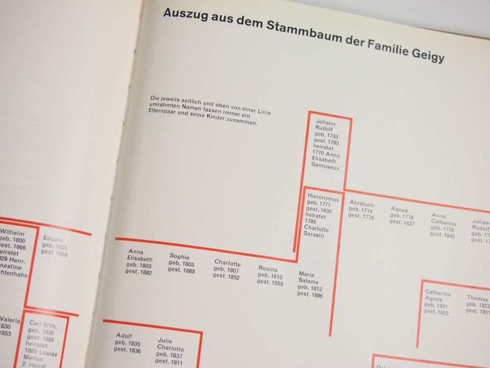
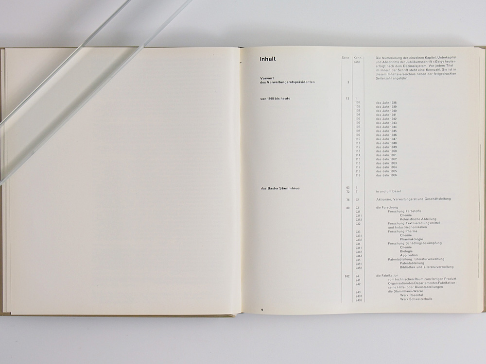
… asymmetric page layout, …
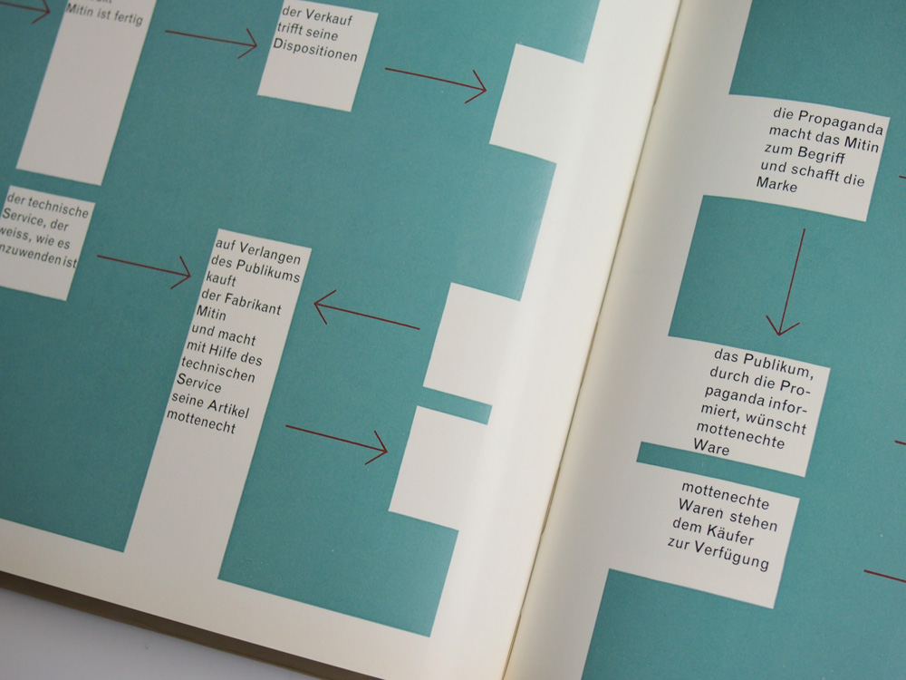
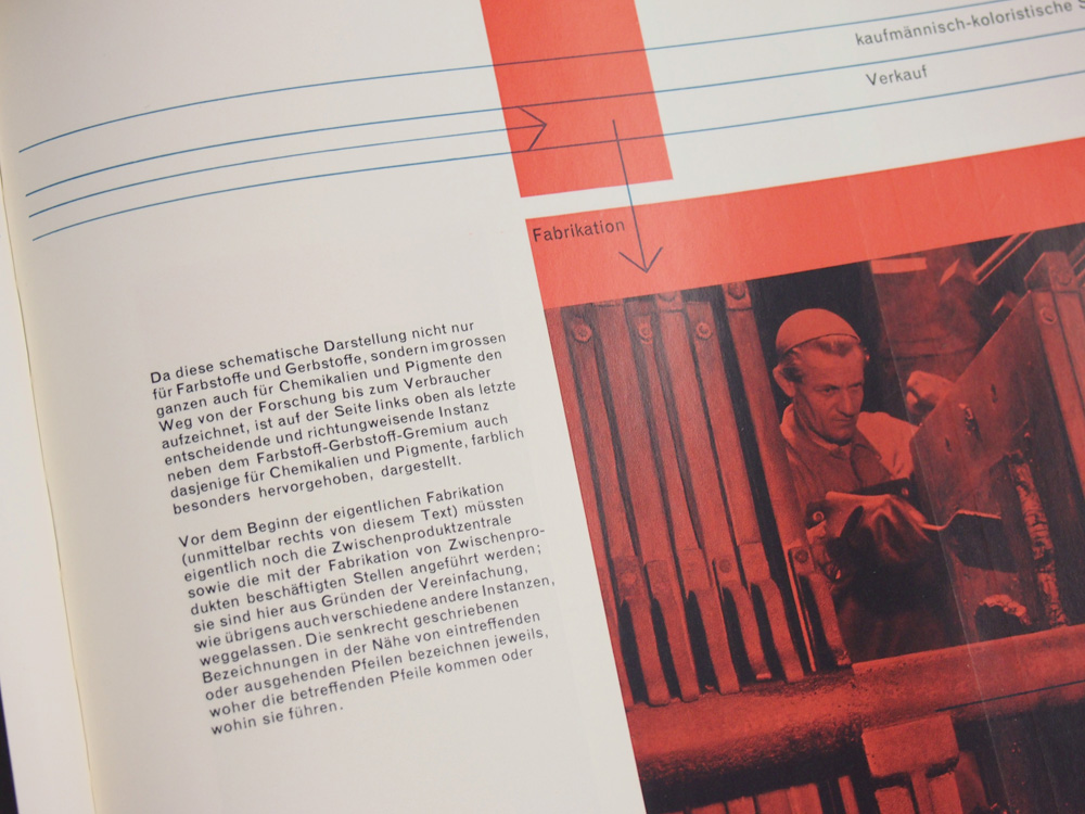
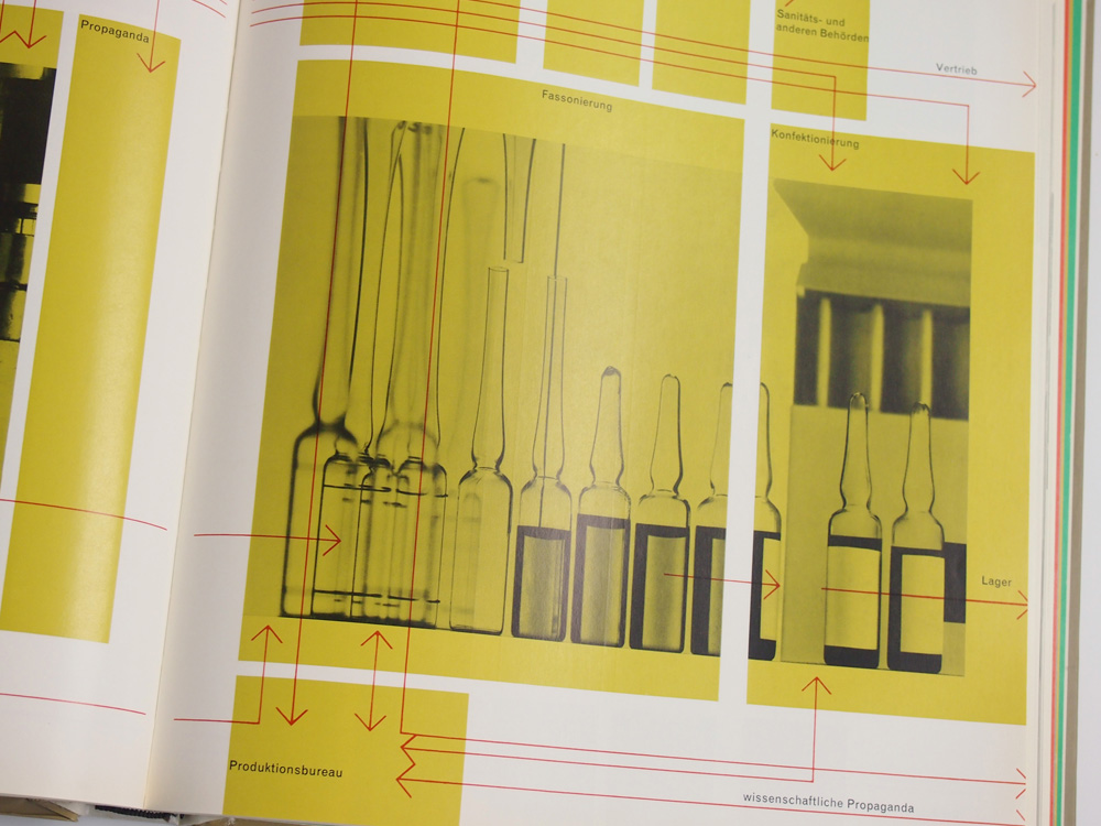
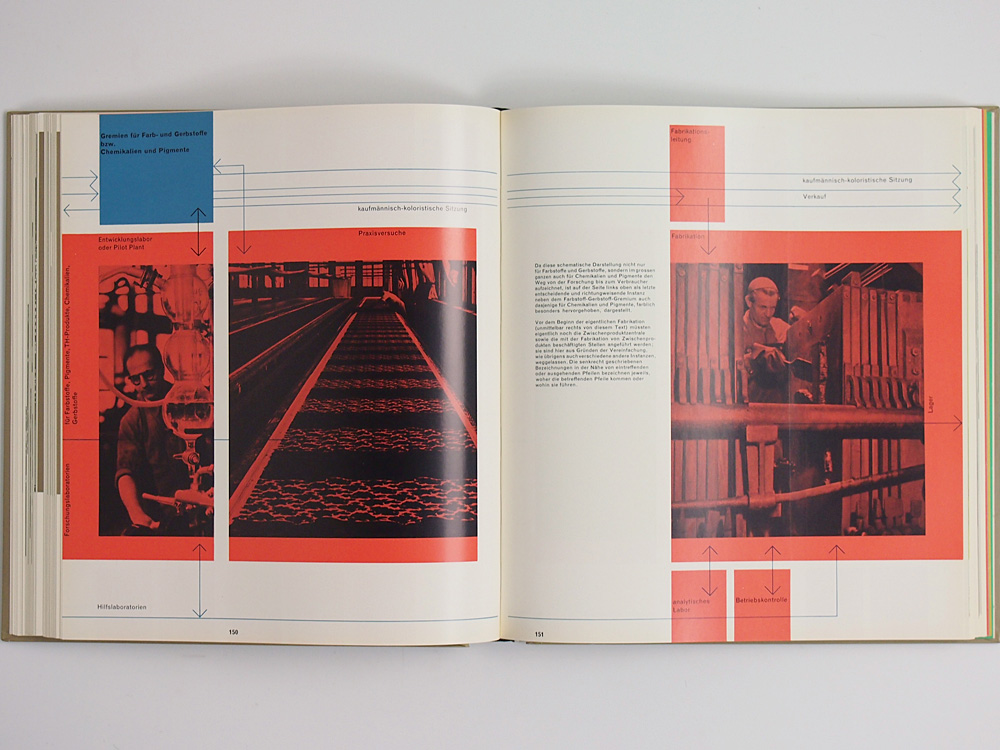
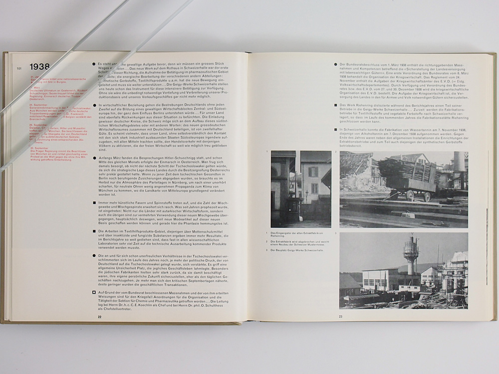
… grid-based image placement …
… classic swiss typography!
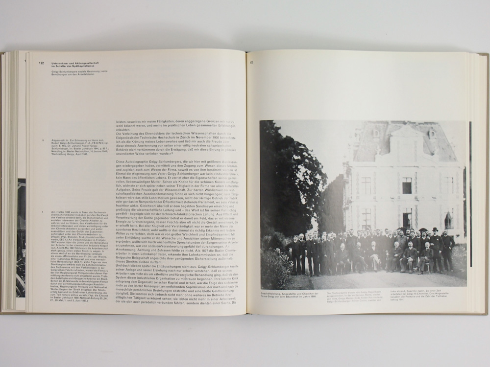
typical for gerstner’s style: some titles begin with lower-case, texts are set flush left, ragged right, …
… and some sections have pages in different colours.
the text originated from wiedler.ch
バーゼルにおけるスイスタイポグラフィと製薬会社は非常に密接でした。
こちらは1958年にガイギー社の200周年を記念して出版された2冊セットの図録や歴史を綴ったものです。著者はMarkus Kutter、デザインはKarl Gerstnerによるもので、のちにggkを立ち上げる二人による伝説となった名著です。
ゲルストナーのトレードマークともいえるような正方形フォーマットに、
akzidenz-grotesk…..
アシンメトリーなレウアウト、グリッドを感じさせる写真配置、伝統的なスイスタイポグラフィスタイル。ゲルストナースタイルが集約された2冊となります。
海外を見渡しても、この2冊セットを市場で見かけることは、なかなかないでしょう。