
Publisher: Seibundoshinkosha
Language: Japanese English
ISBN-10: 441611527X
ISBN-13: 978-4416115275
Product Dimensions: 29.6 x 22.4 x 3 cm
Release Date: 2015
Price: $80 USD (¥8,000 JPY)
Free Worldwide Shipment from Tokyo via airmail
Condition: New
designed by Yoshihisa Shirai,
Yuichi Kato, Takumi Egawa


![]()
日本国内の方は下のボタンからご購入いただけます。
コンディション: 新品
![]()
*国内のみ追跡番号付きクリックポストにて送料無料となります
銀行振込をご希望される方はこちらに直接ご連絡いただけるようお願いいたします。
info@page-spread.com
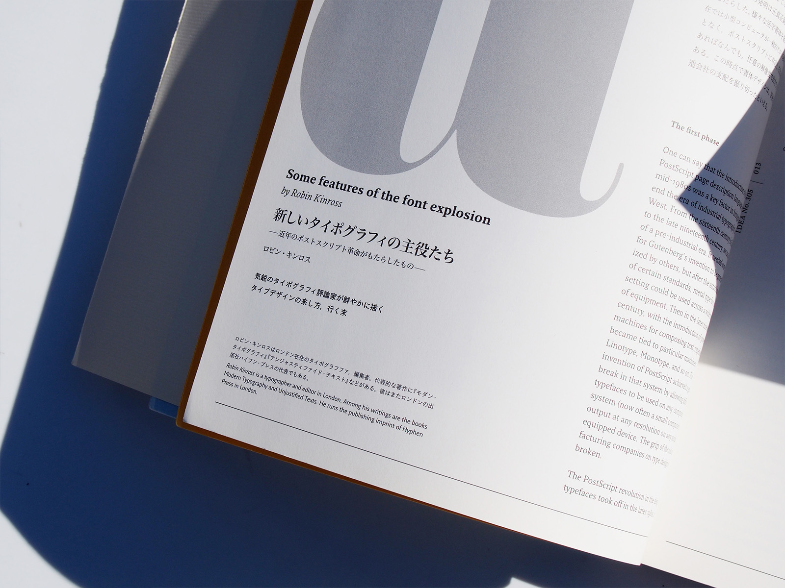
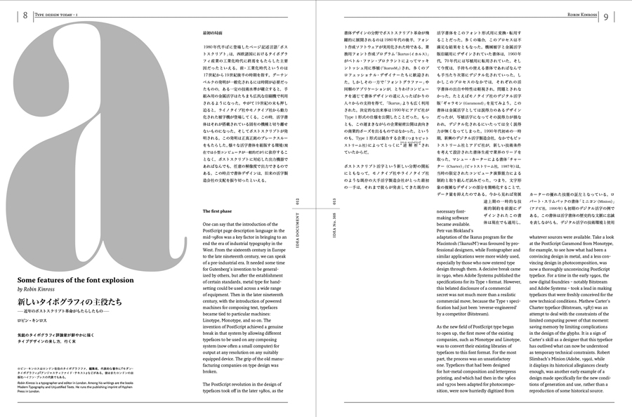
Robin Kinross / Some features of the font explosion
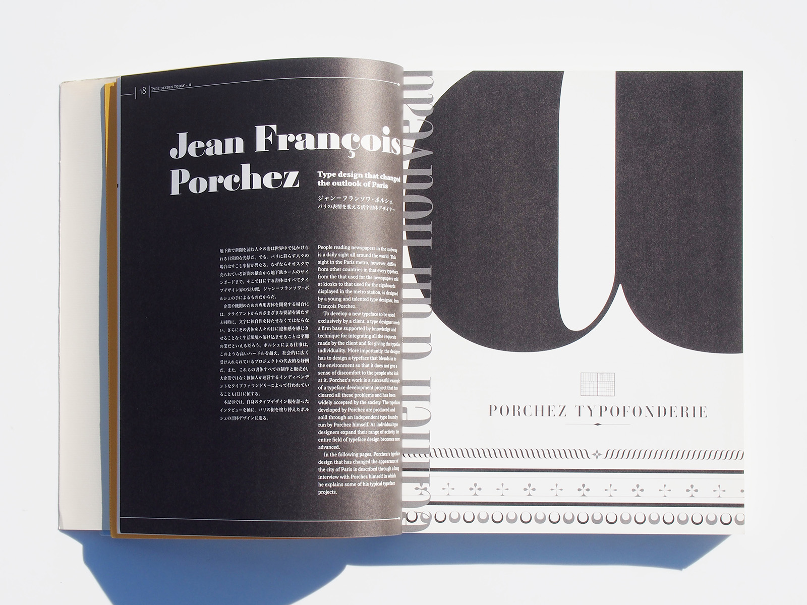
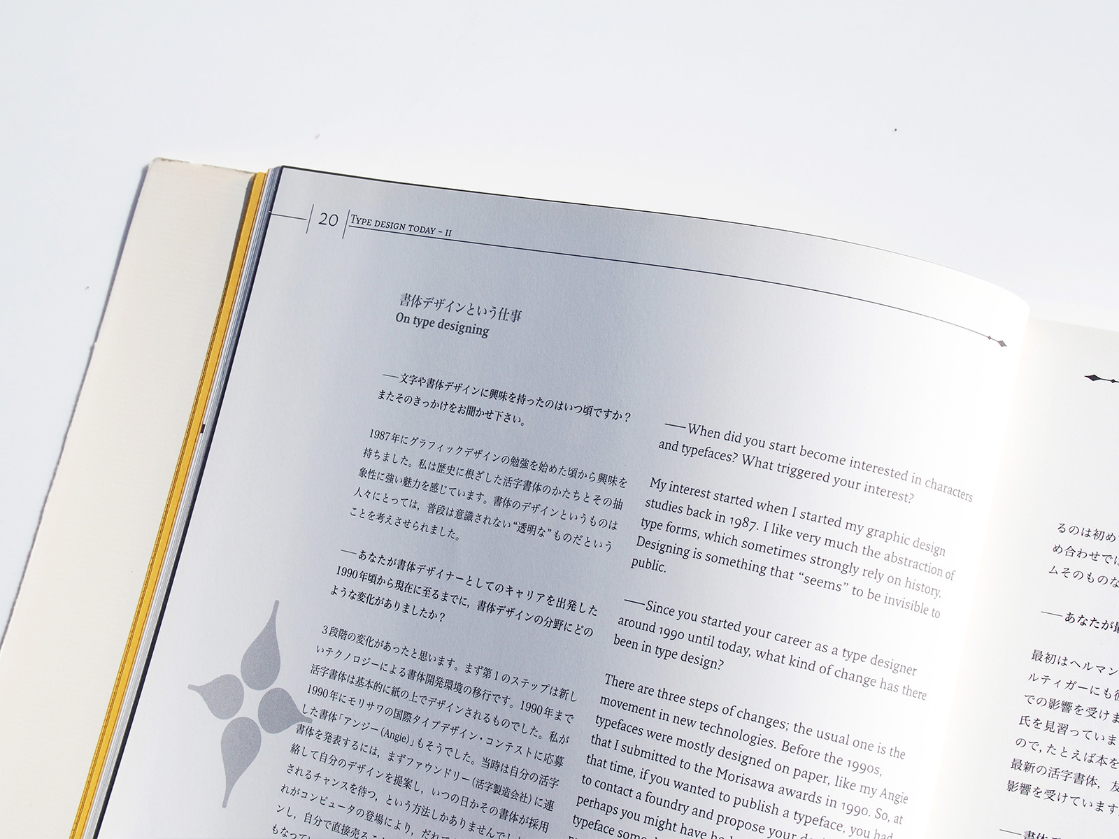
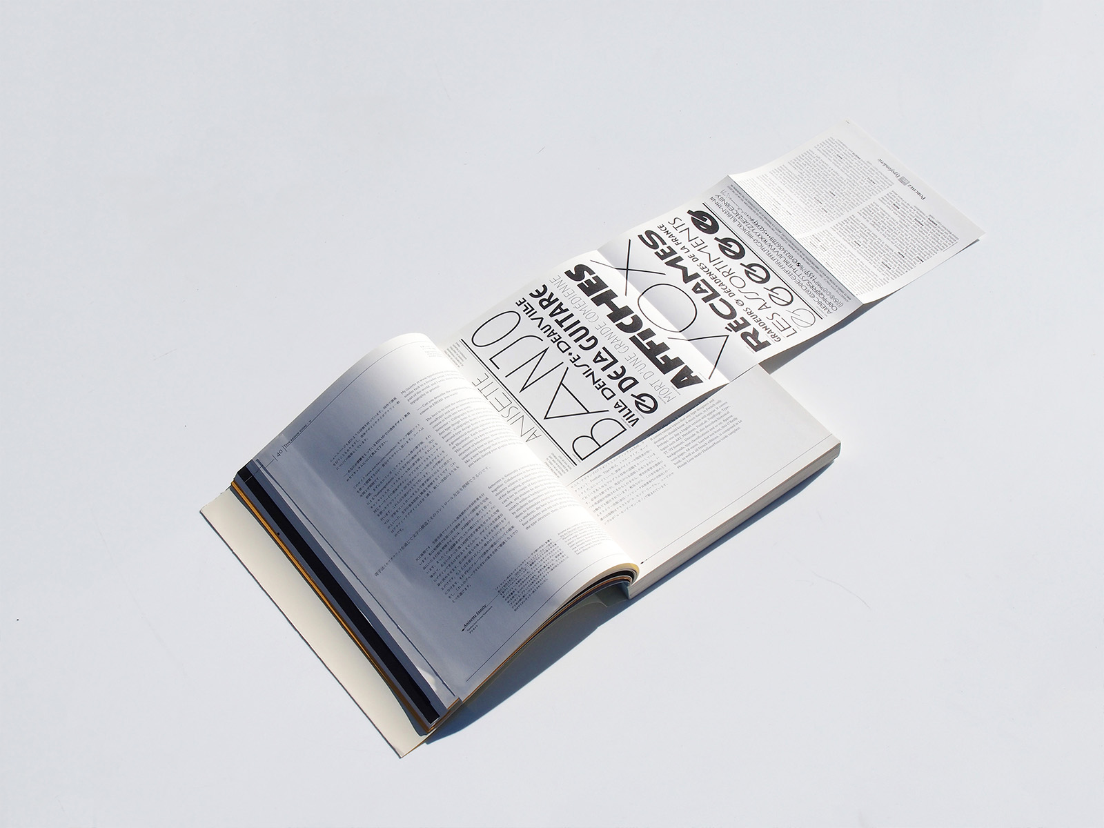
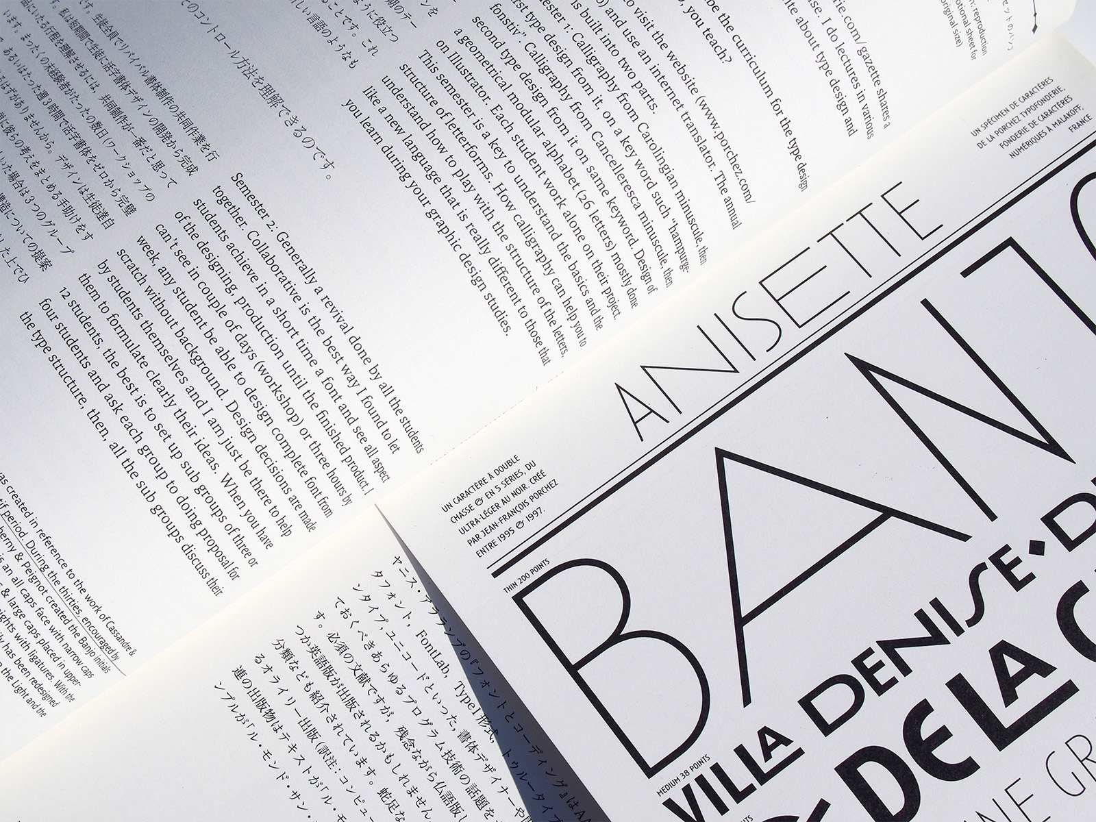
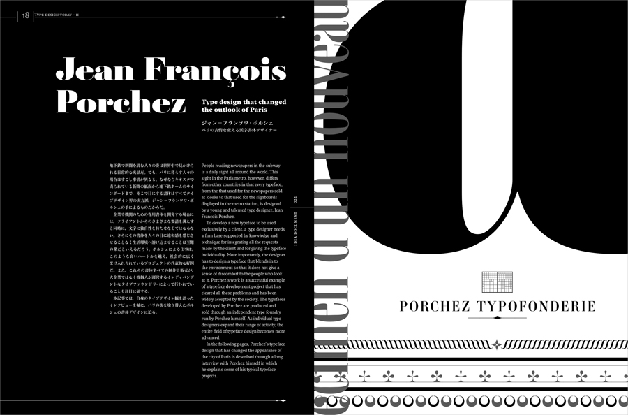
Jean François Porchez : Type design that changed the outlook of Paris
Fred Smeijers : From punchcutting to digital type design

Akira Kobayashi // Originality and Redesign of a Typeface
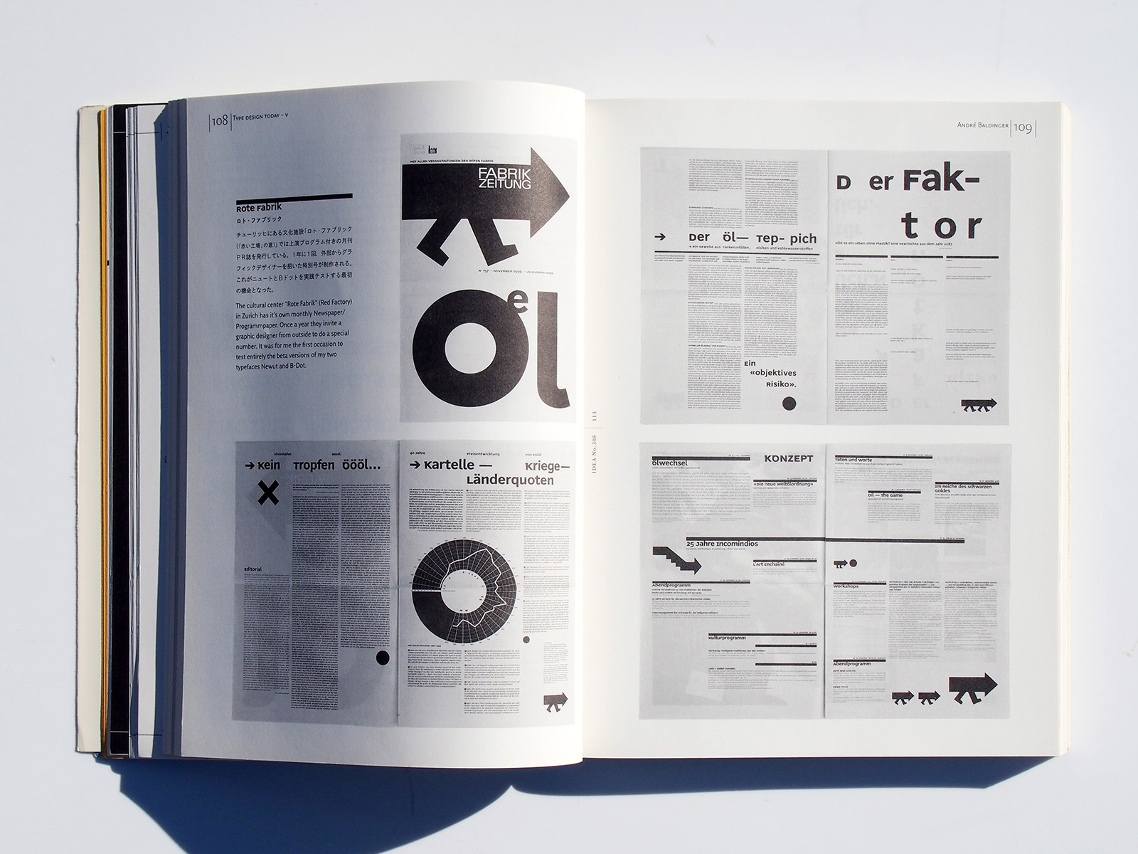
André Baldinger : Succeeding Experimental Typefaces
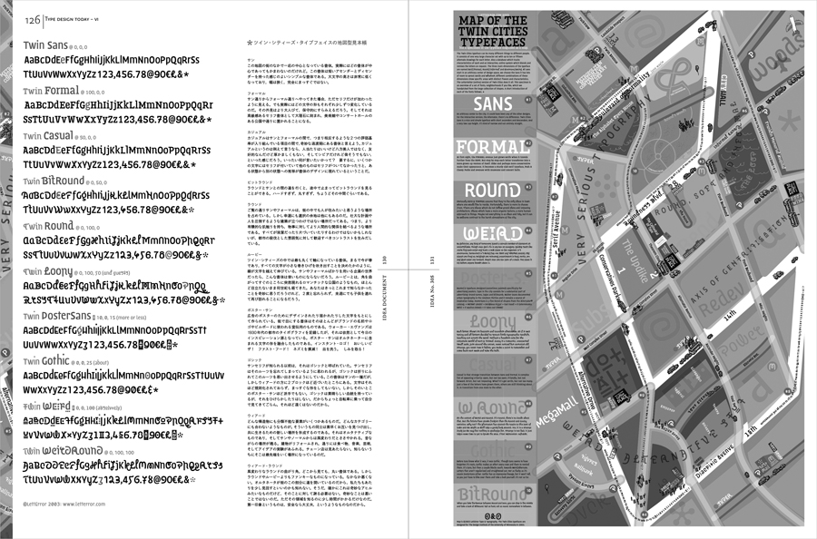
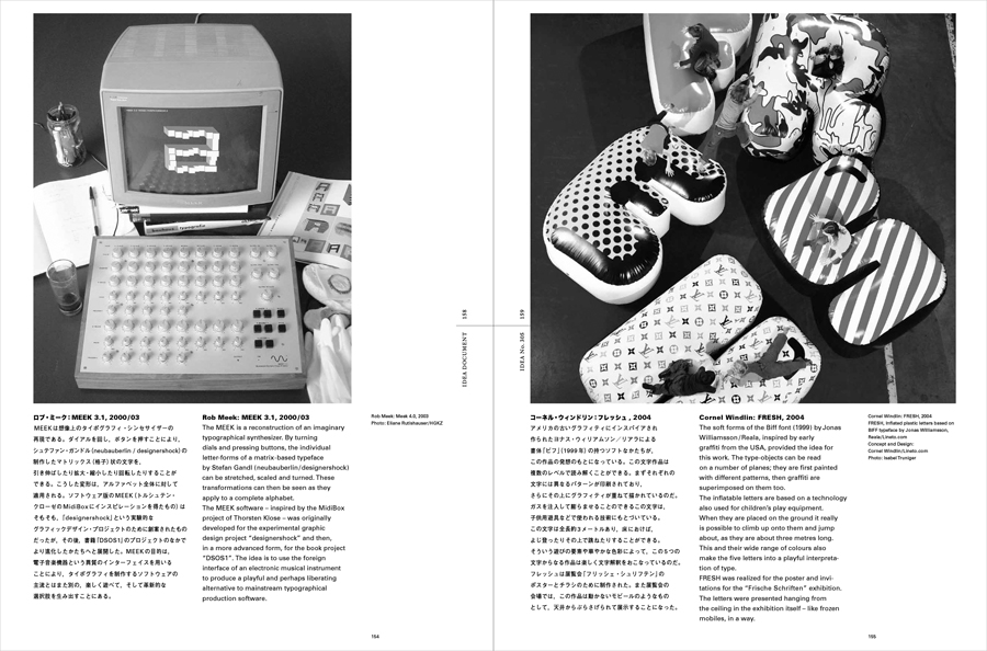
LettError // Twin Cities – The typeface represents a city
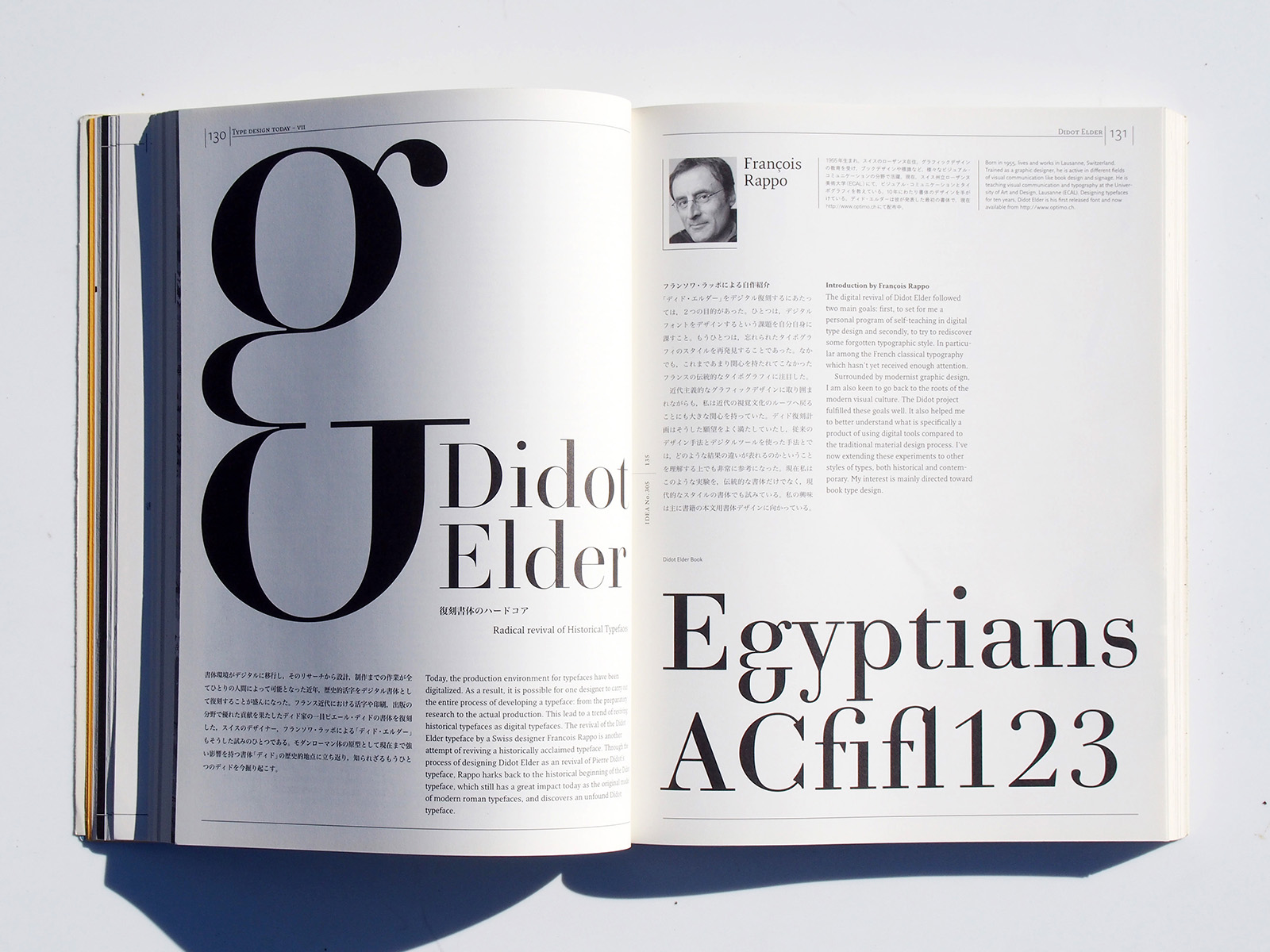
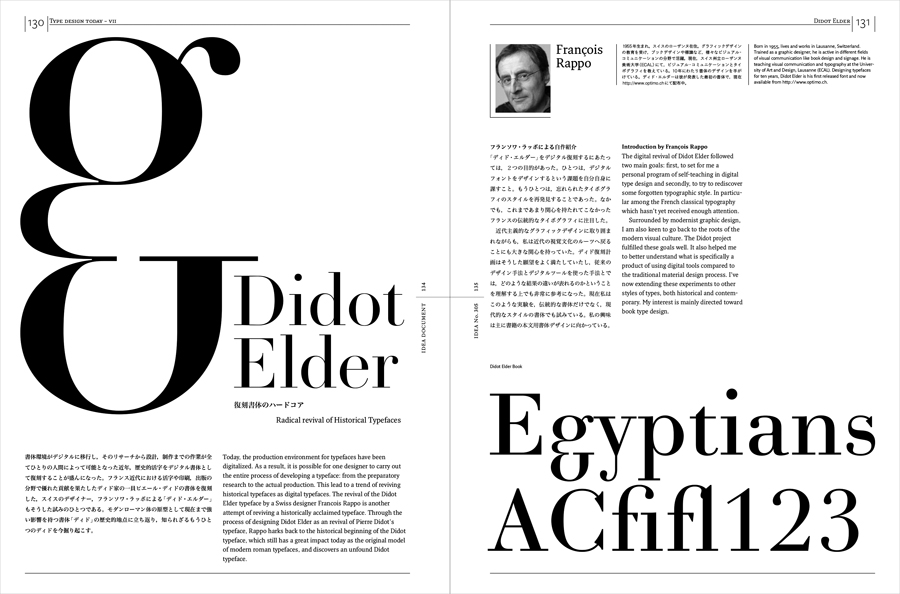
François Rappo : Didot Elder – Radical Revival of Historical Typefaces
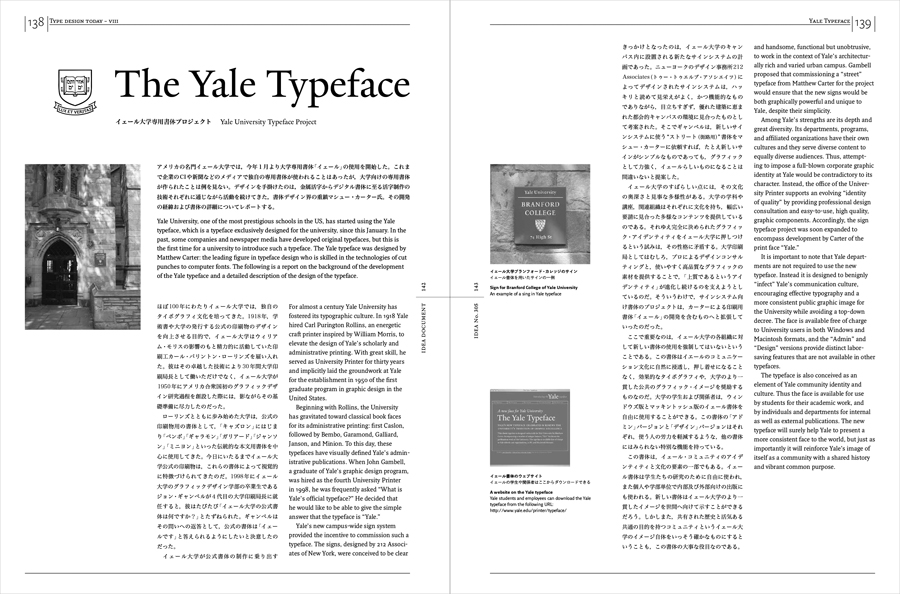
Matthew Carter : Yale University Typeface Project
Type foundry Today

Andres Janser : Frische Schriften / Fresh Type
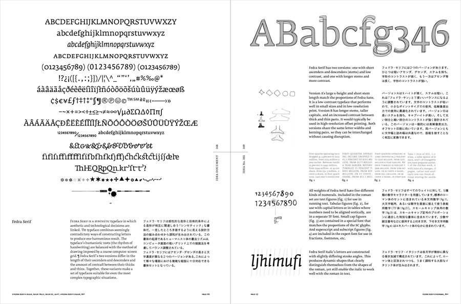
Fedra : polyhistorical and synthetic quality in a type face
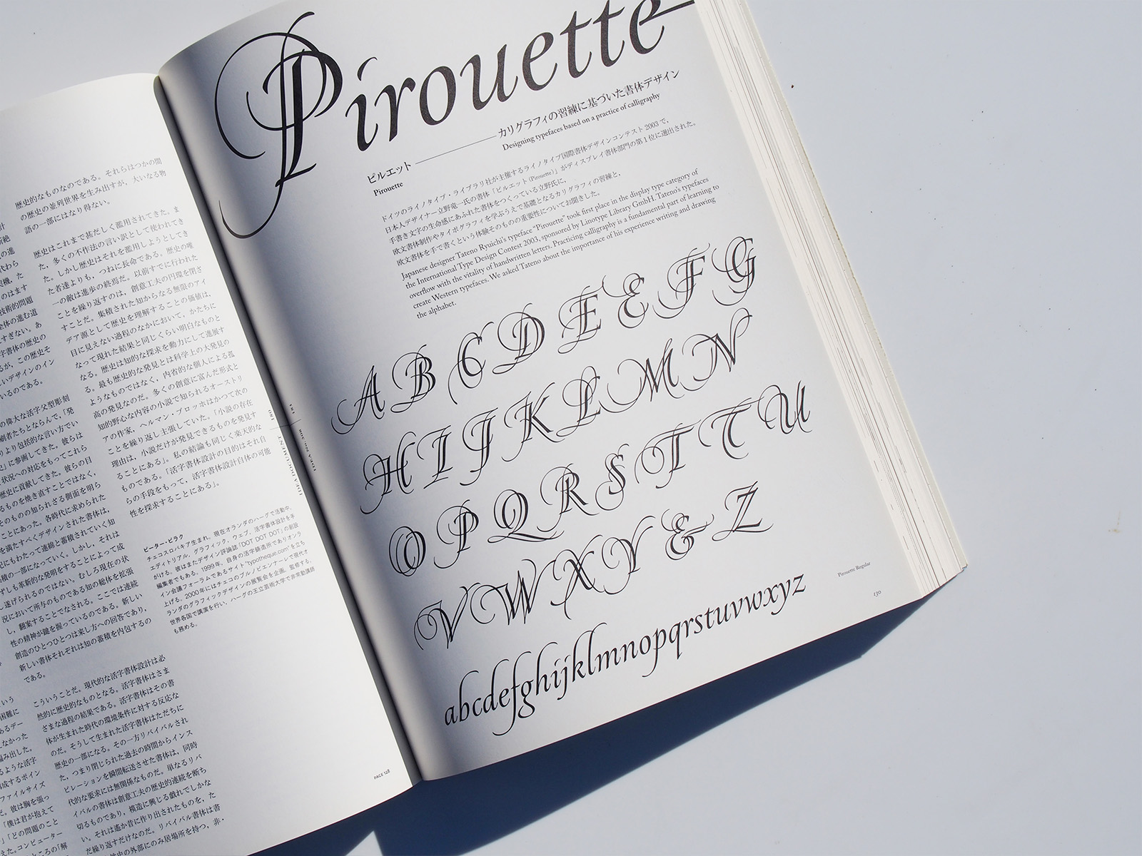
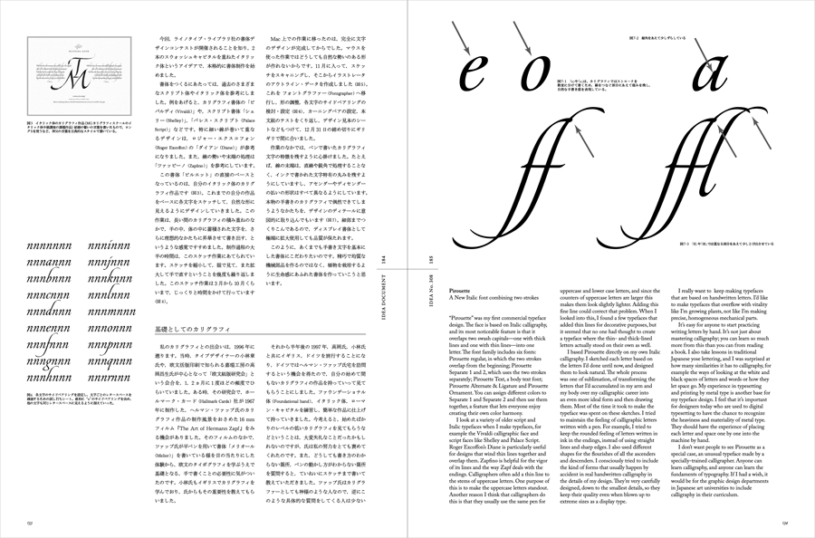
Ryuichi Tateno // Pirouette : Designing typefaces based on a practice of calligraphy
An Interview with Matthew Carter : The Essences of Type design
Sibylle Hagmann // Dwiggins Revisited
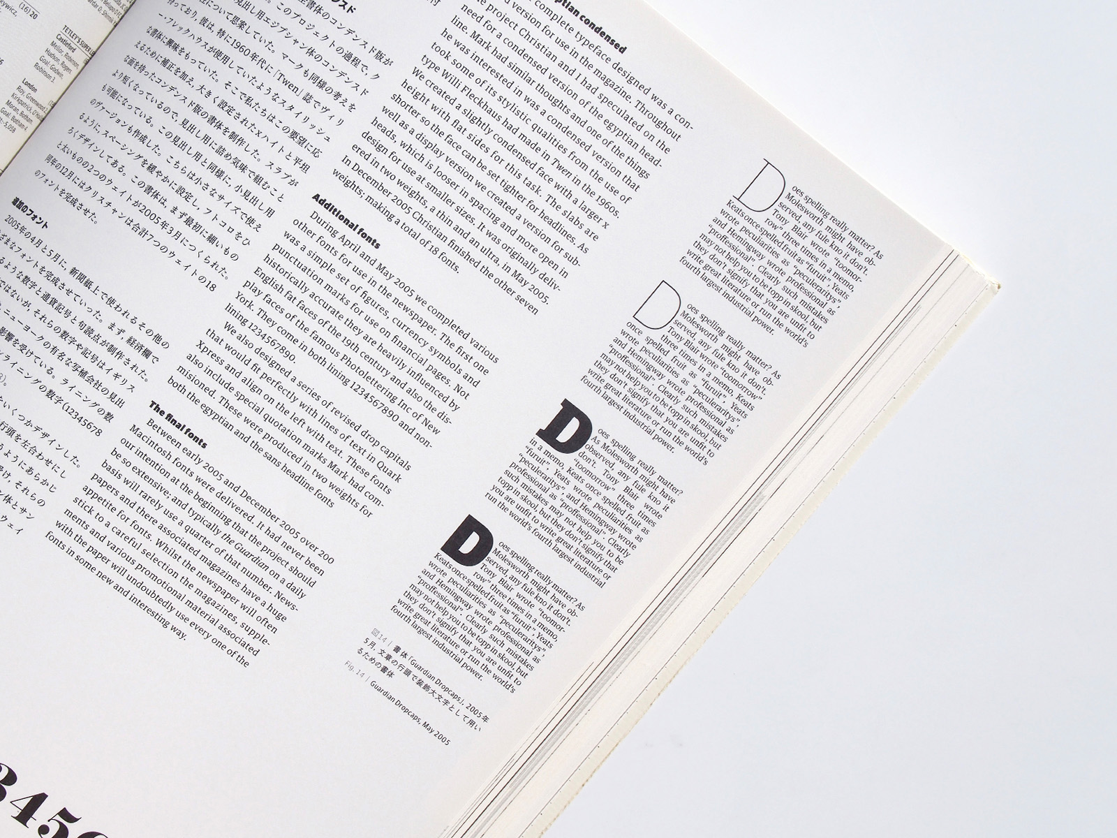
Paul Barnes // The story of the Guardian : typefaces 2003-2005
Ian Lynam // Heft, Gravy, and Swing : The Life & Times of Oswald Cooper
Ian Lynam // John Downer : Type Designer, Sign Painter, Gilder, Artist, Writer, and Critic
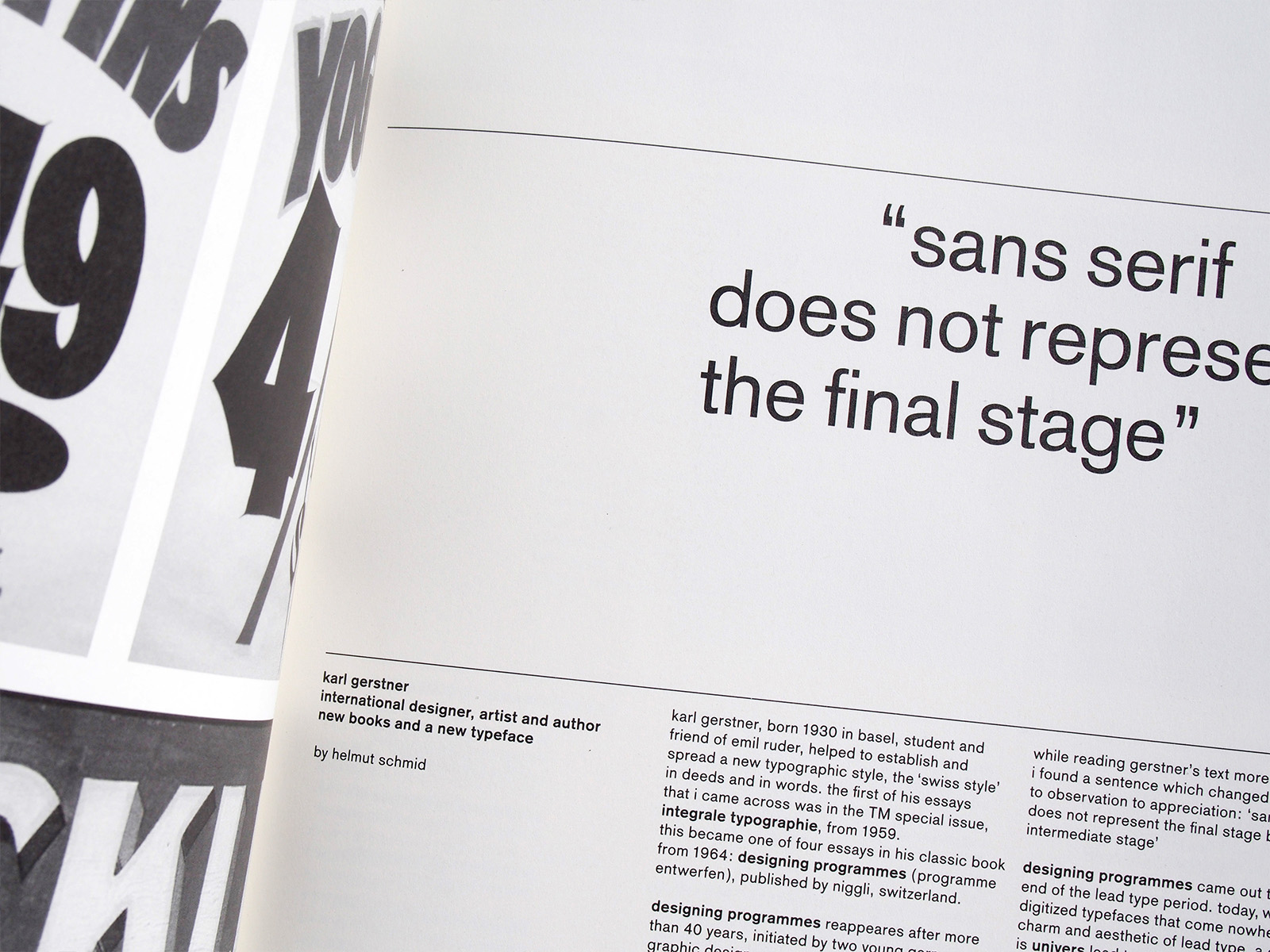
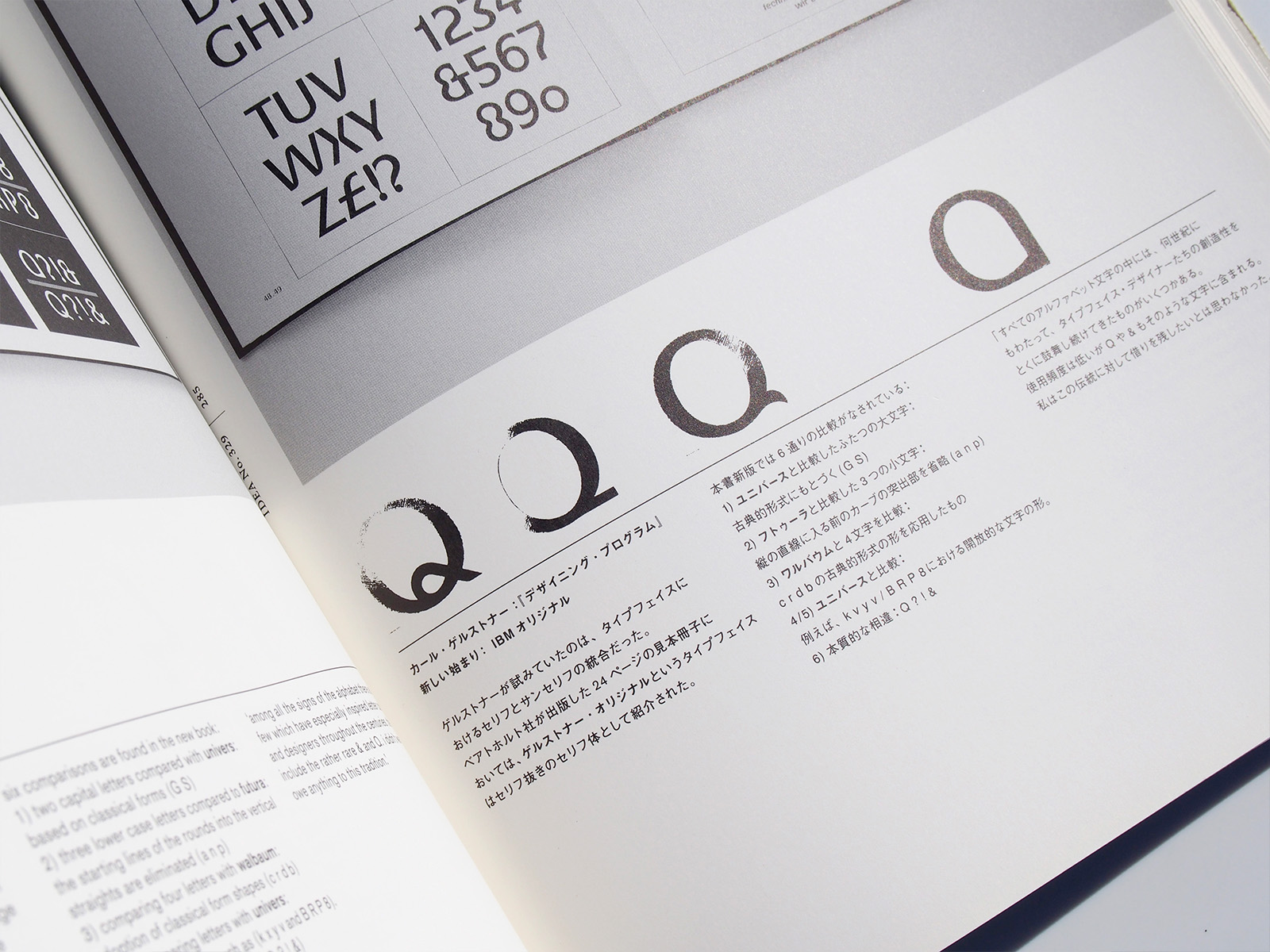
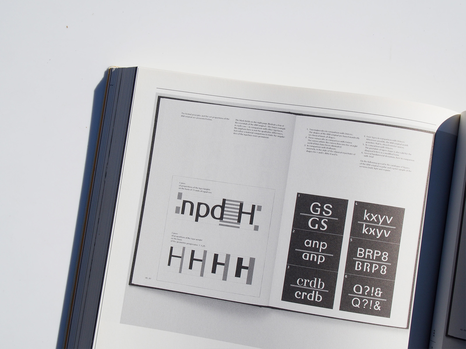
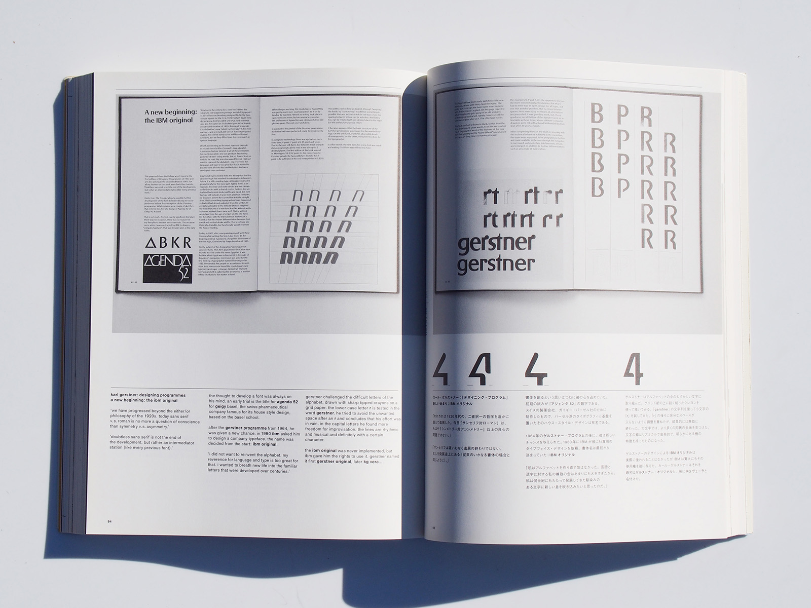
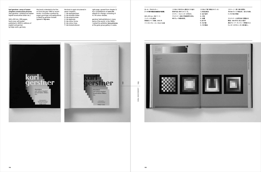
Helmut Schmid // “sans serif does not represent the final stage” karl gerstner international designer, artist and author new books and a new typeface
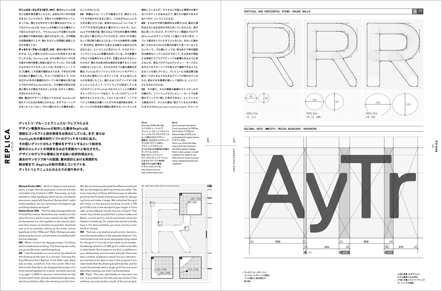
Critical development of sans serifs — Replica, New Rail Alphabet, Neutral
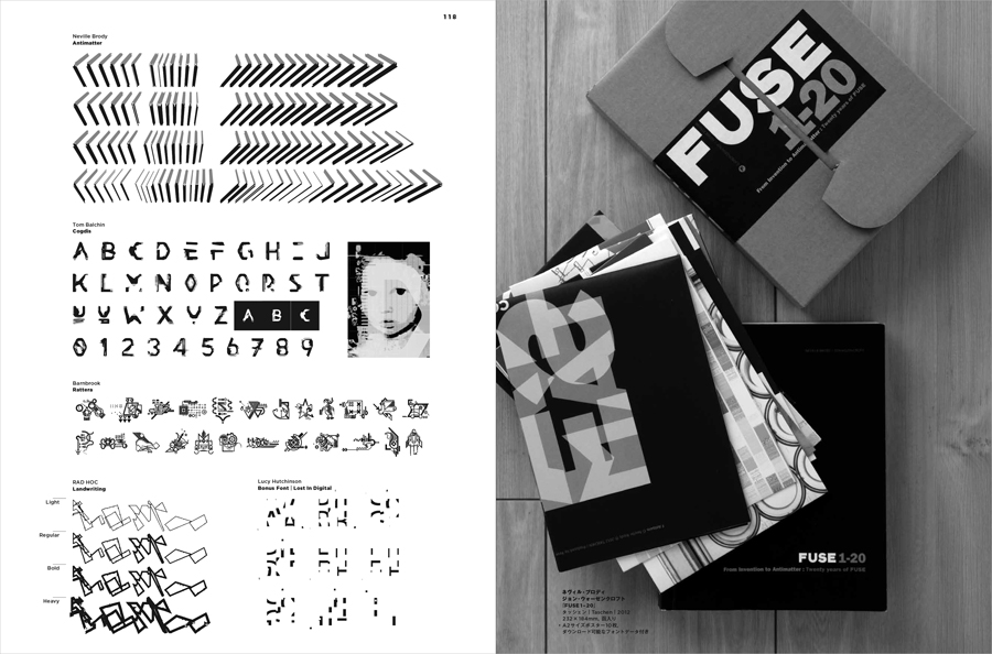
FUSE 1-20 From Invention to Antimatter: Twenty years of FUSE
私たちがPCや携帯情報端末で日常的に慣れ親しんでいる欧文フォントは、15世紀にグーテンベルクが活版印刷術を確立して以来の伝統と革新のうえに生み出されてきたものだ。
長年にわたって金属活字が主流だった欧文活字の世界に大きな技術的革新が訪れたのは、1980年代のMacintosh到来とDTP環境の普及だった。デジタル技術がそれまでの職人的世界から書体デザインを開放したことで、欧文書体は爆発的な勢いで増えていった。
1990年代は伝統書体をとりあえずデジタル化したものや、デジタルならではの可能性を追求した実験的書体が中心だったが、歴史研究の進展やコンピューターの処理能力向上、インターネットの普及とともに、近年ますます洗練された書体が生み出されるようになっている。
本書ではこのような四半世紀にわたる潮流全体をカバーし、グローバル化が進む現代において、デザイナーはもとより日々フォントに接する一般的ユーザーにとって重要なものとなっている欧文書体のデザインとその文脈を提示する。