


Paperback: 95 pages
Publisher: Edition Cantz
Language: German / English
ISBN-10: 3893222316
ISBN-13: 978-3893222315
Product Dimensions: 26.5 x 21 x 0.7 cm
Release Date: 1991
Price: sold

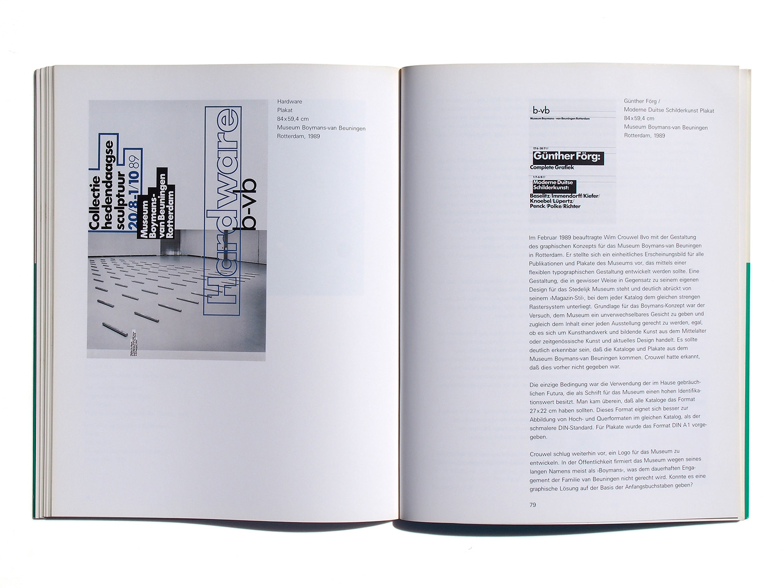
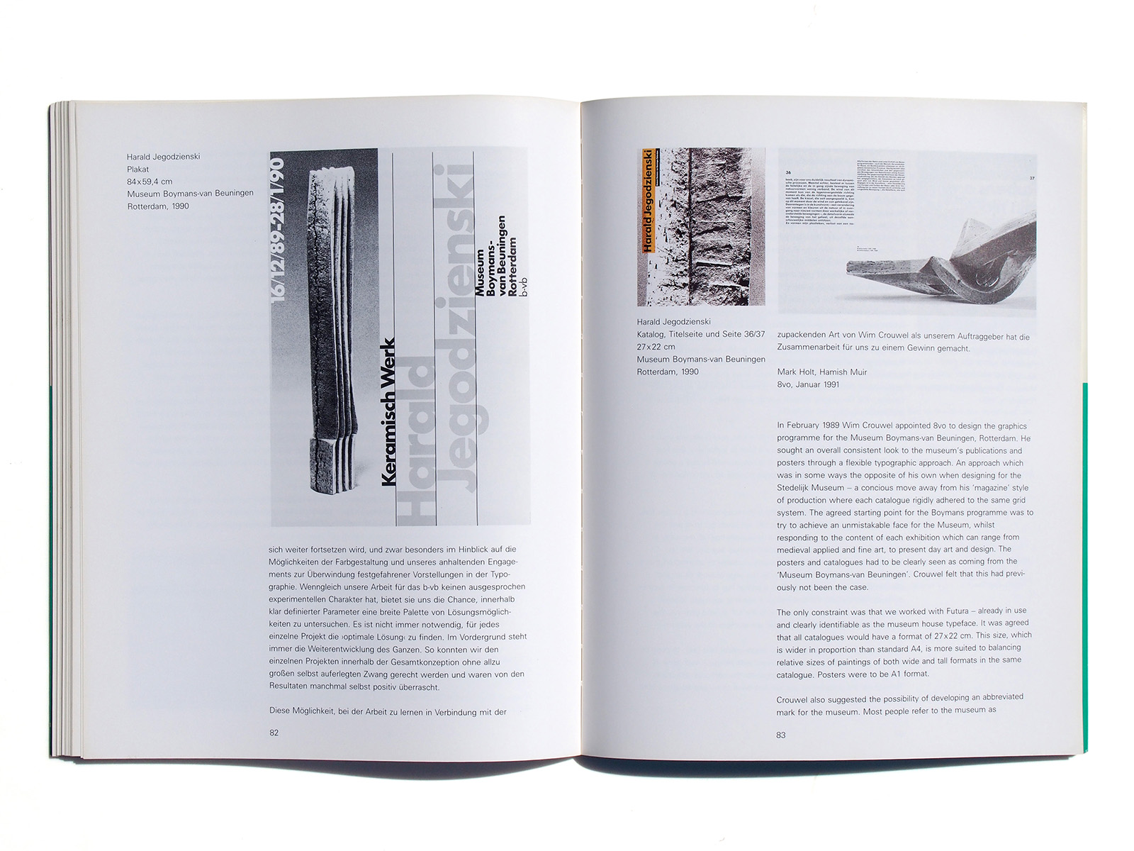
ln February 1989 Wim Crouwel appointed 8vo to design the graphics programme for the Museum Boymans-van Beuningen, Rotterdam. He sought an overall consistent look to the museum’s publications and posters through a flexible typographic approach. An approach which was in some ways the opposite of his own when designing for the Stedelijk Museum — a concious move away from his ‘magazine’ style of production where each catalogue rigidly adhered to the same grid system. The agreed starting point for the Boymans programme was to try to achieve an unmistakable face for the Museum, whilst responding to the content of each exhibition which can range from medieval applied and fine art, to present day art and design. The posters and catalogues had to be clearly seen as coming from the ‘Museunn Boymans-van Beuningen’. Crouwel felt that this had previously not been the case.
The only constraint was that we worked with Futura — already in use and clearly identifiable as the museum house typeface. It was agreed that all catalogues would have a format of 27×22 cm. This size, which is wider in proportion than standard A4, is more suited to balancing relative sizes of paintings of both wide and tall formats in the same catalogue. Posters were to be A1 format.
Crouwel also suggested the possibility of developing an abbreviated mark for the museum. Most people refer to the museum as
‘Boymans’ because of its long name, which does not reflect the equal and continuing support of the van Beuningen family. Was there a graphic solution based around the initials in the name? Here Crouwel suggested a parallel with the ’SIVI’ mark he had introduced at the Stedelijk. A simple combination of the letterforms, was developed. Lower-case was used as these forms were more easily recognisable as Futura than capitals. However, the use of this abbreviation has not affected the way people refer to the museum — visitors continue to refer to the museum as the ‘Boymans”
In the 2 years since our appointment, we have produced some 16 catalogues and 12 or so posters. Producing the posters has been an education for us. Wim Crouwel insists that posters should be clear and legible from a distance. We have learnt what makes a poster, which is still something of a mystery to most designers in the UK. To achieve maximum impact from a distance you learn you have to work with type of a certain minimum size. This poses many problems — sometimes restricting the number of layout options – especially with such a long museum name, but in some ways this restriction has become one of the strengths of the posters – there are strong links between the typography of each poster which helps to emphasise the museum’s identity.
One of the joys of working for the b-vb is that very rarely are you required to apply a corporate sponsor’s logo to a poster 4 this has become a disease in Britain where it is not unusual to see a poster with as many as tour or five such logos positioned uncomfortably in the bottom right-hand corner.
Wim Crouwel and the curators at the b-vb recognise that a poster has to have its own life. Whereas in the UK, museum curators and the designers they employ suffer from a ’chocolate-box-lid’ mentality in there approach to museum posters and always see the ‘art’ as sacrosanct and typography as secondary e unable to understand that a lithographic reproduction can never be the original work of art and should never be seen as such. First a poster has to function. In further contrast With the UK, the b-vb favour a minimal approach to information. Some posters for museums in the UK try and give you the history of the cosmos in 9 didot type somewhere at the bottom.
The posters for the b-vb range from single-colour text only, through to 2-colour and 4-colour process combined with image — each time in direct response to the allocated budget for the particular exhibition. Throughout the programme our aim has been to try and integrate both text and image.
The typo system for the catalogues is driven by the need to work with both Dutch and English text. Continuity of appearance has been achieved whilst utilizing a different grid in each book — Wim Crouwel was first attracted to the work of 8vo through the design of the typo journal ‘octavo’ in which each issue works within a fixed framework of format, typeface, number of pages, paper etc., yet its visual appearance develops with each issue, sometimes even rejecting typographic conventions used in earlier issues.
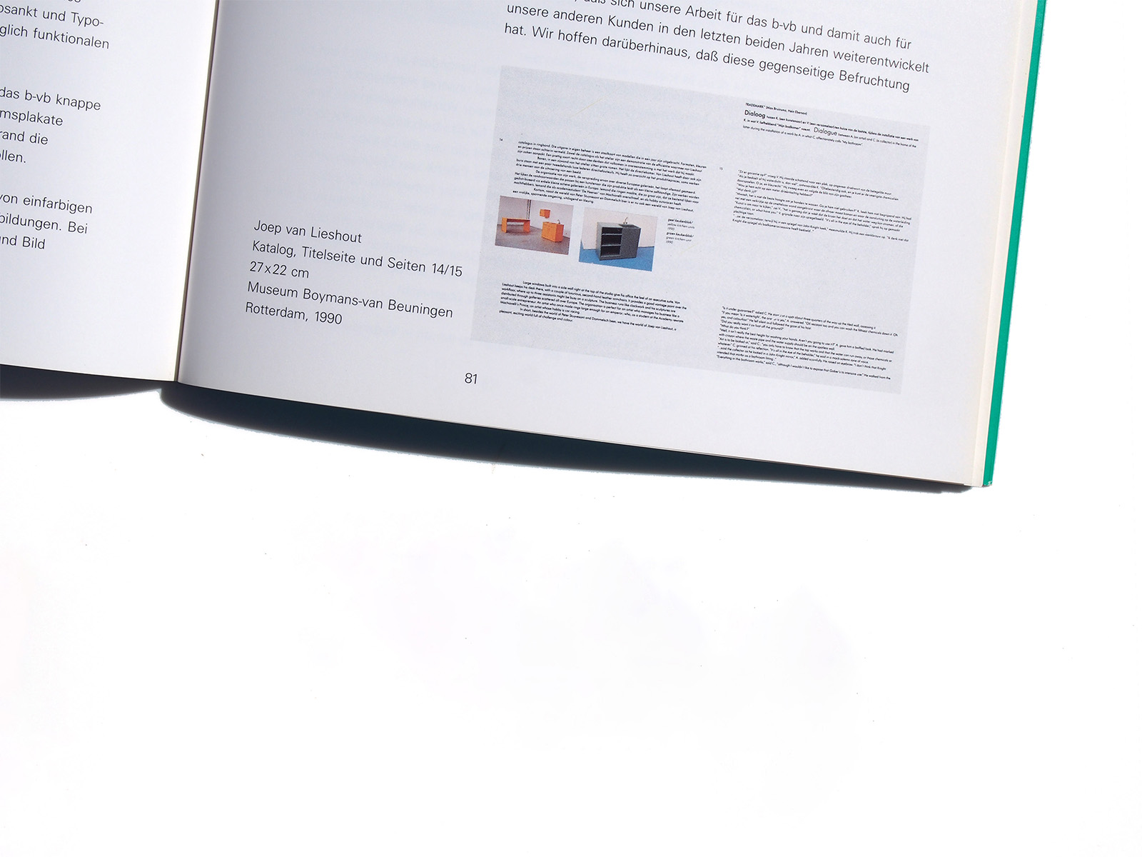
The b-vb catalogues have to be printed at a reasonable cost and as such their design cannot rely on expensive print gimmicks e total control of the production process is impossible; there are several different printers in Holland and Belgium that the museum use, each company having there own standards and methods. It was our intention to use the same paper for each catalogue, but this has proved impossible due to availability and cost of materials in Belgium and Holland. With such varying production parameters the consistent feel of the catalogues has to be driven by strong and simple design principles whilst trying to balance these against the stated aim of flexibility in approach in response to catalogue contents.
Hopefully the work undertaken by for the b-vb has developed, and with it our work for other clients over the last 2 years. There will, we hope, continue to be a cross-fertilisation of ideas from our work for the b-vb and other 8vo projects — especially in the use of colour and our ongoing attempt to break away from set ideas about typography. Although not experimental, the work for the b-vb has at least provided us with a chance to explore within a fairly well defined set of parameters. We have seen that it is not necessary to try and create the ‘best ever job’ for each new project. Rather the development of the programme of a whole is more important.
With less intense self-defined pressure on the individual jobs within the programme, we have enjoyed the work and sometimes surprised ourselves with the results. This aspect of learning from the job, combined with the ’hands-off’ approach of Wim Crouwel as a client has proved most rewarding.
Mark Holt, Hamish Muir
8vo, January 1991