
Language: English
Product Dimensions: 29.5 x 21 cm
Release Date: 1987
Price: sold
The dust jacket shows some edge chipping, and there is a slight bump to the fore-edge corner. While there are minor signs of wear, the book itself remains in very good condition.
An international journal of typography.
Eight issues to published an intervals of six months.
size of book or page given by folding sheet of standard size three times to form eight leaves/sixteen pages
Editors:
Simon Johnston
Mark Holt
Michael Burke
Hamish Muir
Published by Eight Five to Zero.
3,000 copies printed.
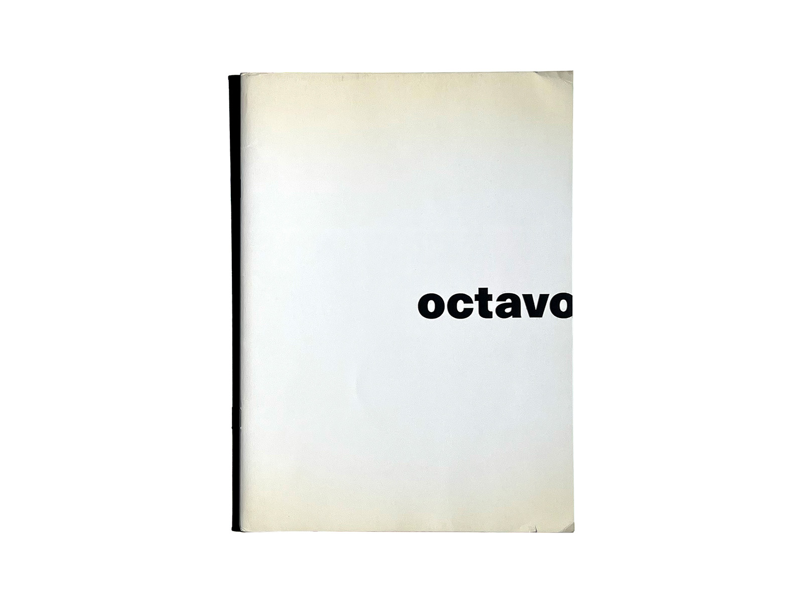
8vo was a London-based design collective founded in 1984, active until 2001.
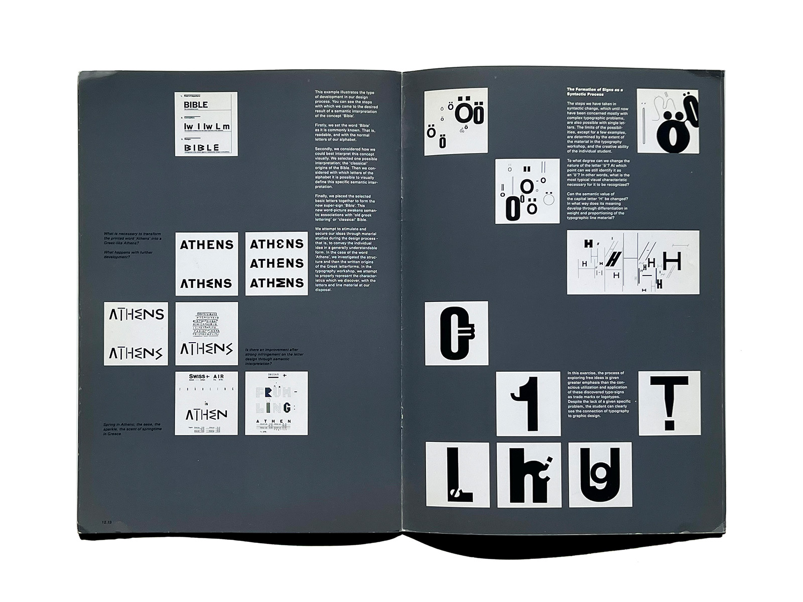
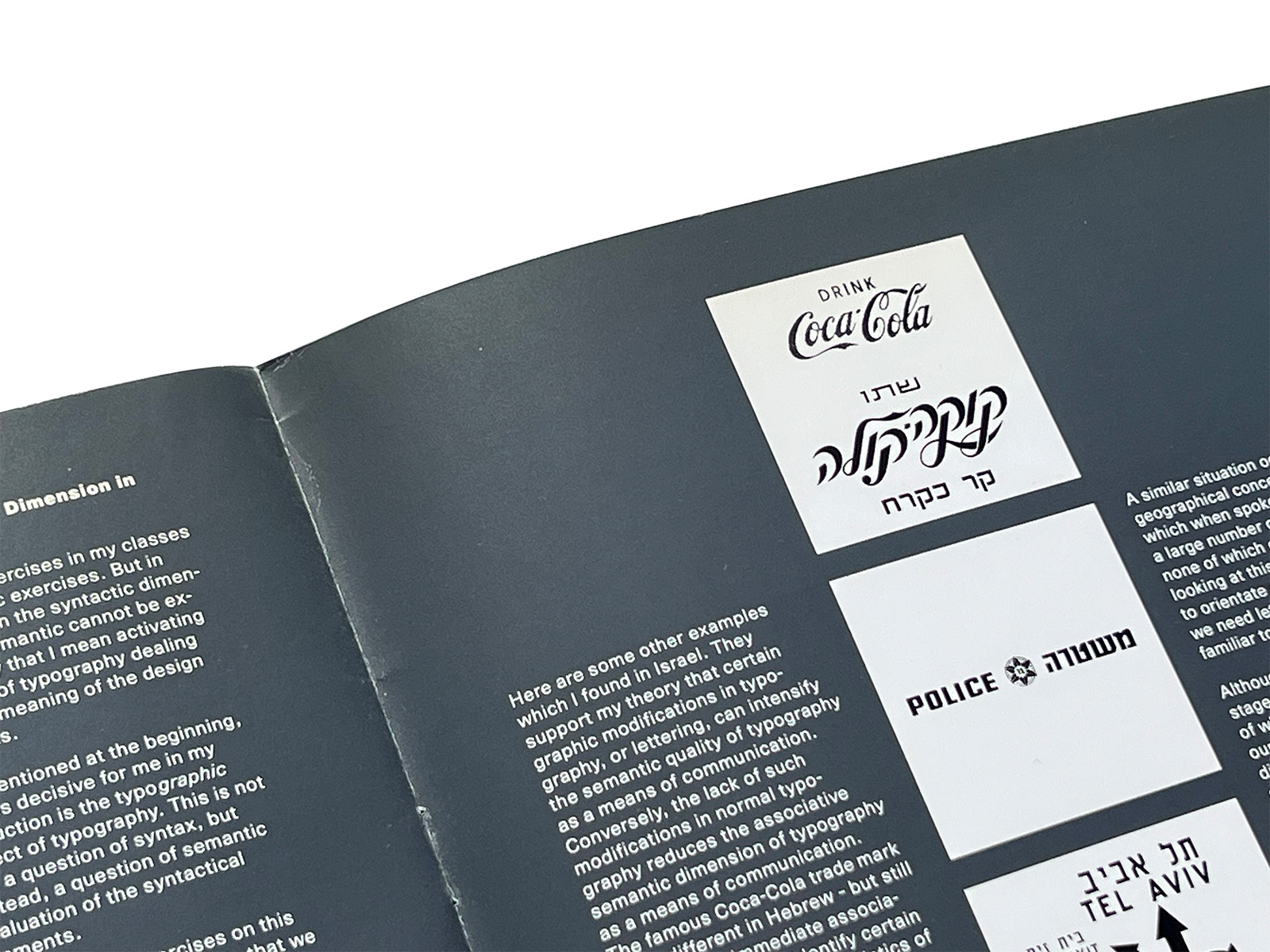
At a time when British graphic design was largely shaped by convention, 8vo challenged the prevailing norms and developed a contemporary interpretation of European modernist typography.
Alongside their design practice, they published a typography journal of the same name, Octavo, producing eight issues in total. Conceived as a platform to deepen and invigorate discourse around typography, the journal became known for its rigorously structured layouts, technically ambitious printing processes, and meticulously engineered visual design — it was, in many respects, an “event” in itself.
The design of Octavo traced a trajectory from a strict three-column grid to an interactive CD-ROM format. In other words, it moved from paste-up mechanical artwork with typeset galleys (in the pre-Mac era) to the format of an interactive screen.
The original design concept remained consistent throughout all eight issues:
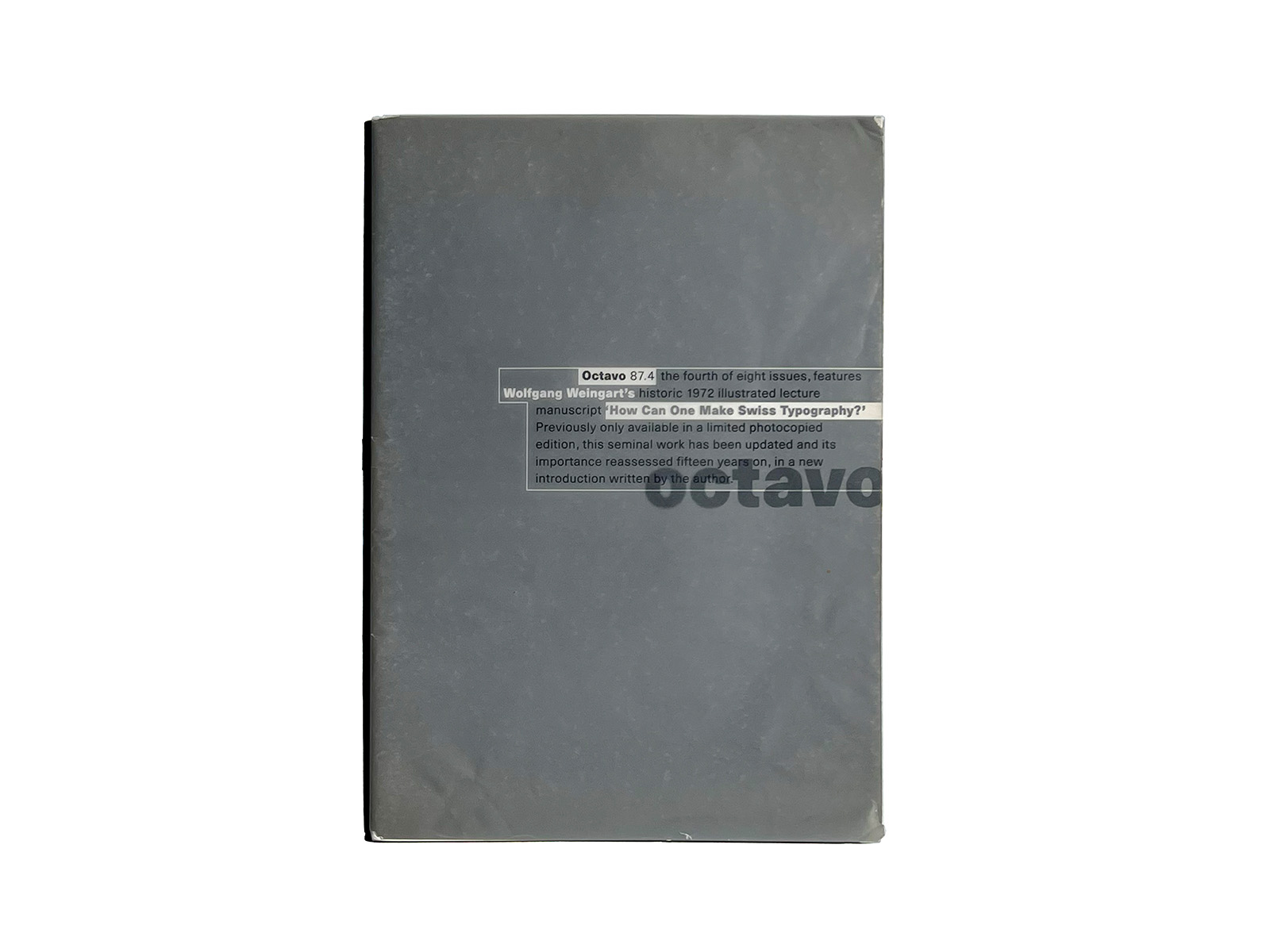
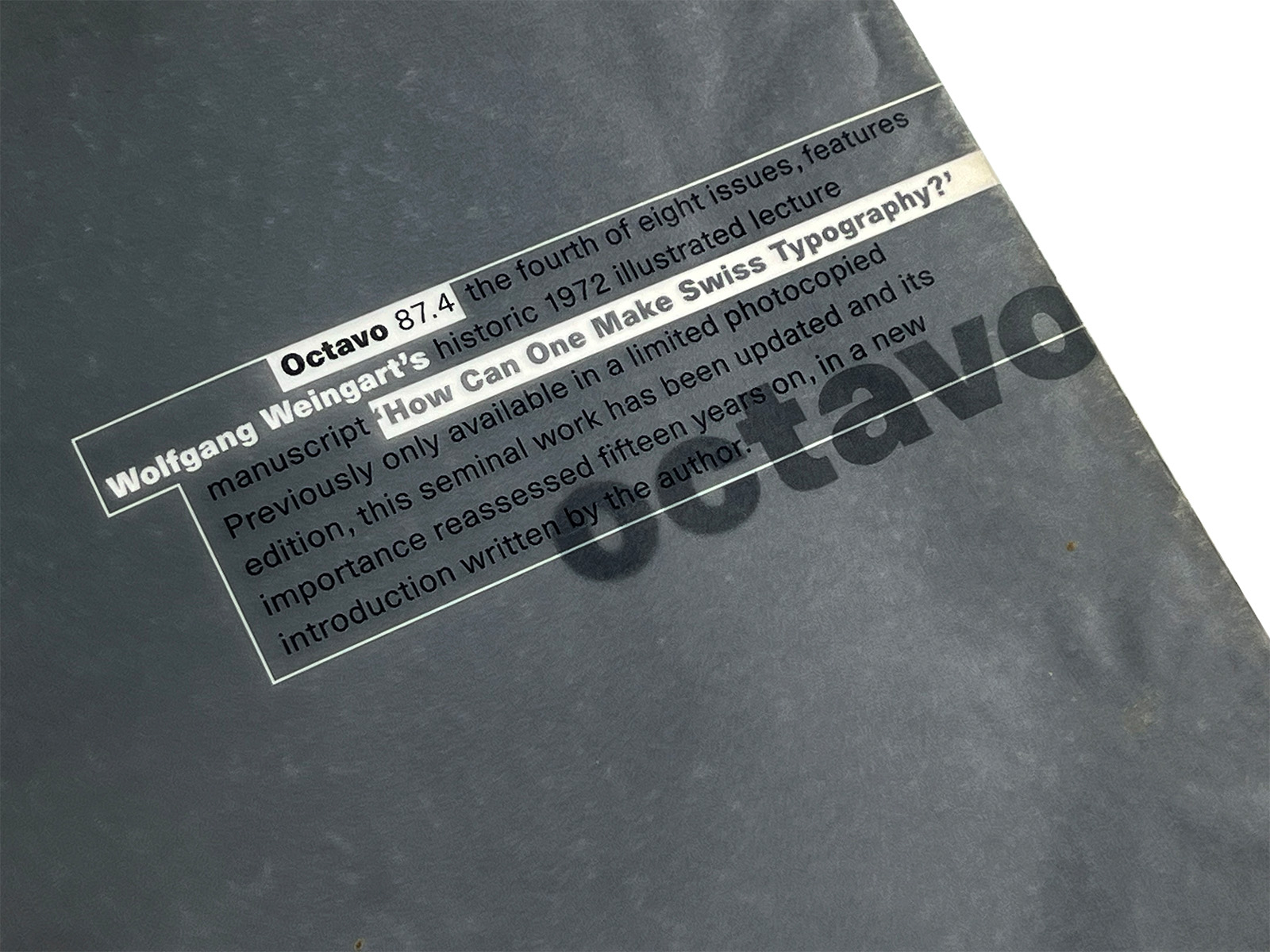
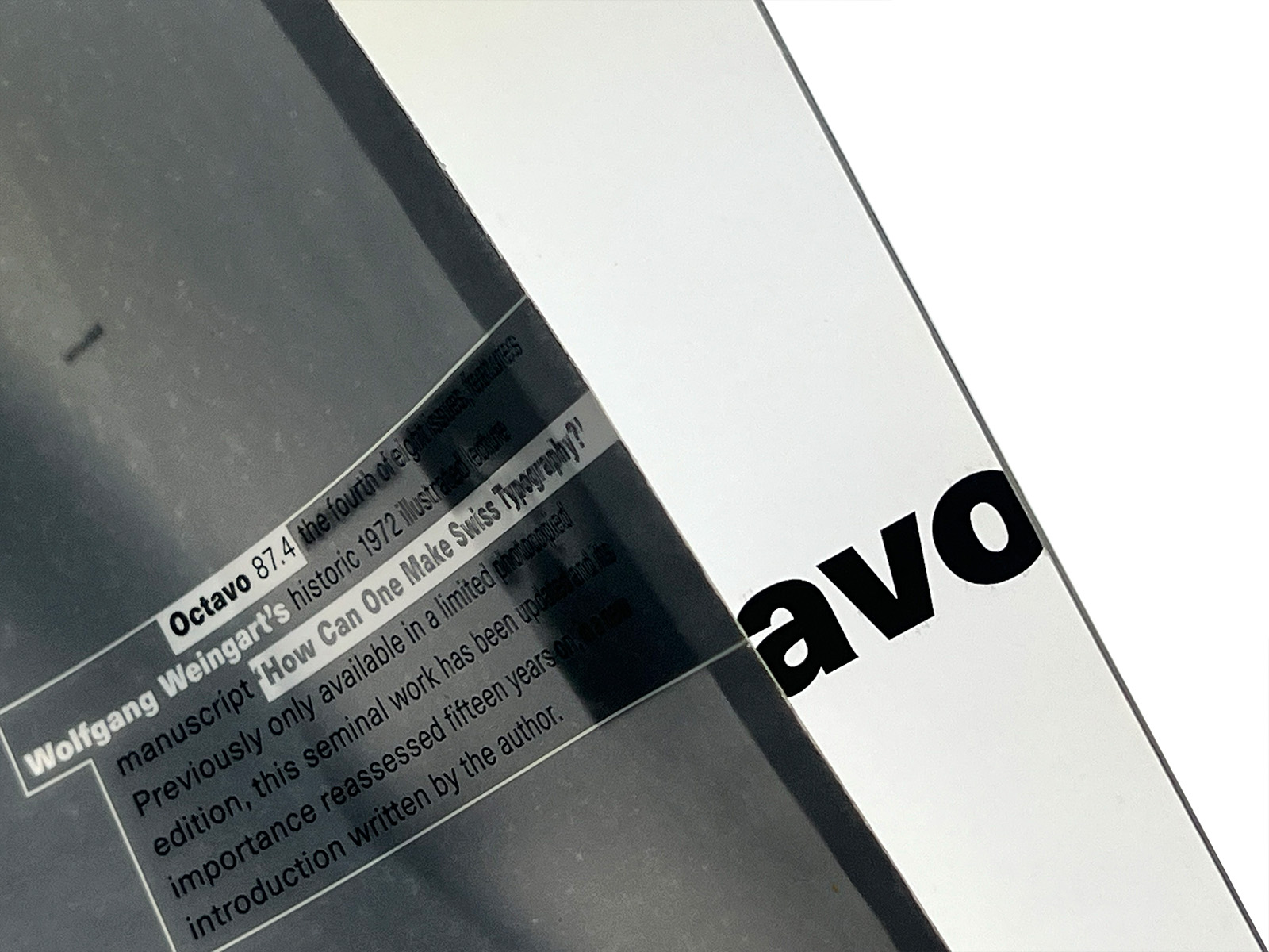
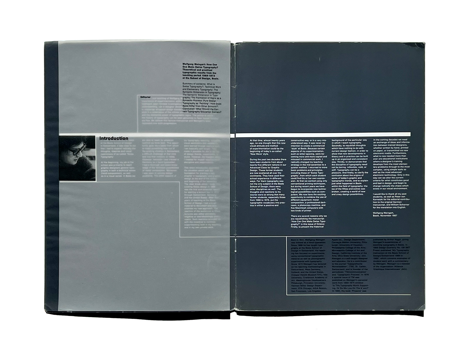
A4 format (297 × 210 mm), 16 pages created from a folded A1 sheet (594 × 841 mm), effectively forming an “octavo.” Each issue featured a tracing-paper cover. The typeface chosen for the journal was Unica.
8vo(オクタヴォ)は1984年に設立され2001年までロンドンを拠点としたデザイナー集団である。
8voは当時の英国における因習的なグラフィックデザインの主流にさからい、
ヨーロッパのモダニズムに影響を受けたタイポグラフィを同時代的に解釈、展開した。
彼らはデザイン活動と平行して、タイポグラフィについての議論をより深く、活発にするメディアとして、
同名のタイポグラフィジャーナル「オクタヴォ」誌を全8会にわたって刊行。
丁寧に基づいた誌面、技術の枠を凝らした印刷、視覚工学による緻密なデザインは、ひとつの「事件」だった。
「オクタヴォ」のデザインは3列のグリッドからインタラクティブCD-ROMへといたる軌跡を描いた。
つまり、文字の清刷を貼りこんだ版下原稿(Mac以前)から、
インタラクティブなスクリーンの形式へ、というわけだ。
当初のデザインコンセプトは全8号を通じて、A4判(297x210mm)の本文16ページ(A1 594x841mmの3つ折り=オクタヴォ)。
表紙にトレーシングペーパーのカバー付き。
使用書体として「Unica」を選んだ。
idea 343より参照