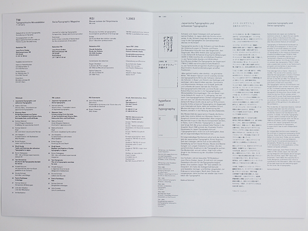

Journal for Typographic Composition, Design, Communication, Printing and Production.
Published by the Printing and Paper Union Switzerland for the advancement of education in the profession.
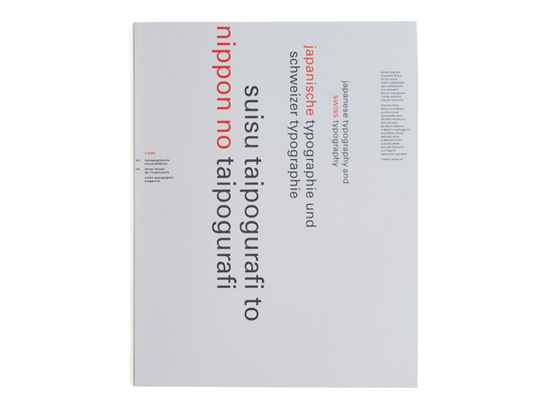
cover design : Helmut Schmid
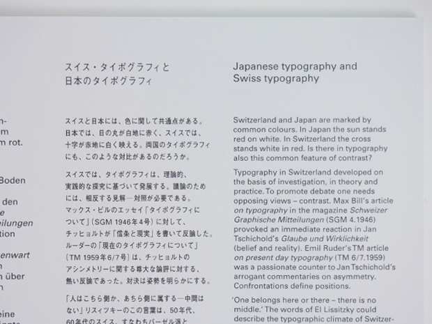
Japanese typography and Swiss typography
Switzerland and Japan are marked by common colours. In Japan the sun stands red on white. In Switzerland the cross stands white in red. is there in typography also this common feature of contrast?
Typography in Switzerland deveroped on the basis of investigation, in theory and practice.To promote debate one needs opposing views — contrast. Max Bill’s article on typography in the magazine Schweizer Graphische Mitteilungen (SGM 4.1946) provoked an immediate reaction in Jan Tschichold’s Glaube und Wirklichkeit (belief and reality). Emil Ruder’sTM article on present day typography (TM 6/7.1959) was a passionate counter to JanTschichold’s arrogant commentaries on asymmetry. Confrontations define positions.
‘One belongs here or there — there is no middle.’ The words of El Lissitzky could describe the typographic climate of Switzerland (meaning the schools of Basel and Ziirich) in the 50s and 60s.The debate then was symmetry and asymmetry, serif and sans serif, printed and unprinted.
The typographic activity of Emil Ruder and Robert Büchler was carried into the pages of TM.The Basel-inspired magazine, now in its 71st year, contributed far more to the typographic thinking than Neue Grafik, published by the four Zürich artists, which lasted just 18 issues. Real Swiss typography, in contrast to the international style, stands on solid soil.The modernity is not in the application of the grid but in the attitude of the profession.
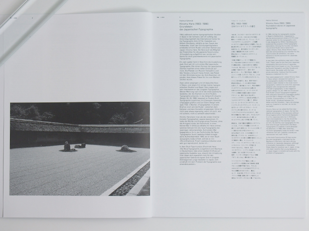
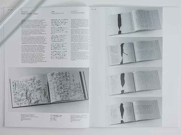
The modernity of Japanese classics, claimed by Keinosuke Sato (see the article by Hisayasu lhara) is unquestionable. But past modernity needs to be transfered to the present, in deeds, not words.Typography in Japan used to consist of just the grey space in a graphic design work. As late as 1980 the illustrator Yoshio Hayakawa
wrote in the Japan Typography/Annual:
‘it seems impossible for typography
to argue that it has its own independent territory.’
An independent territory was created by the architect of Japanese typography, Kohei Sugiura. Since the 705 he moved editorial design to a new Ievel. Today, we are seeing some movements of young designers searching for the personal expression in typography. Modernity, as we can see,
is not necessarily in the application of the newest computer software.
Fifteen years ago, Jean-Pierre Graber, the editor of TM, visited Japan. He met with young designers enthusiastic about typography and a further Japan TM* issue was proposed. I have taken this opportunity to invite designers, publishers and critics to contribute to the discussion. After the chaos of the past years we are searching again
for the inner life of typography.
Helmut Schmid
スイス・タイポグラフィと日本のタイポグラフィ
スイスと日本には、色に関して共通点がある〝日本では、日の丸が白地に赤く、スイスでは、十字が赤地に白く映える。両国のタイボグラフィにも、このような対比があるのだろうか。
スイスでは、タイボグラフィは、理論的、実践的な探究に基づいて発展する。 議論のためには、相反する見解-対照が必要である。 マックス ・ ビルのエッセイ「タイボグラフィについて」(SGM 1946年4号)に対して、 チッヒョルトが 「信条と現実」 を書いて反論した。 ルーダーの「現在のタイボグラフィについて」(TM 1959年6/7号)は、チッヒョルトの アシンメトリーに関する尊大な論評に対する、 熱い反論であった。対決は姿勢を明らかにする。
「人はこちら側か、 あちら側に属する中間はない」リスィツキーのこの言葉は、50年代、60年代のスイス、すなわちバーゼル派とチューリッヒ派のタイボグラフィの精神的風土をよく表わしている。当時の論争の的は、シンメトリーかアシンメトリーか、セリフ体かサンセリフ体か、印刷された部分とされない部分、などであった。エミール・ルーダーとロベルト・ビュヒラーの見解はTM誌上で紹介された。 バ一ゼル理念に支えられたTM誌 (現在創刊 71年目) は、タイボグラフィックな思考に関しては、チューリッヒの4人の美術家たちによって発行された 「ノイエ・ グラフィック」よりもはるかに大きな貢献をした。後者はー8号で 終刊した。 真のスイス・ タイポグラフィ (インターナショナル・ スタイルとは違って) は堅固な土壌から生まれる。 現代性は、グリッドの適用にあるのではなく、専門家としての姿勢にあるのだ。
佐藤敬之輔が主張している日本の古典の現代性 (伊原久裕の寄稿参照) には、疑う余地はない。しかし、過去における現代性は、言葉ではなく、実践において、現在に変換する必要がある。 日本におけるタイポグラフィは、グラフィックデザイン作品に含まれる灰色の部分にすぎなかった。1980年になっても、 イラストレーター、 早川良雄は 「日本タイボ グラフィ年鑑』 に書いている:「夕イボグラフイが…独立したテリトリーを主張することは無理なように思われる」
独立したテリトリーは、日本のタイポグラフィの建築者、杉浦康平によって創出された。70年代以来、彼はエディトリアルデザインに新しい基準をもたらしてきた。今日、タイボグラフィの個人的な表現を求める若いデザイナー たちの動きが見えてきた。 言うまでもなく、現代性は、必ずしも最新のコンピュータソフトの使用によって生み出されるとは限らない。
15年前、TM誌のジャン=ピェ一ル・グラバ編集長が来日した。タイボグラフィに熱意を持つ若いデザイナーたちに会い、再びTM誌日本特集号*を編む計画を提案した。 私はこの機会を得て、日本のデザイナー、出版者、評論家諸氏に寄稿によるディスカツションへの参加を依頼した。長年にわたる混乱を経て、われわれは、今再び、タイボグラフィの内なる生命を探り始めた。
ヘルム一ト ・ シュミツト
TM誌の歴史
1882年にSGM誌がチューリヒのR.Scweizer氏によって創刊された。
1923年にはRSI誌がE.Guggiに氏により創刊。そして1933年、ベルンのスイスタイポグラフィ協会かTM(Typografische Monatsblatter)誌が創刊された。
1948年にTM誌とRSI誌が、さらに1952年にはSGM誌も加えた3誌がTM誌に合併。
尚、出版社はComedia社であり、1981年のRudolf Hostettler氏の没後からは、Jean Pierre Graberが編集を手掛けている。現在はLucius Hartmannの編集の下で季刊ベースで発行されている。