Publisher: Seibundoshinkosha
Language: Japanese English
ISBN-10: –
ISBN-13: –
Product Dimensions: 29.6 x 22.4- cm
Release Date: 2001
Price: sold
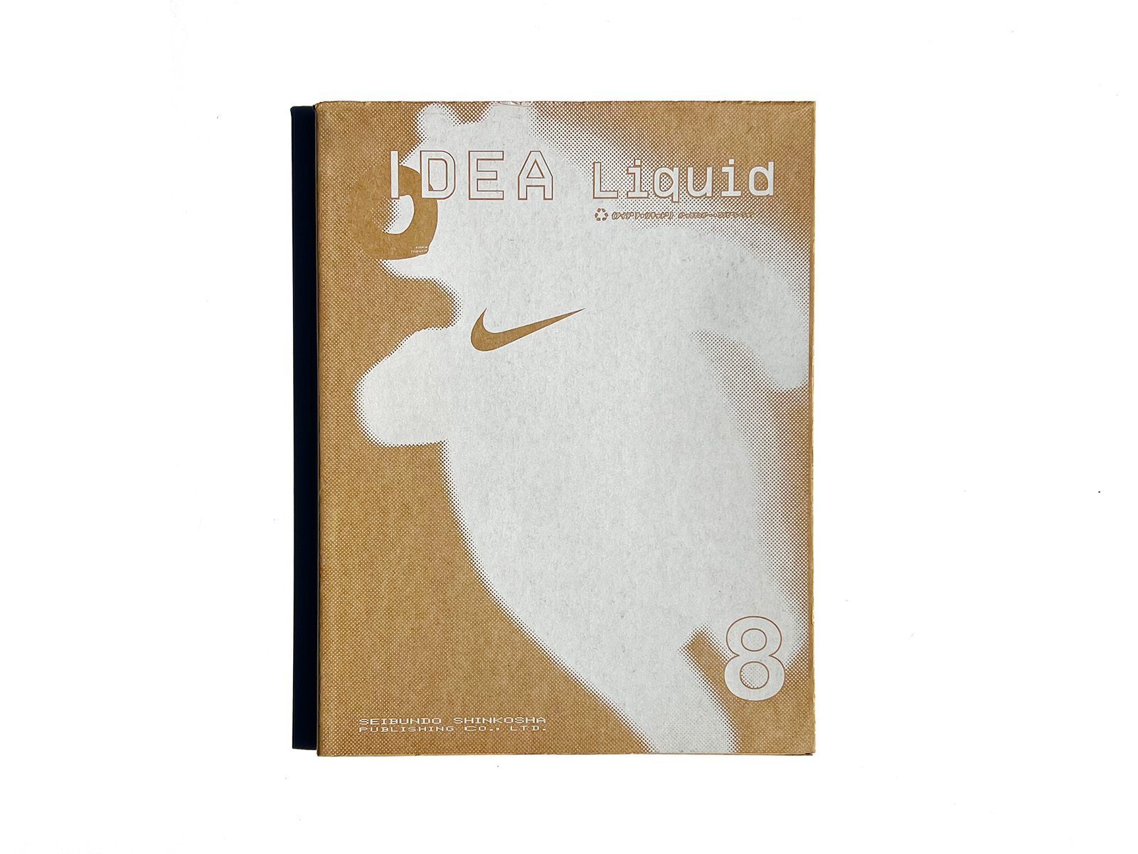
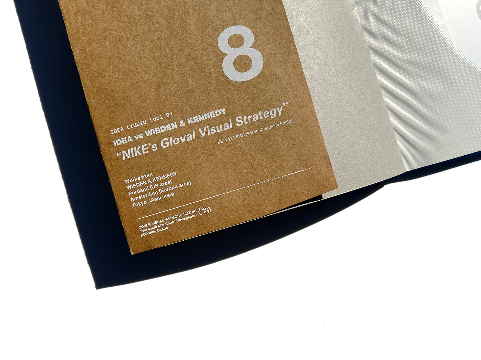
idea vs Wieden & Kennedy
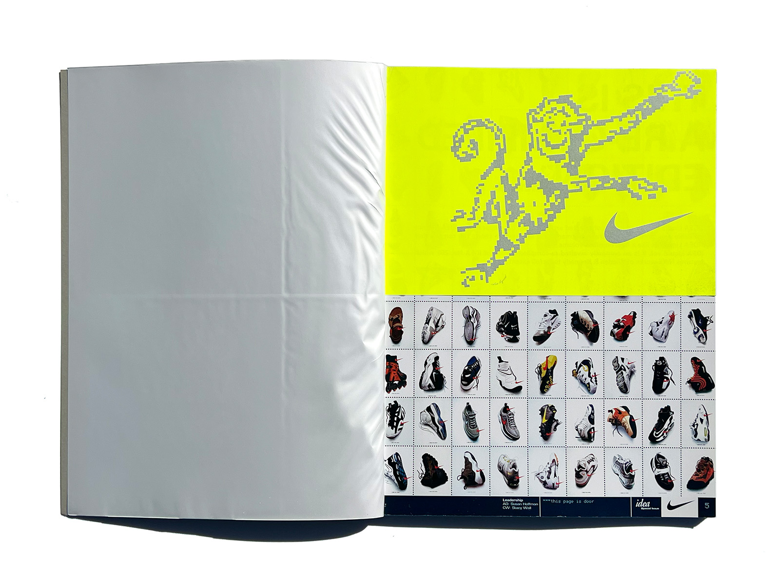
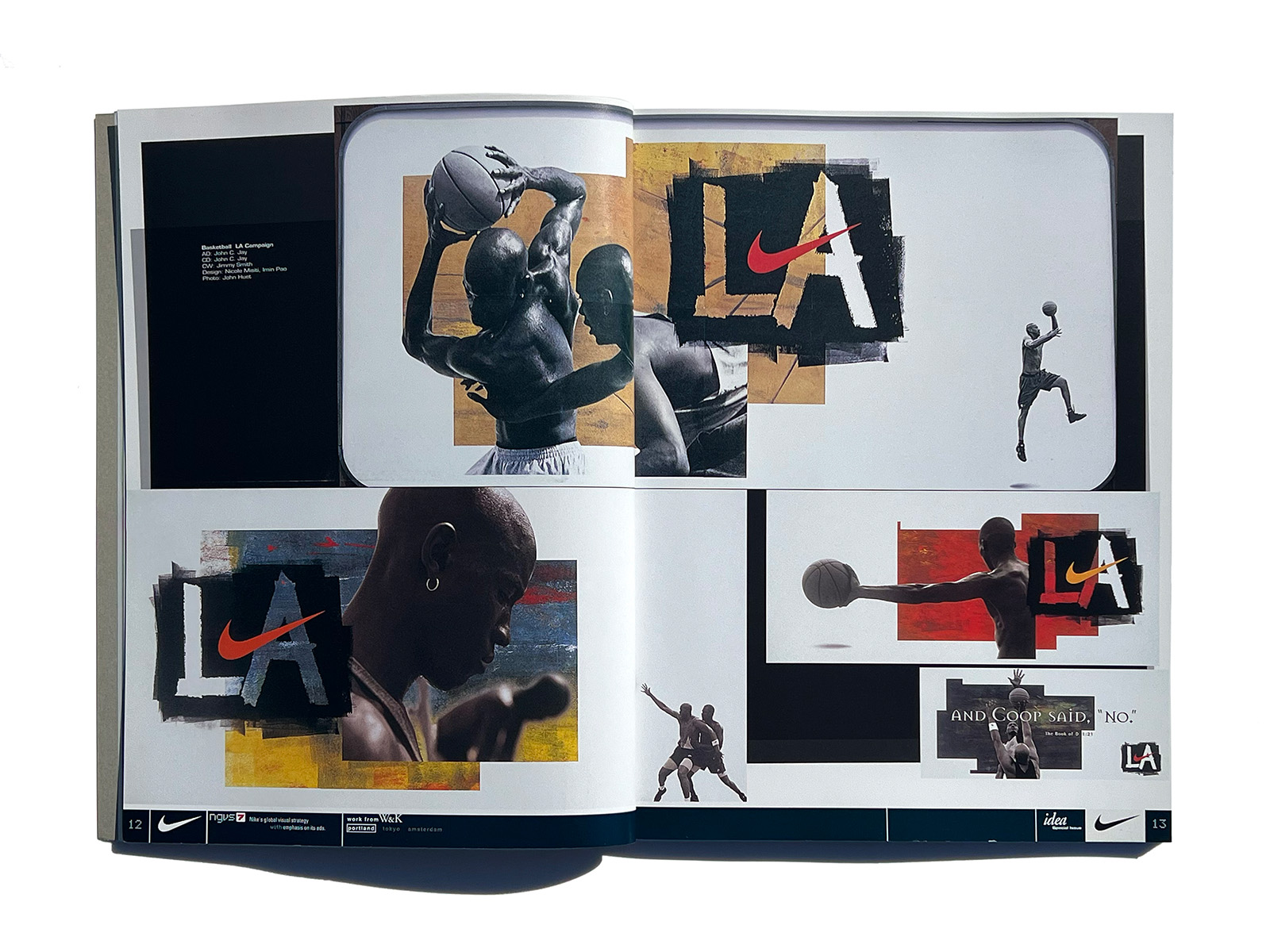
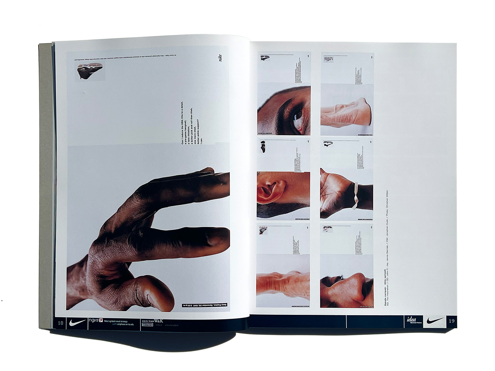
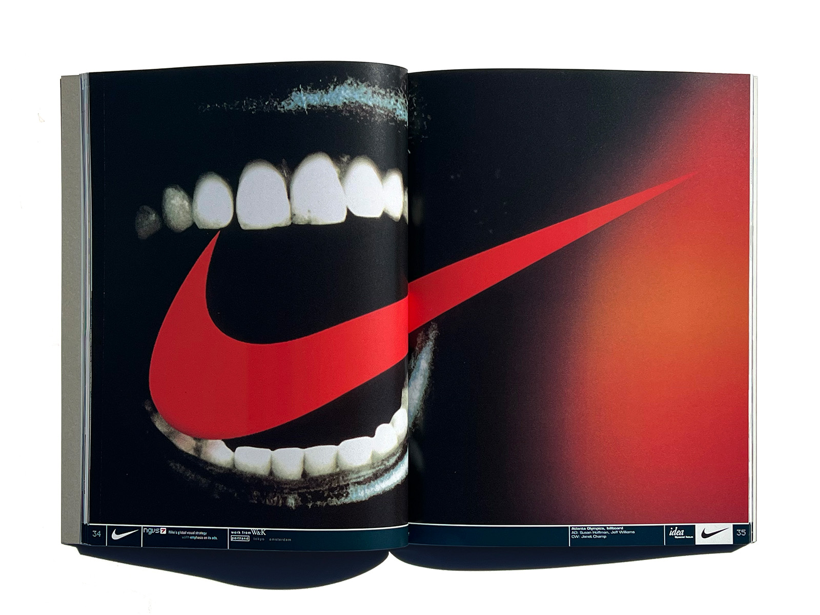
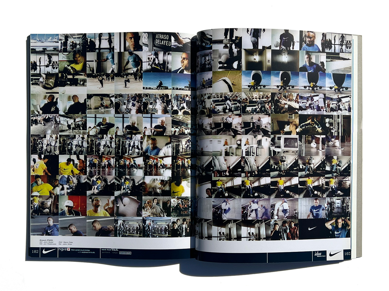
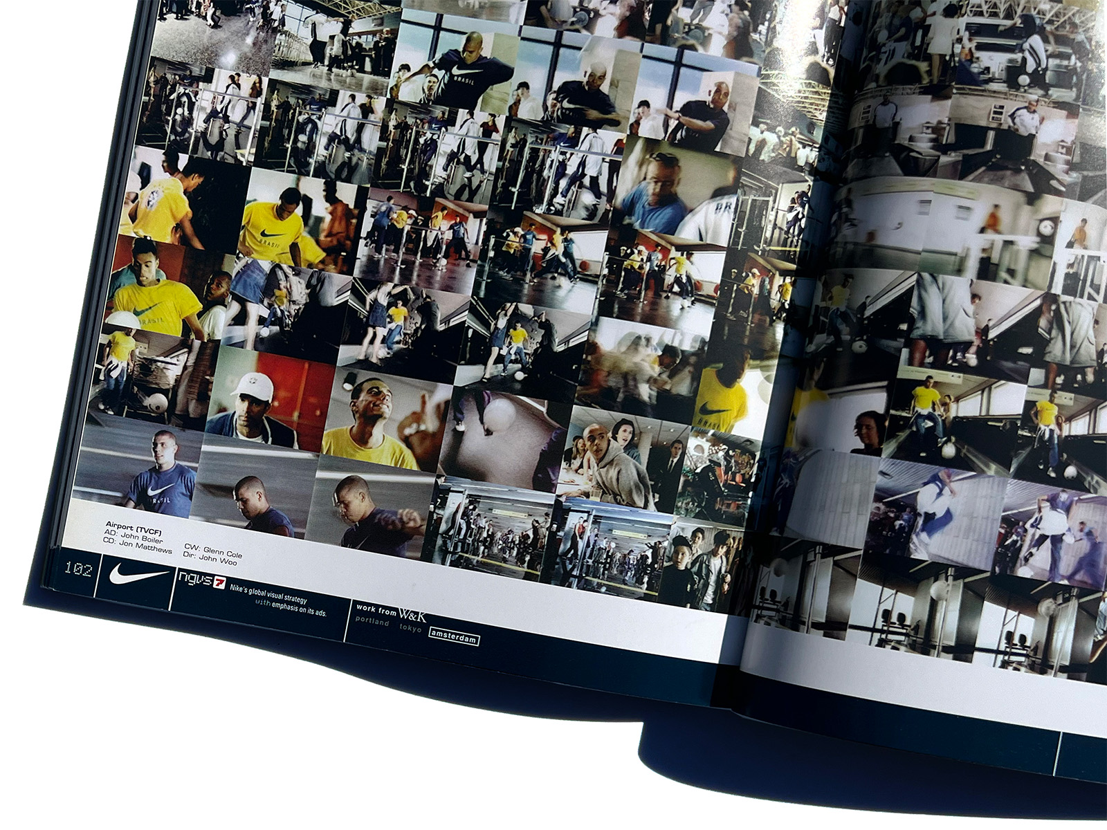
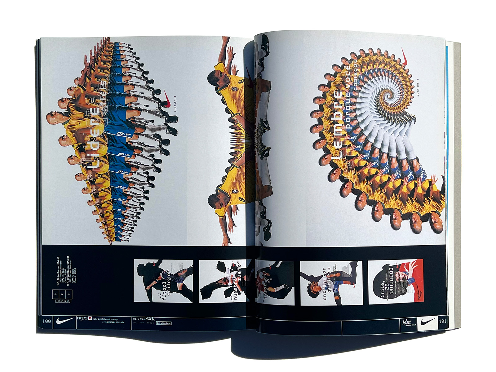
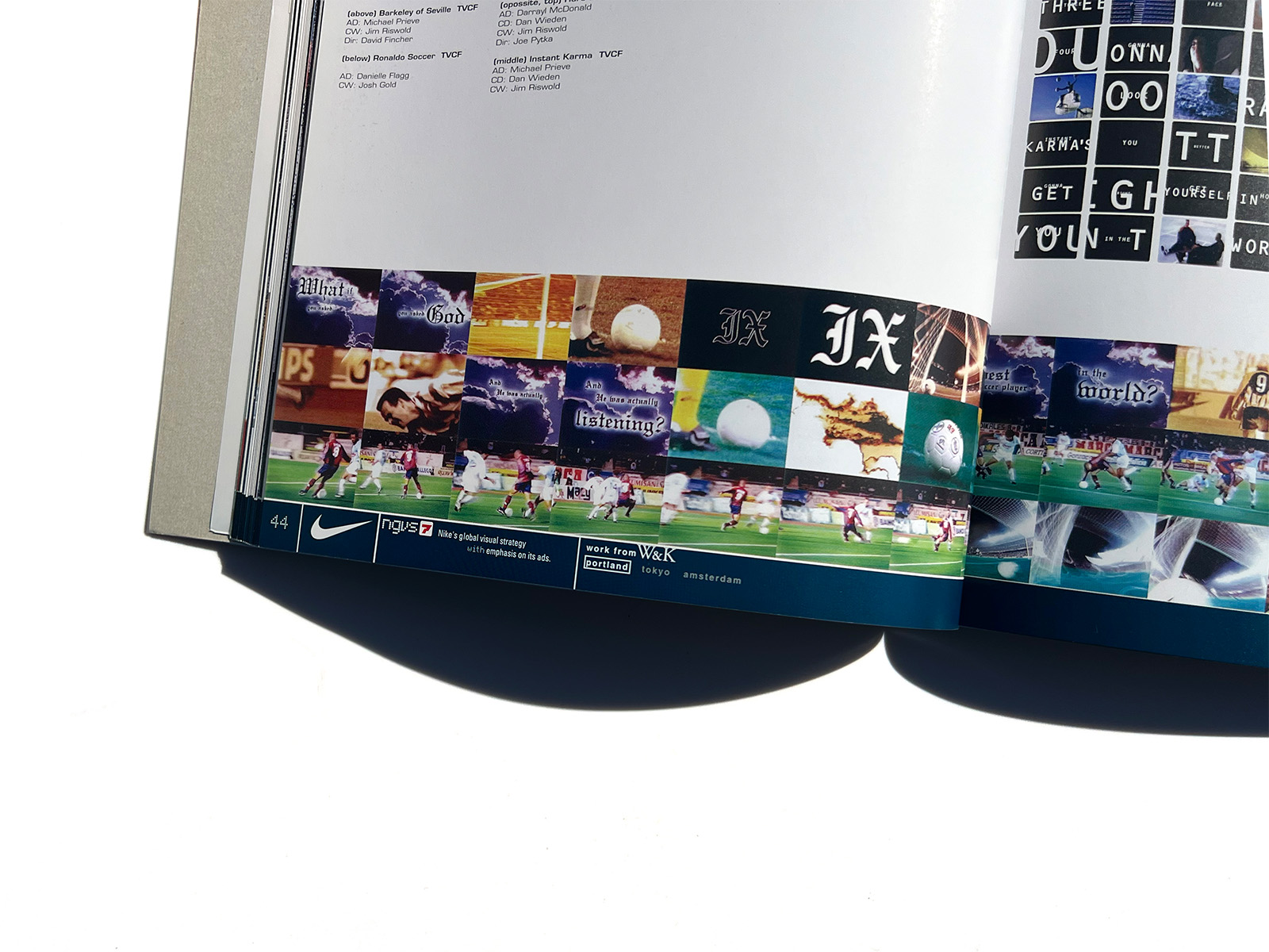
About when did the logo called “Swoosh” begin to charm Nike’s target audience with its special power which seems to come from Nike, the winged goddess of victory in Greek myth? The image of “Nike” continues to haunt us without our noticing it. It has been attributable to Nike’s unique, innovative visual creative which has been instrumental in increasing the appeal of the world’s top-notch athletes called “Nike guys,” who are represented by Michael Jordan moving in high spirits in Nike’s TV commercials and print ads and which has enabled the nameless youth and elderly on the street to make equally strong impacts.
Needless to say, it is difficult to successfully create and communicate innovative, exciting images in the field of advertising. It is more difficult to continue to make efforts to do so.
Nike’s visuals, however, have an atmosphere of toughness and composure, which
makes us unaware of such efforts. The key to Nike’s seemingly simple but actually elaborate visual strategy is the presence of Wieden & Kennedy, an ad agency (rather, a sensible creative group) solely responsible for Nike’s global visual work. W&K’s avant-garde creative activities, which are not bound by conventional methodologies, have helned break deadlocks not only in the advertising community but also in society at large and have thereby brought about a TURE change in values and methodologies in the field of creative work.
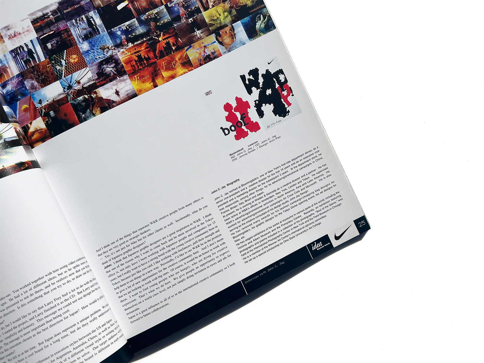
This IDEA special issue features Nike’s visual strategy. It also looks into a common language or a visual communication style, which W&K created in the process of transmitting Nike’s corporate image through its operational bases in the key parts of the world (Portland in the United States, Asia and Oceania, Tokyo in Japan, and Amsterdam in Europe).
