

Publisher: helmut schmid design
Language: English, Japanese
Product Dimensions: 25.0 x 25.5 cm
Release Date: 2010
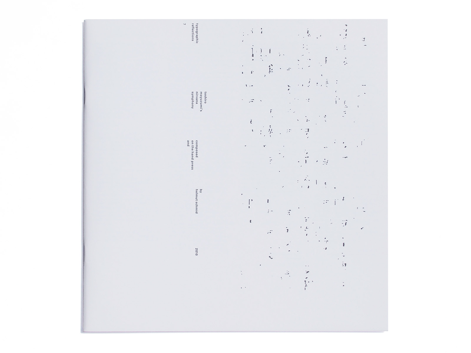
composed on the hand press and
in the days of hot metal type, a typesetter was also called a compositor and the work-room was also called a composingroom. though the names are not so
far apart, a composer of music and a type compositor expresses two contrasting aspects of the creative process. the composer is free in his creation, a compositor had to live with restrictions, given by
the precise measurements of his typographic material, by the rectangular way
of composing. the composer is an artist, the compositor is a craftsman.
but there were always attempts to break the rules of typography. the compositor had to challenge his material and suppress his pride. he was given sketches to typeset by people from outside his trade. artists like the russian el lissitzky,the german kurt schwitters, or the clutch piet zwart did not care about the sanctity
of the printing trade, or the functionality of their sketches.
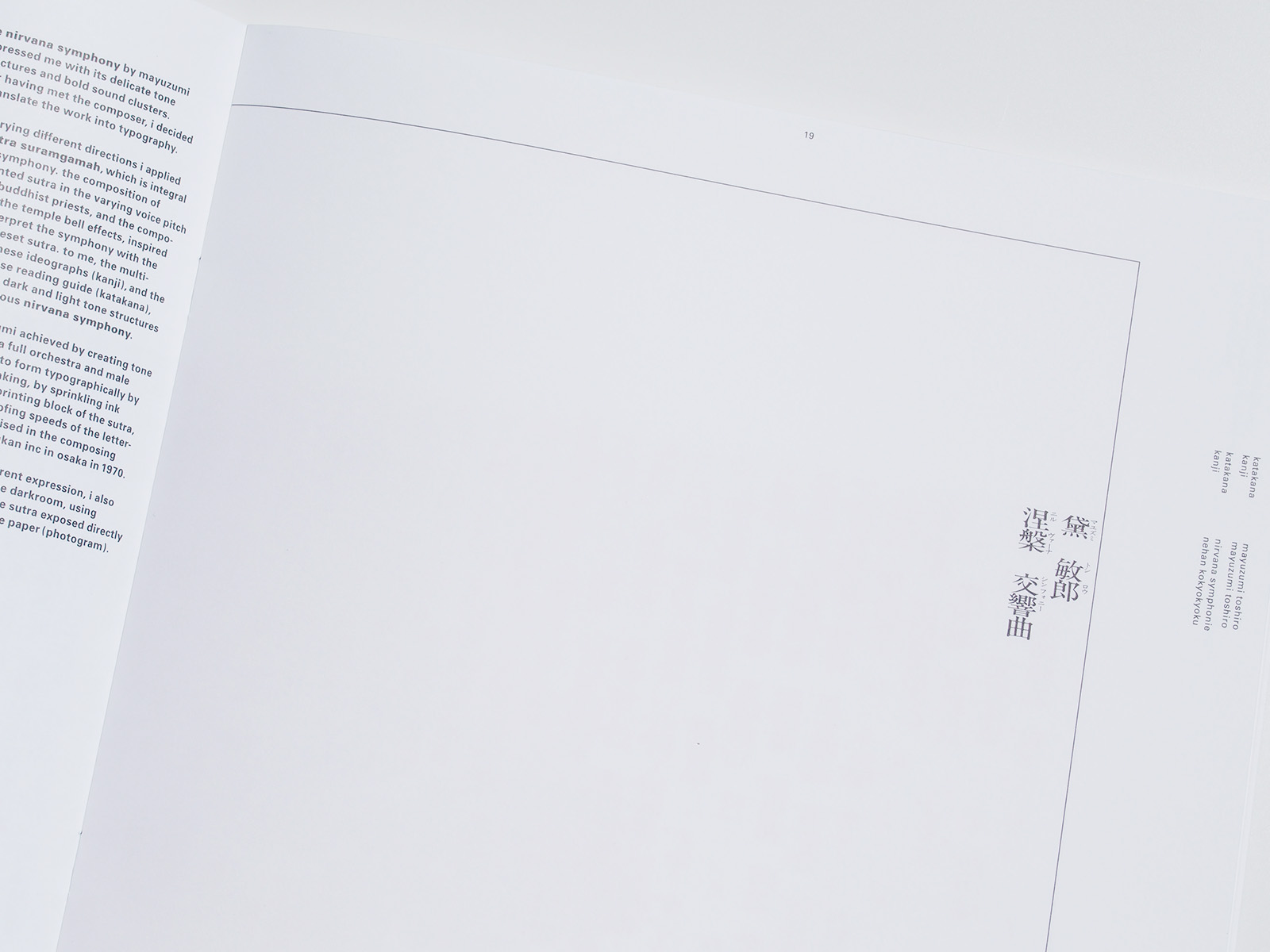
the nirvana symphony by mayuzumi impressed me with its delicate tone structures and bold sound clusters.
after having met the composer, i decided to translate the work into typography.
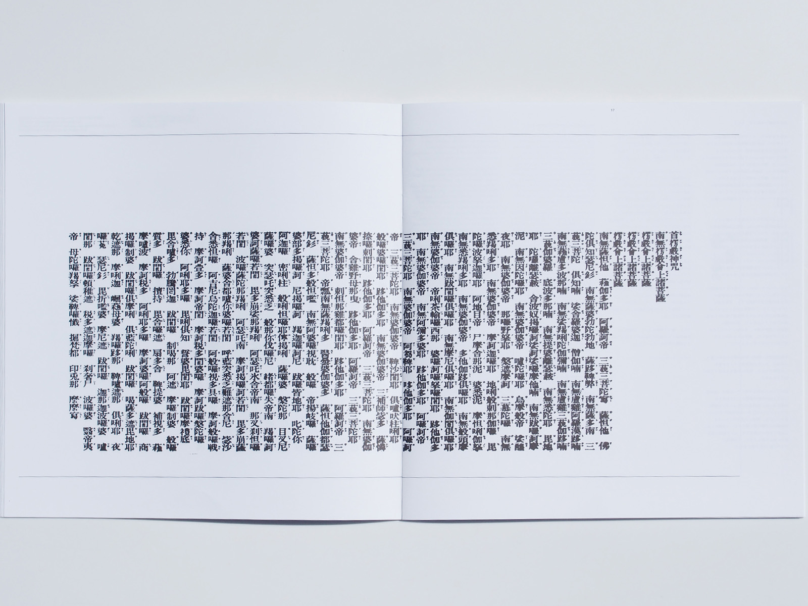
after trying different directions i applied the sutra suramgamah,which is integral to the symphony. the composition of
the chanted sutra in the varying voice pitch style of buddhist priests, and the composition of the temple bell effects, inspired me to interpret the symphony with the newly typeset sutra. to me, the multistroke chinese ideographs (kanii), and the tiny japanese reading guide (katakana), express the dark and light tone structures of the sonorous nirvana symphony.
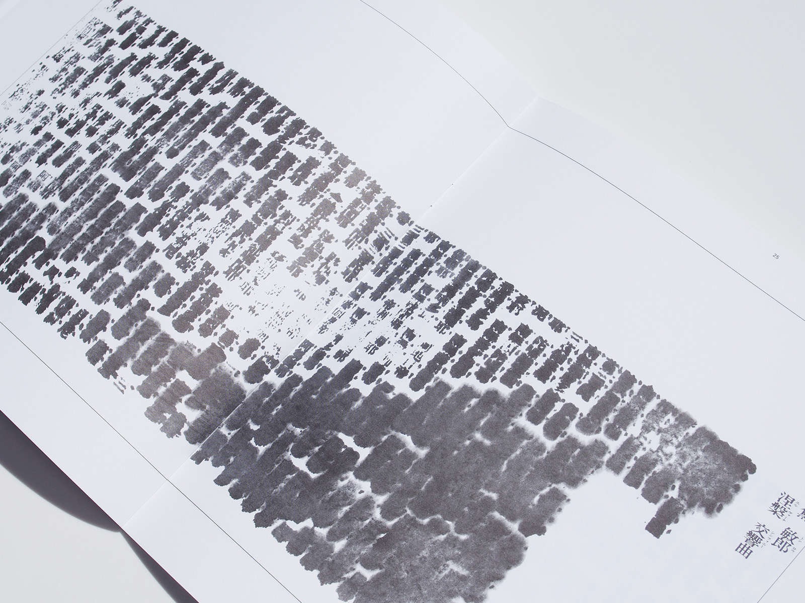
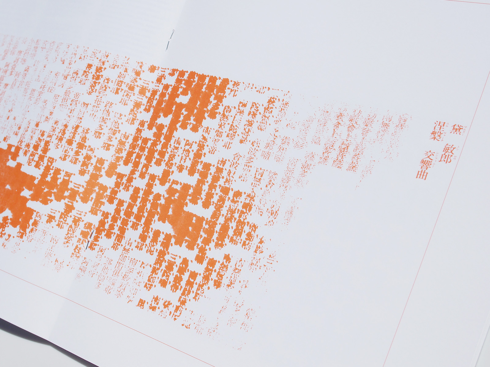
what mayuzumi achieved by creating tone clusters with a full orchestra and male chorus, i tried to form typographically by spontaneous inking, by sprinkling ink cleaner on the printing block of the sutra, by different proofing speeds of the letterpress. all improvised in the composing
room of yarakasukan inc in osaka in 1970.
in search of a different expression,r i also experimented in the darkroom,r using
two negatives of the sutra exposed directly on the silver gelatine paper (photogram).
helmut schmid
活版印刷機で作曲する そして
金属活字の時代、タイプセッターは植字工とも呼ばれ、作業場は植字室とも呼ばれていた。
語源的には音楽の作曲家(composer)と植字工(compositor)とはそれほどかけ離れてはいながい、創作の過程においては対称的な側面をもつ。
作曲家は創作の上でまったく自由であるが、植字工は制約からは逃れられない、
すなわち活版印刷における活字素材の性格な寸法、矩形に縛られる植字などがそうだ。
作曲家をアーティストとすれば植字工は職人である。
しかしタイポグラフィの決まりを破ろうとする試みは常々あった。植字工は活字素材に挑みつつ、プライドを抑えなければならなかった。
業界外の人間から活字の組み方のスケッチを与えられるのだ。ロシアのエル・リシツキー、ドイツのクルト・シュヴィッタース、オランダのビート・ツヴァルトといったアーティストたちは印刷業界の神聖な義務もスケッチの持つ機能性も意に介さなかった。
薫の涅槃交響曲は、その繊細な音色の構築と大胆な音の塊とで私に強烈な印象を与えた。
作曲家本人に出会ってから、私はこの作品をタイポグラフィに翻訳しようと心に決めた。
いくつかの異なる方向性を試みた後で、私はこの交響曲には欠くことのできない首楞厳神呪の経文を採用することにした。
仏教の僧がお経を唱えているような様々な高さの音声による経典のような構成、寺の鐘の音の効果を具現する構成。
それが、新しく組まれた活字の首楞厳神呪を使って交響曲を表現しようというひらめきを私に与えてくれた。字画の多い中国の表意文字(漢字)と日本語の画数の少ない音節(カタカナ)が、私にとっては、鳴り響くような涅槃交響曲の暗くて明るい音色の構築を表現している。
薫はフルオーケストラと男性合唱によって密集音塊の創造を成し遂げた、それを私はタイポグラフィによって形作ろうと試みた。
インクを無作為に塗布したり、経文の印刷ブロックの上にインク・クリーナーをふりかけたり、活版校正器の印刷スピードを変えたり、といったやり方を用いてみた。これらの作業は即興で、1970年に大阪のヤラカス舘の植字室で行った。
そして、違った表現を求めて、印刷紙上に直接感光させた経文の2枚のネガを使って暗室でも実験を重ねた(フォトグラム)
ヘルムート・シュミット
series of booklets
printed in single black
concept and design: helmut schmid