
Publisher: helmut schmid design
Language: English Japanese
Product Dimensions: 25.0 x 25.5 cm
Release Date: 2015 3.11
Price: sold
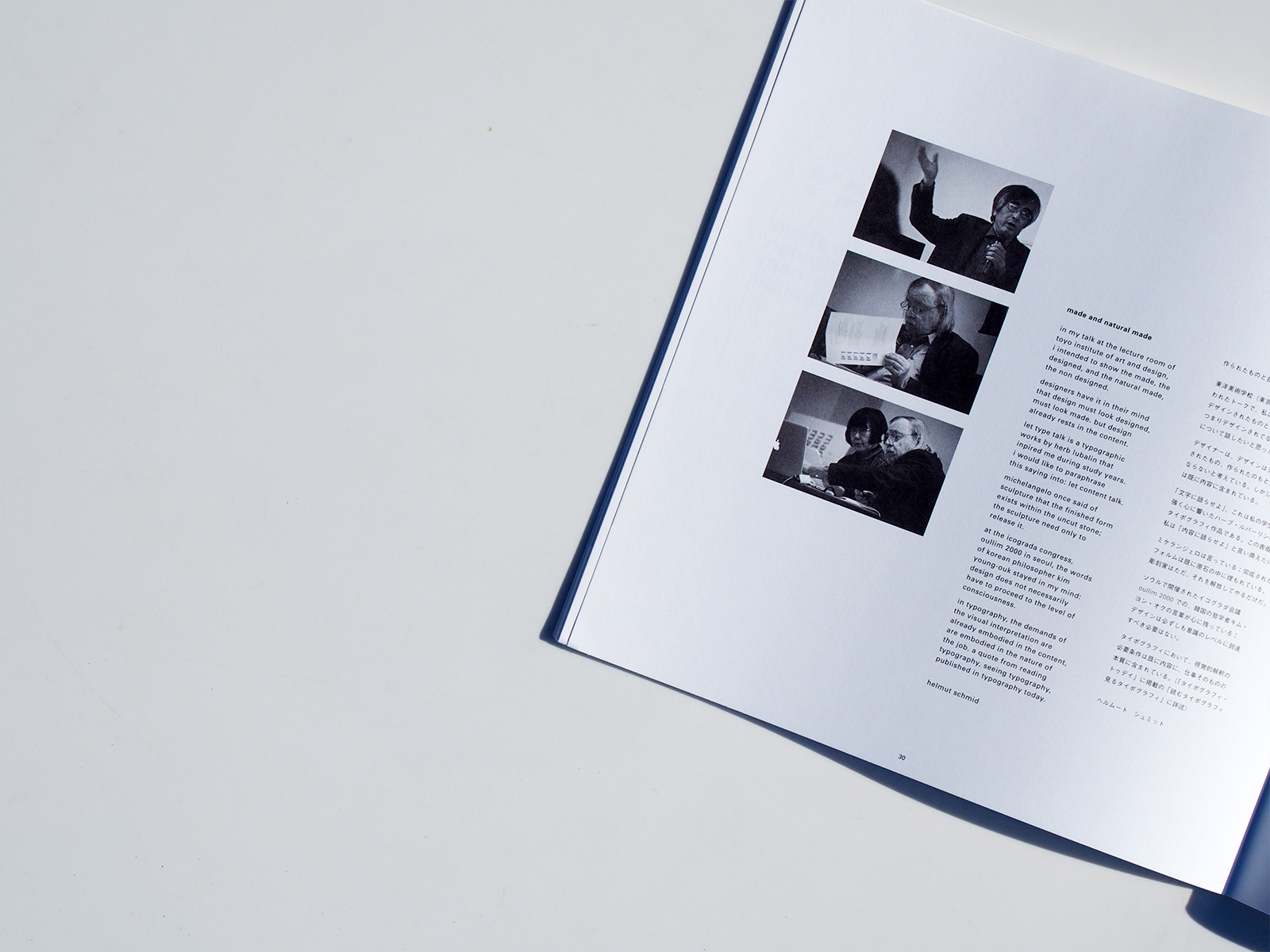
helmut schmid
and nicole schmid
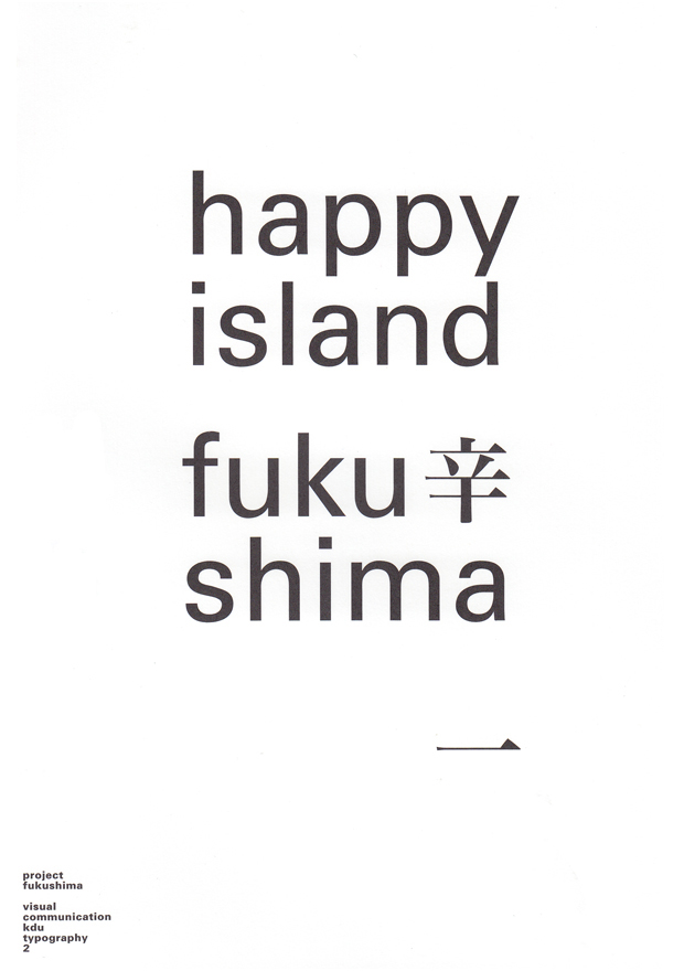
it took me some time to find a project
that touches on the nature-made
and man-made disaster at fukushima
of 11 march, 2011.
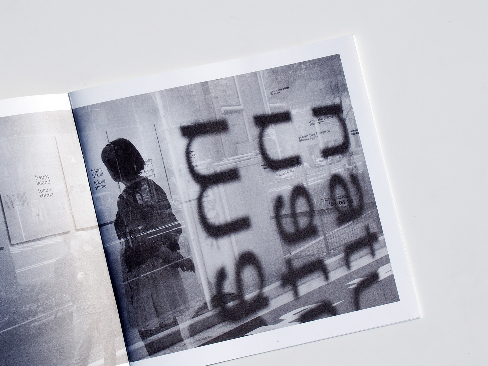
when i found that fukushima means
happy island in english, i thought
this ironic translation would fit as
final final typography project at kdu. i then
set the words, happy island fuku
shima, in black on white paper and
asked the students to add their
message in japanese in ming-cho
type on my design. for me it was the
first time to collaborate with
the students and i expected creative
messages and powerful designs of the students.
instead of challenging the given
design, one of the students
found a space in the design where
she could space her message.
somehow like a musician who takes
up a tone from another musician
and continues it into
a new melodic tone.
mayuko morimoto explained:
i turned my attention to the space
near fufu and shim. i thought
this is only space where kanji
can coexist without dirtying the
surrounding white space and
spoiling the design. also even just
one kanji can express meaning.
that is the feature of japanese
characters. and so i hit on this
design.
her stunning solution became
issue eight of typographic
reflections, using her words to
explain her messages.
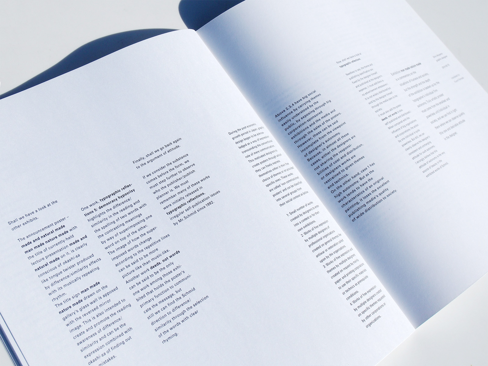
when jiro katashio of rebound
suggested an exhibition of
celebrate the book publication of
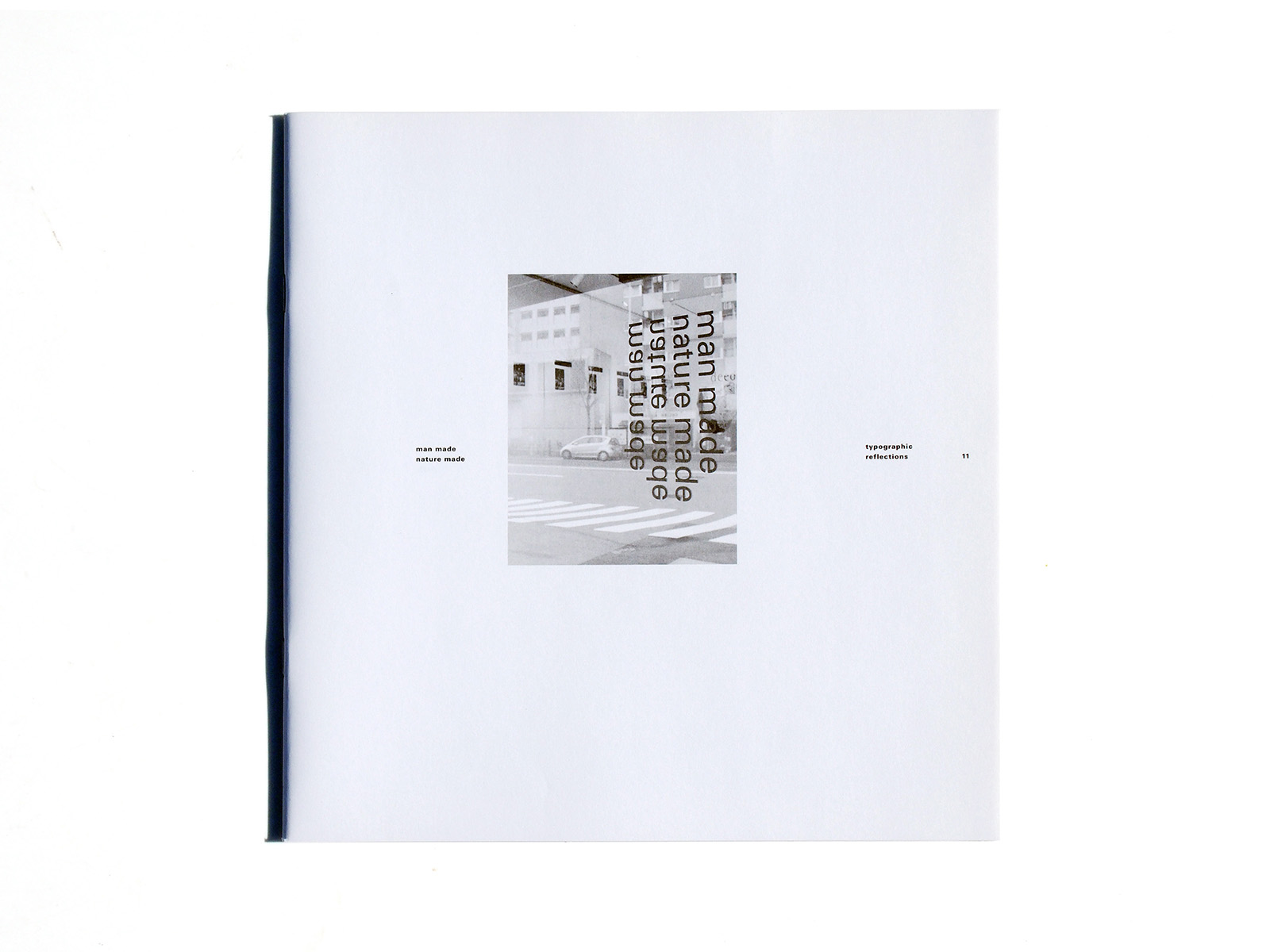
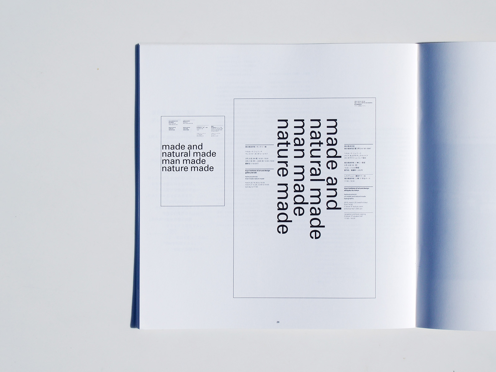
japan japanese, i focused
on man made nature made,
focused on project fukushima.
helmut schmid
2011年3月11日
に福島を襲った天才と
人災に向き合ったプロジェクトに出会う
までかなりの時間がかかった。
福島は英語にすると幸せの島の意味
であると知ったときに、私はこに皮肉に
聞こえる訳語こそ、神戸芸術工科大学での
最後のタイポグラフィの課題にふわさしい
であろうと考えた。そこでこの英訳
happy island fuku shimaを白い紙の上に
黒で組んだ。そして学生たちに、この
デザインに自分のメッセージを明朝体の
日本語で加えるよう求めた。私は、
創意に富んだ言葉、力強いデザインを
期待した。
森本真優子は、与えられたデザインに
挑戦する代わりにメッセージを
付け加えるためのスペースを見つけようと
試みた。それは、ミュージシャンが他の
ミュージシャンの音調を借りて新しい
メロディを作ろうとするかのようだ。
彼女自身、作品を次のように説明している。
私は、fuku shimaのところにある
スペースに着目しました。そこだけが
周囲の余白を汚すことなく、さらには
happy island fuku shimaも損なわれずに
感じと共存することができるスペース
だと思いました。そして漢字は一字
だけでも意味を示すことができます、
それは日本の文字の特徴だと思ったので、
このデザインを思いつきました。
彼女の驚嘆すべき解決方法をタイポグラ
フィック・リフレクション8で紹介した、
彼女自身の説明の言葉を採用して。
朗文堂の片塩二朗社長から「ニッポンの
ニッポン 日本的なるものの寡黙な美」の
出版記念の展覧会を提案されたとき、
私はテーマはman made nature made
に決めた。
ヘルムート シュミット