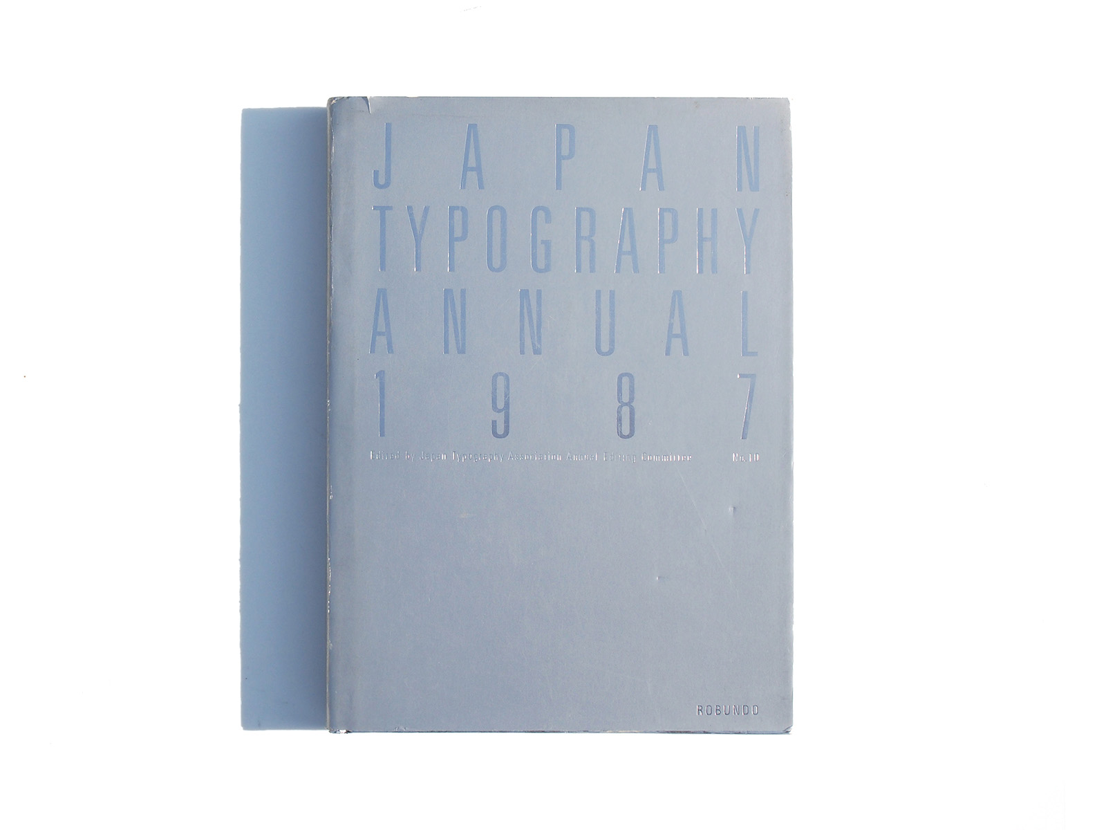


Publisher: Robundo
Language: Japanese English
ISBN-10: 4947613122
ISBN-13: 978-4947613127
Product Dimensions: 30 x 21.2 x 3 cm
Release Date: 1987
Price: sold


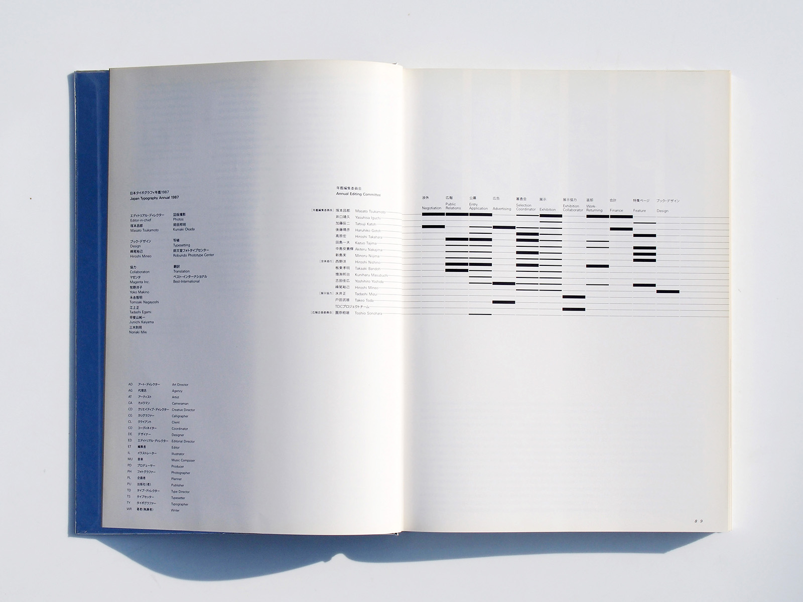
Editor in chief
Masato Tsukamoto
Book Design
Hiroshi Mineo
The Eyes and Hearts of Japanese
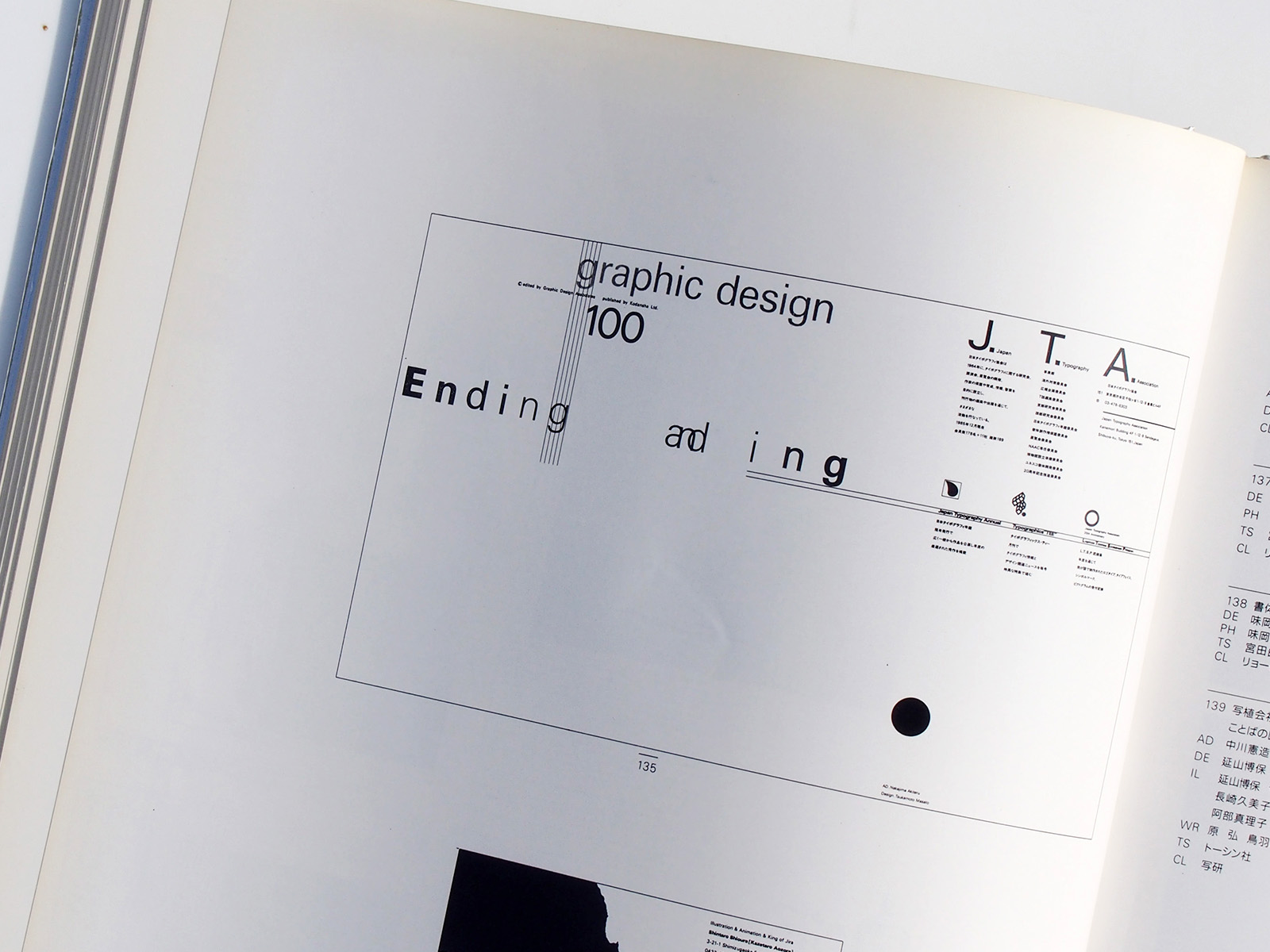
The Japan Typography Annual is making its tenth appearance.
Published once every we years, it has become the crystallization el 20 years of history.
Glancing over each issue of the year book, we can see the changeover to an advanced information society. However, with the appearance of Various new rnethods of representation, beginning with phototypography,
the diversification of values brought about by changes in lifestyle, and the worsening of the economic environment, foresight
and expressive power have become more essential for manufactures and differences in awareness and strength among manufactures have begun to clearly emerge.
In Cities overflowing with prim and signs,
things that have only flashiness t0 recommend them are en the increase, while quiet, beautiful, gracetul things that Originally represented
Japanese Culture are neglected in the mess media.
Japanese have Japanese hearts and eyes, just as the people of other countries each have their own heart and eyes. There was a time when Japanese thought that everything foreign was good and disposed Japanese things.
Perhaps the social climate of that time surved to dull the eyes and hearts of the Japanese who came after end caused them to forget the subtle distinctions between light and shade and their deep
sensibilities.
In a Social environment in which the expression of design and typography have come to occupy an important place in management strategy, not to mention the boom in corporate Identity, a large-scale revolution in consciousness and finer sensibilities are
demanded of manufacturers.
Ii Japanese typography, which provides the underpinning for the Coming information Society, is to Stand Shoulder to Shoulder with ‘that of advanced countries, we will have to reexamine the concept of “visual Communication”
– the basis of typography – and “eyes and hearts of Japanese” in modem Society.
Masato Tsukamoto
Editor-in-Chief
Japan Typography Anual 1987
「日本タイポグラフィ年鑑」が10号目を迎えました。2年に1冊の刊行なので、もう20年の歴史の結晶となります。
それらの年鑑を1冊ずつ追っていくと、高度な情報化社会への推移が、見えてきます。しかしその反面、写植書体をはじめとする多様な表現素材の出現と、生活環境の変化による価値観の多様化やより確かな先見性と表現力がますます必要となり、製作者側の意識と力の差は歴然と出始めています。
待ちにあふれている印刷物や看板など騒がしいものが増え、元来、日本人の文化であった静香で美しく奥ゆかしいものは、マスの中で軽視されるようになりました。
日本人には日本人の目と心があり、それぞれの国にはそれぞれの国の目と心があるはずです。
一時、日本は外国のものすべて良いと考え、自国の物を卑下した時代があります。
その時の風潮が、その後の日本人の目と心を鈍化させ、微妙な濃淡の違いや奥深い精神性を、忘却の彼方に捨て去ってしまったのではないでしょうか。
CIの流行に見るまでもなく、デザインやタイポグラフィ表現が、経営戦略の重要な位置を占める社会環境の中で、製作者側の大胆な意識の転換と、より繊細な神経が求められています。
これから先、日本のタイポグラフィが、情報化社会の担い手として、タイポグラフィ先進国と肩を並べていくとすれば、タイポグラフィの基本である「視覚」による伝達ということと、現代社会における「日本人の目と心」ということを、
もう一度見つめなおしてみることが、必要なのではないでしょうか。
塚本昌都
「日本タイポグラフィ年鑑1987」編集委員長