

Paperback: approx. 40 pages
Publisher: –
Language: German
ISBN-10: –
ISBN-13: –
Product Dimensions: 19 x 20 cm
Release Date: 1957 1st editon
Price: $600 USD
Free Worldwide Shipment from Tokyo
Condition: very good (pre-owned)
minor compression along the spine and some age-related discoloration and surface wear, but overall the condition is very good
The cover and the spread showing the colophon are from the actual copy for sale, while the other spread images were taken from a different, less well-preserved copy to avoid stressing the binding. The condition of the item offered here is excellent—remarkably well-preserved for a book nearly seventy years old.
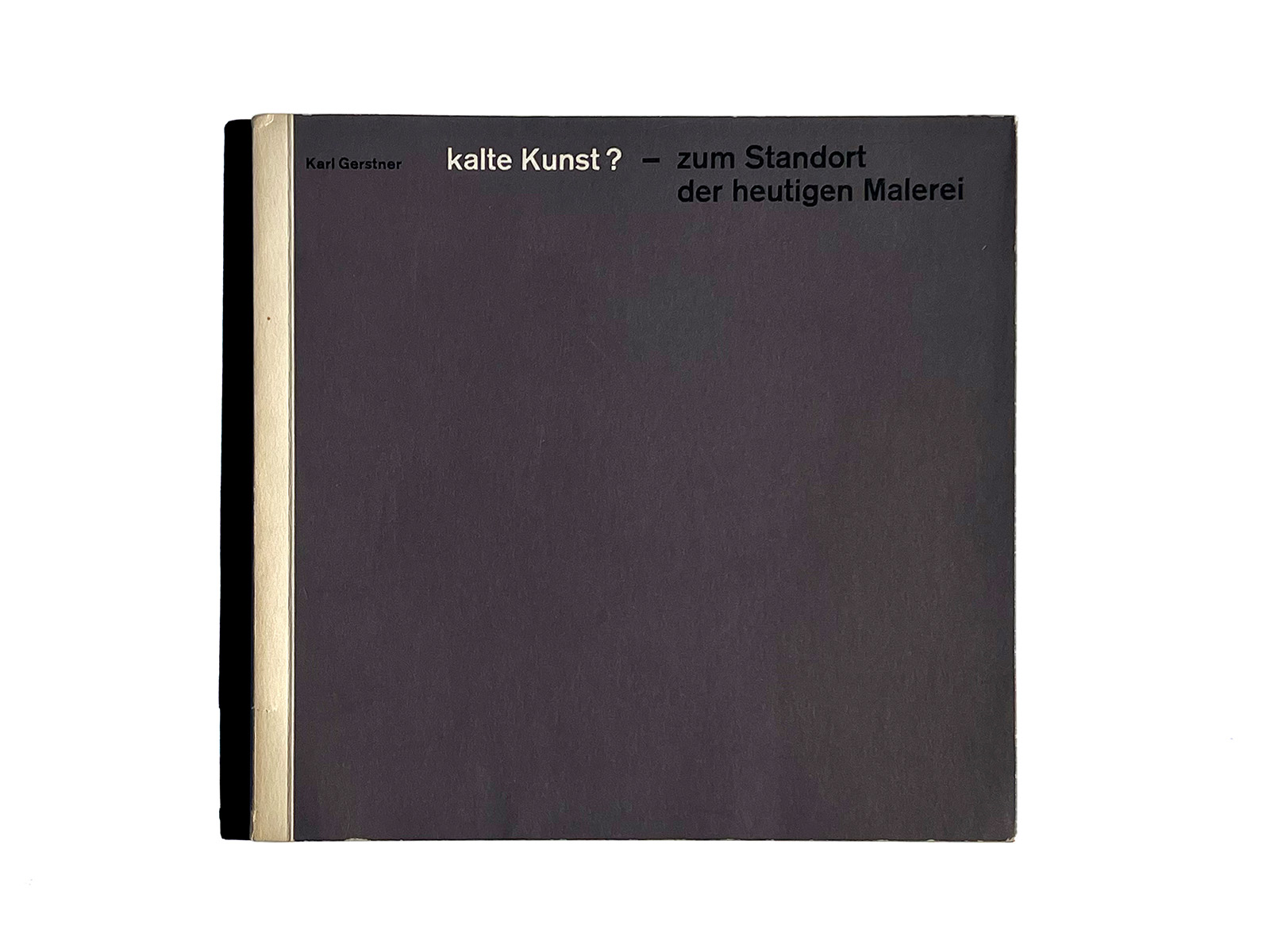
Design: Karl Gerstner
Max Bill, Camille Graeser, Richard P. Lohse, Lanfranco Bombelli, Gérard Ifert, Mary Vieira,
![]()
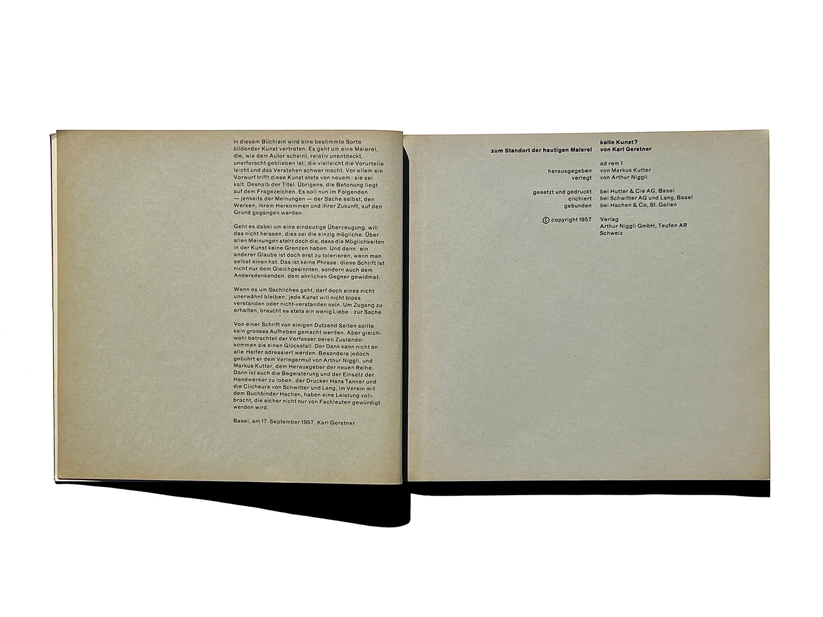
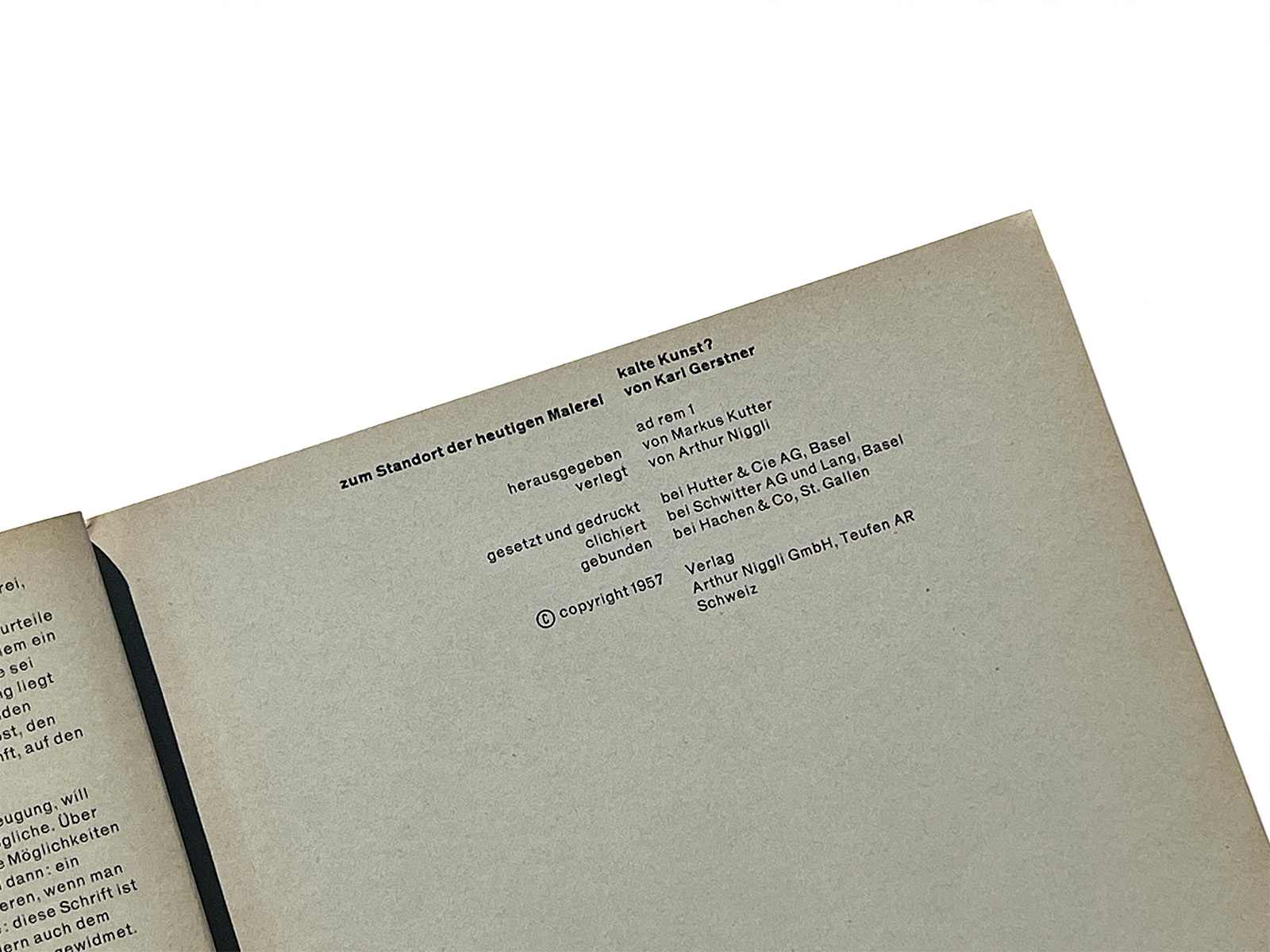
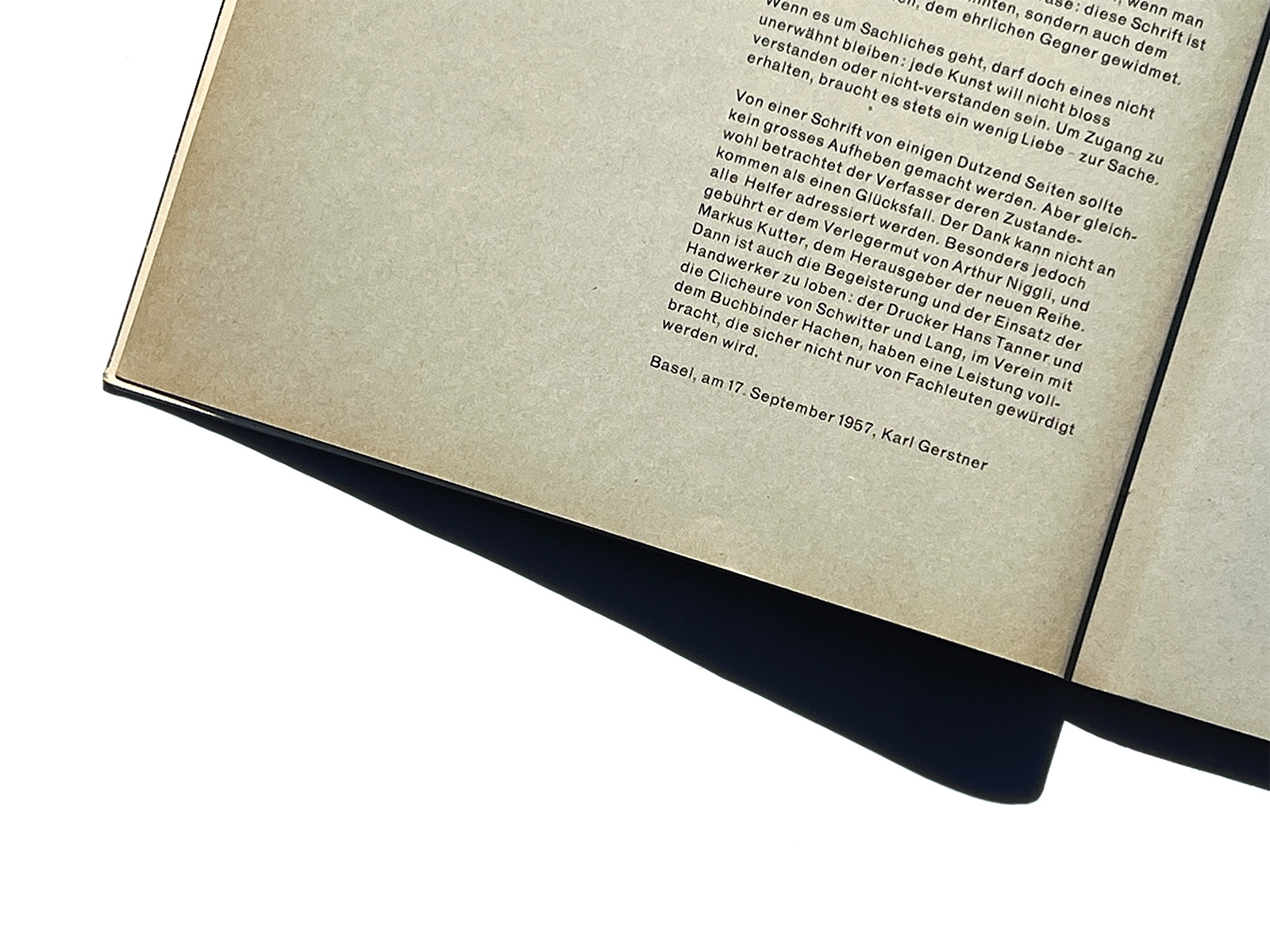
In 1957, Karl Gerstner (1930–2017) published his first book as an author, kalte kunst? (“cold art?”), a work that set out to challenge the widespread prejudice that constructive art is “cold.”
After a brief introduction to the history of constructivist and concrete art, Gerstner focuses on Swiss artists such as Max Bill, Camille Graeser, Verena Loewensberg, and Richard Paul Lohse, followed by a younger generation including Marcel Wyss, Mary Vieira, and Gerstner himself. Like Bill and Lohse, Gerstner was a painter who earned his living as a graphic designer.
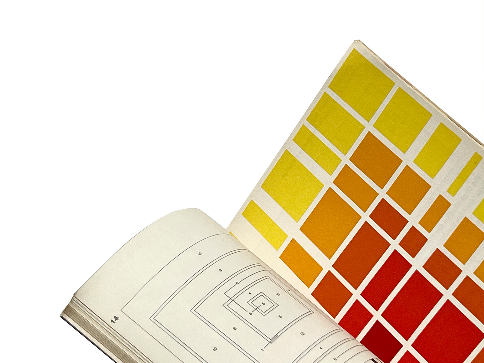
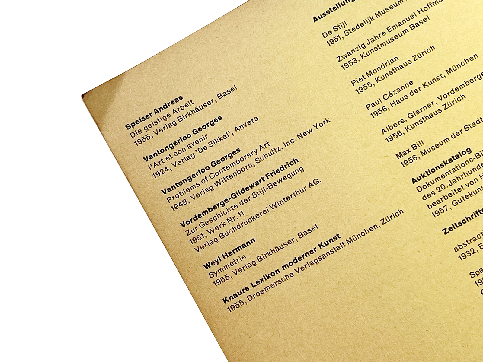
The design of the book shows many of Gerstner’s characteristic features: titles beginning with lowercase letters (set in Akzidenz-Grotesk Semi-Bold), unjustified text setting, a square format, different colored papers for each section, and brown card wrappers with a white spine—Gerstner seemed to have a fondness for brown.
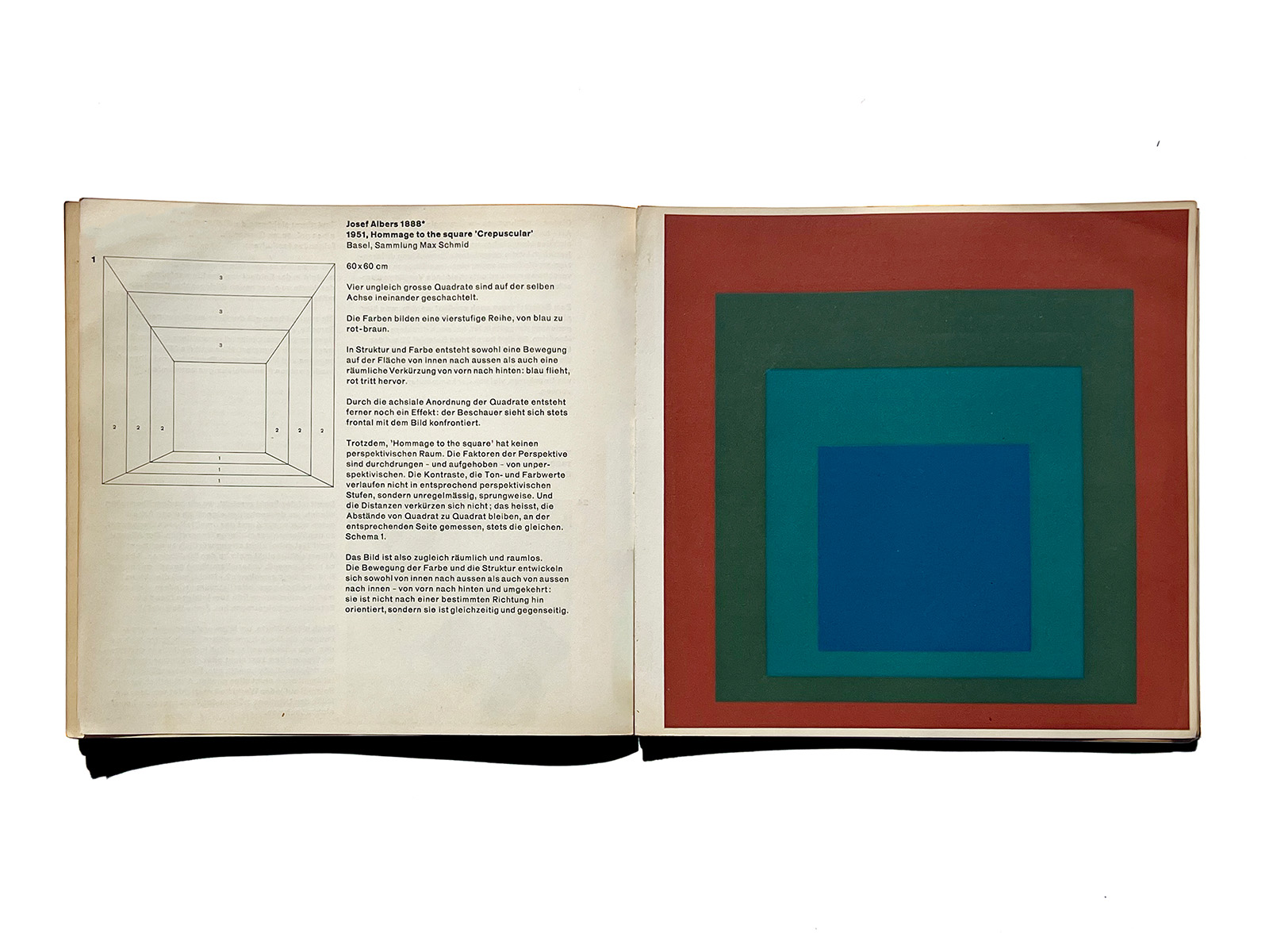
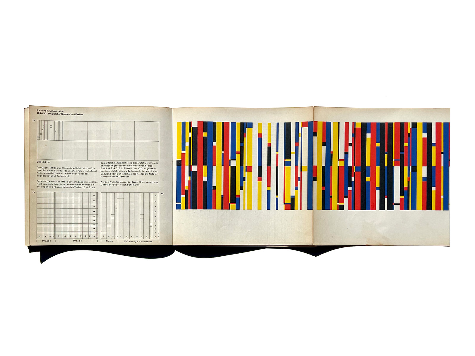
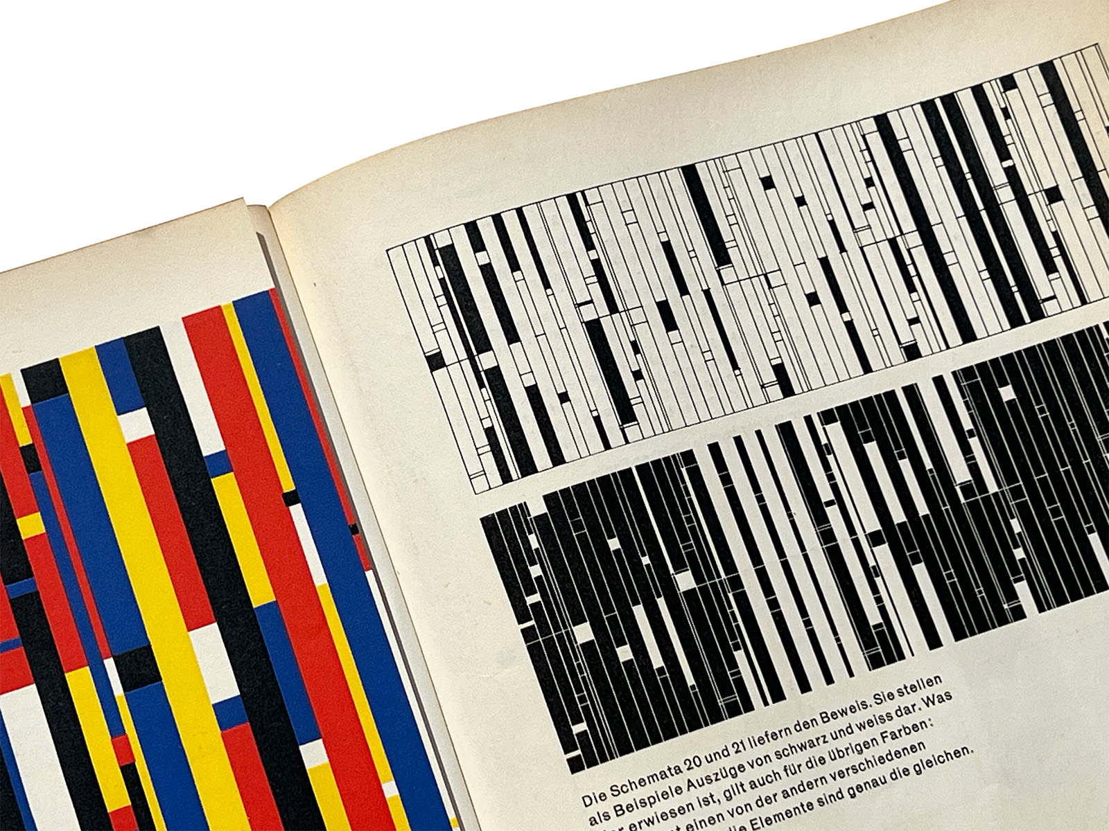
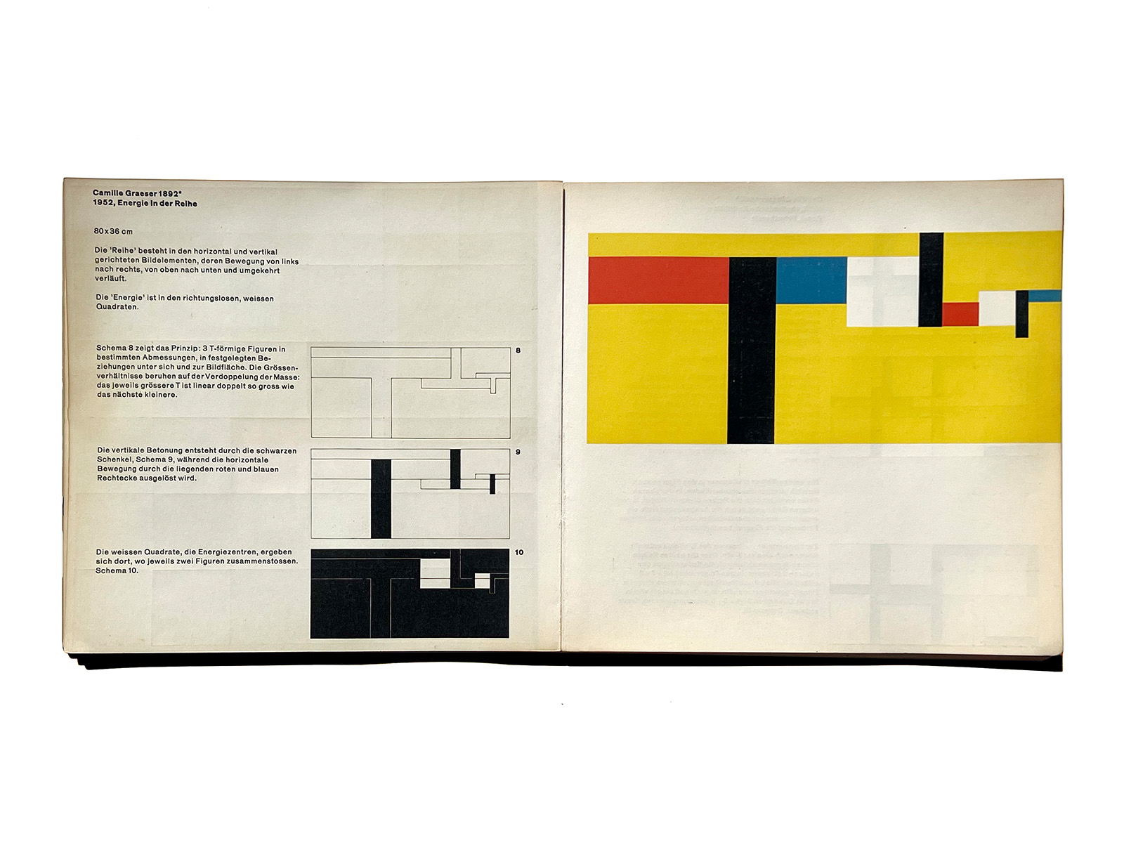
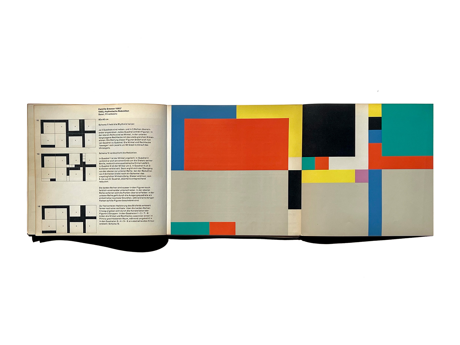
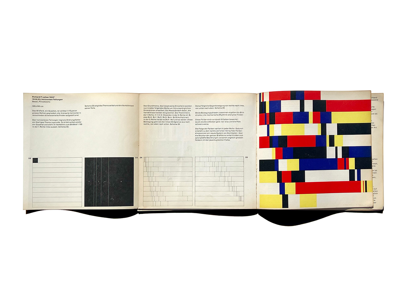
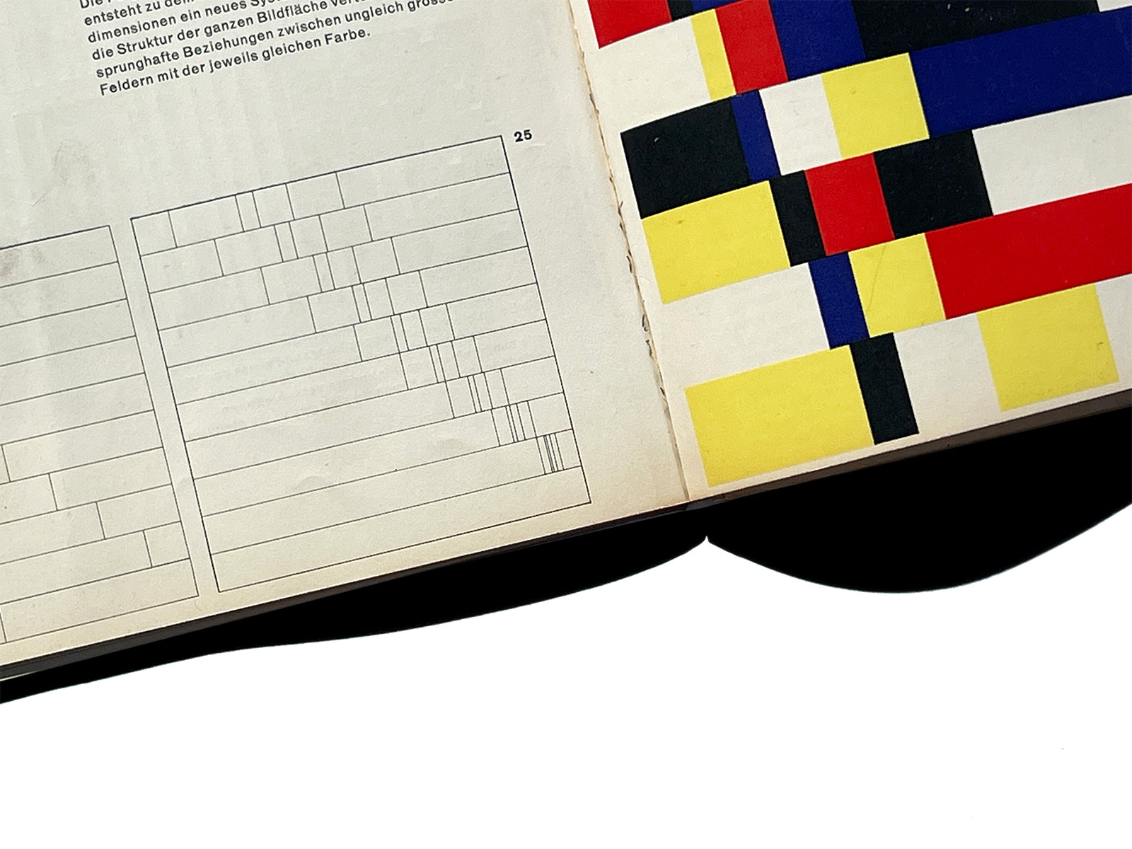
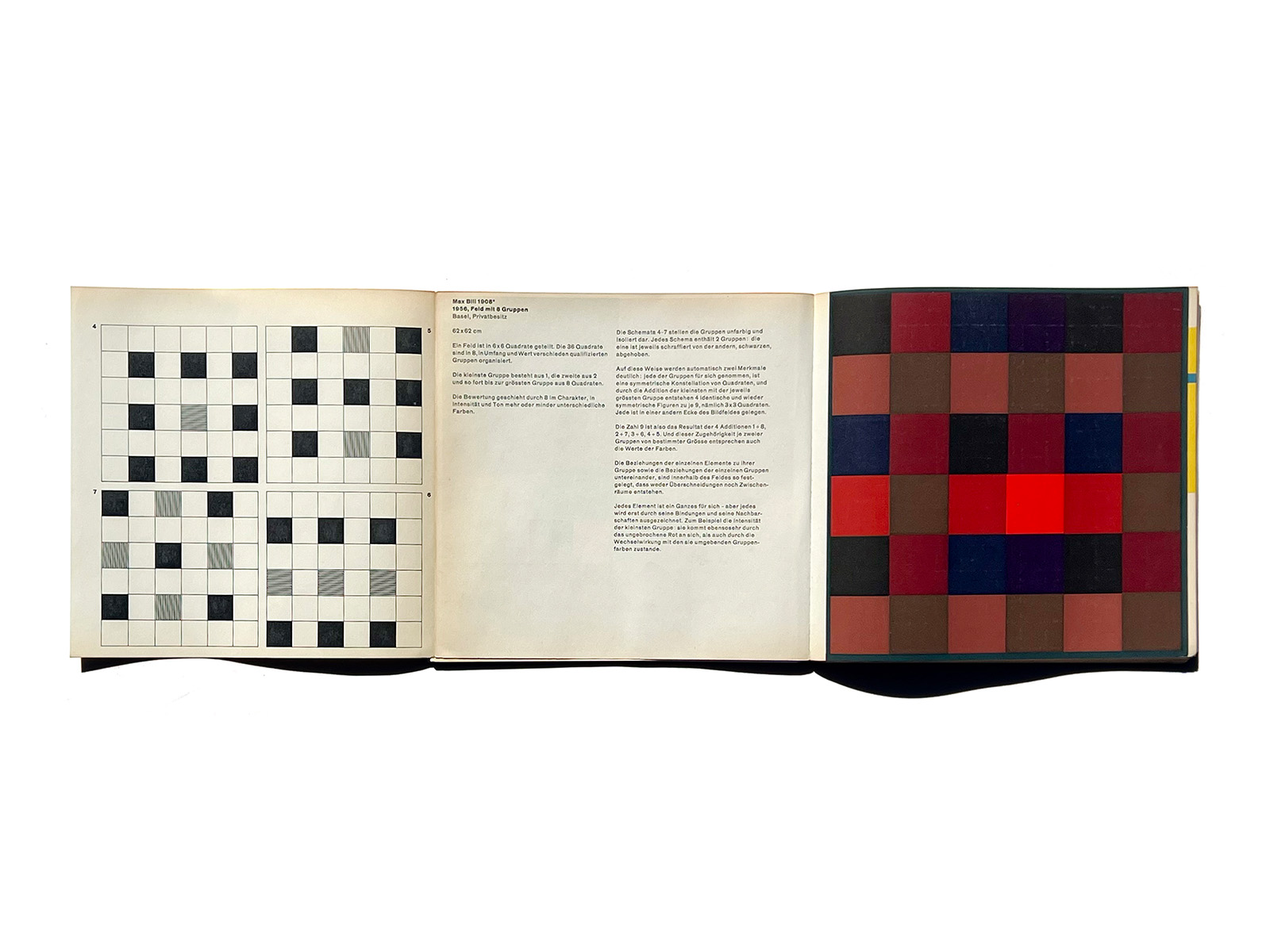
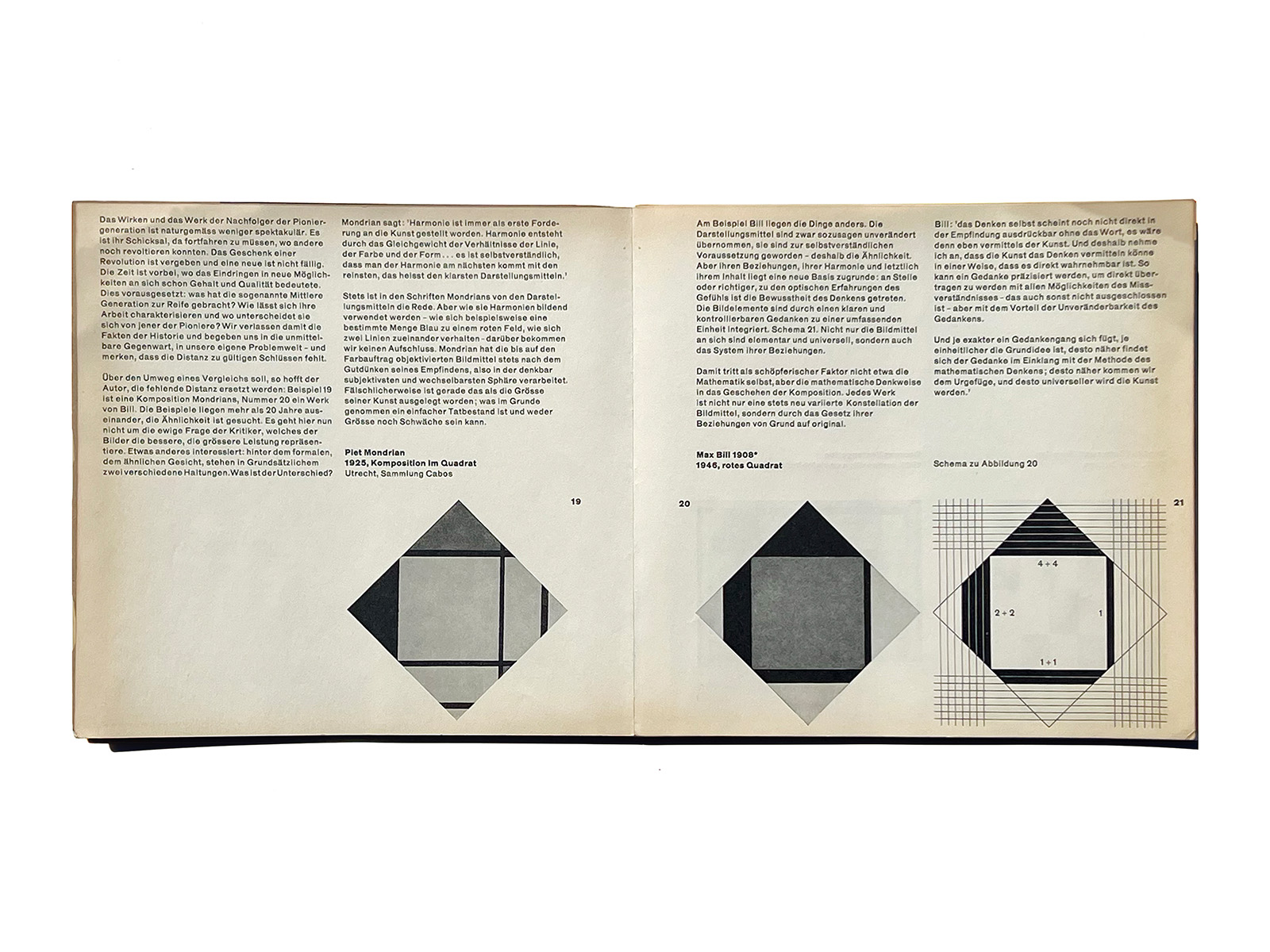
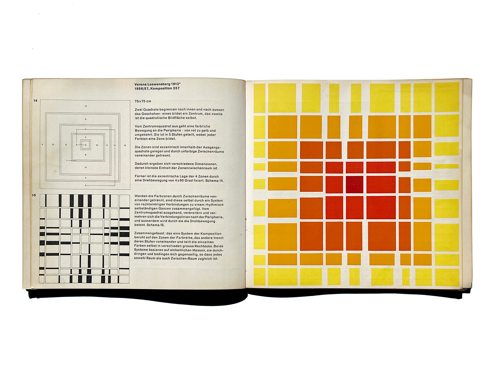
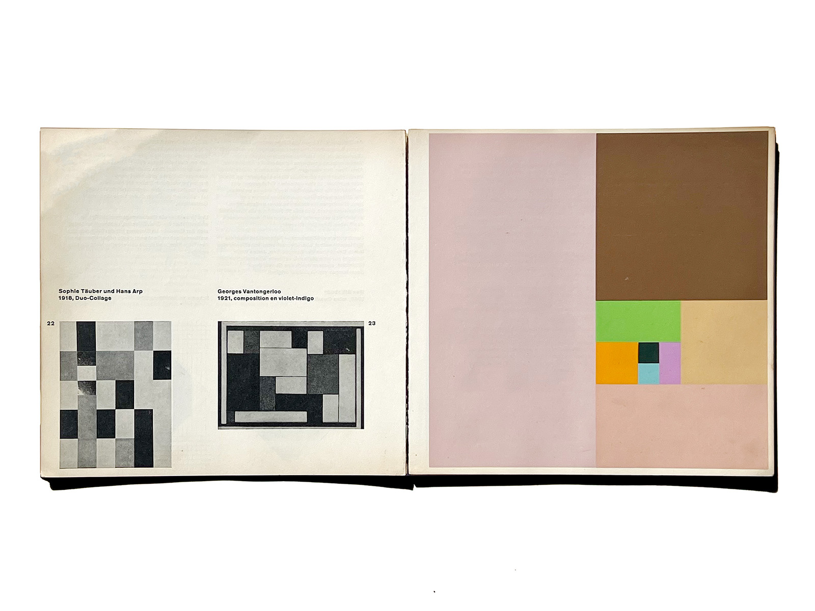
Gerstner provides precise analytical texts and diagrams for several of the reproduced paintings. These examples are presented in the following order: Bill, Graeser, Loewensberg, and Lohse (with foldout).
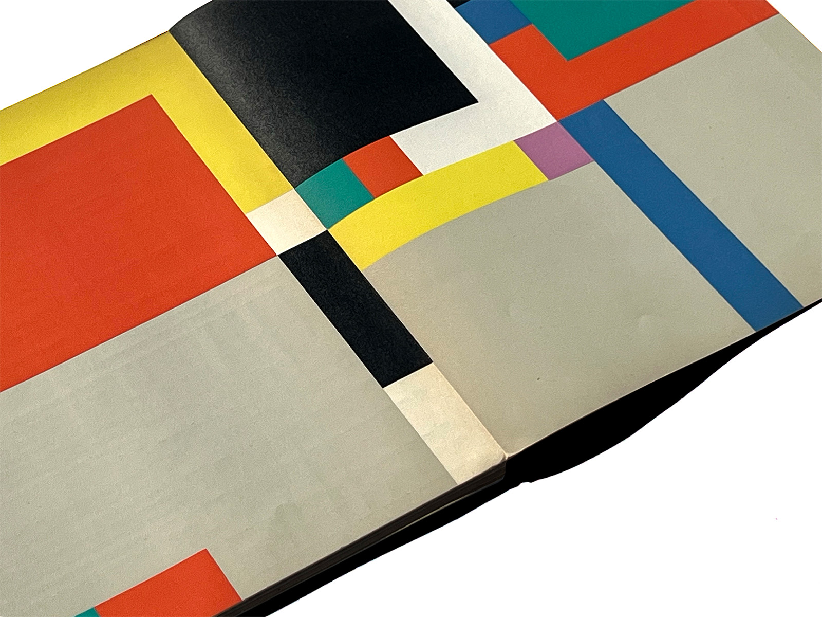
The color plates are of outstanding print quality. In his later book 5×10 Years Graphic Design (ISBN 3775791515), Gerstner recalls how this was achieved: the reproductions were printed from line plates using individually mixed inks—there are no halftone dots. The resulting letterpress prints possess a color quality comparable to that of a lithograph or screen print.
This description is based on and adapted from wiedler.ch/felix/books/story/16.