Publisher: –
Language: German French English
ISBN-10: –
ISBN-13: –
Product Dimensions: 23.3 x 16.5 cm
Release Date: 1958
Price: $220 USD (¥24,200 JPY)
Free Worldwide Shipment from Tokyo
Condition: good (pre-owned)
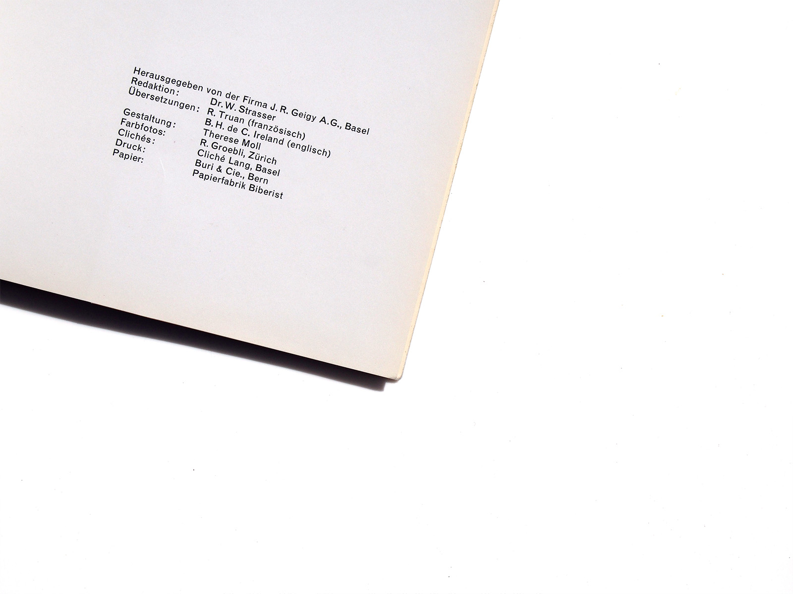
design by Therese Moll
photo by René Groebli
![]()
日本国内の方は下のボタンからご購入いただけます。
コンディション: 良い(カバーに微細なやぶれがありますが、写真の通り概ね良好です)
![]()
*国内のみ日本郵政ゆうぱっく発送にて送料無料となります
銀行振込をご希望される方はこちらに直接ご連絡いただけるようお願いいたします。
info@page-spread.com
the year 1958 marked the 200th anniversary of geigy, a swiss chemical company which is now part of novartis.
in the 1950-60s geigy’s innovative communications and graphic design department was one of the key institutions to develop and popularise what is now known as “swiss style graphic design”.
already in story 83 we came across two geigy anniversary books, designed by karl gerstner.
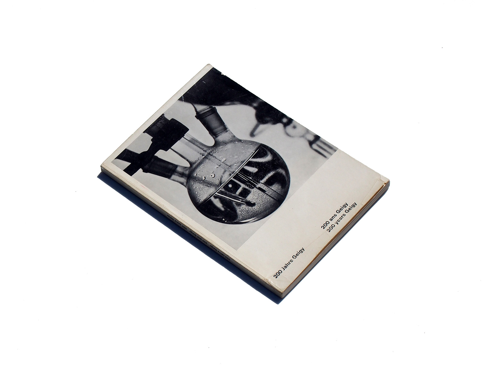
I love that cover, with a distorted “geigy egg” logo visible through a flask!
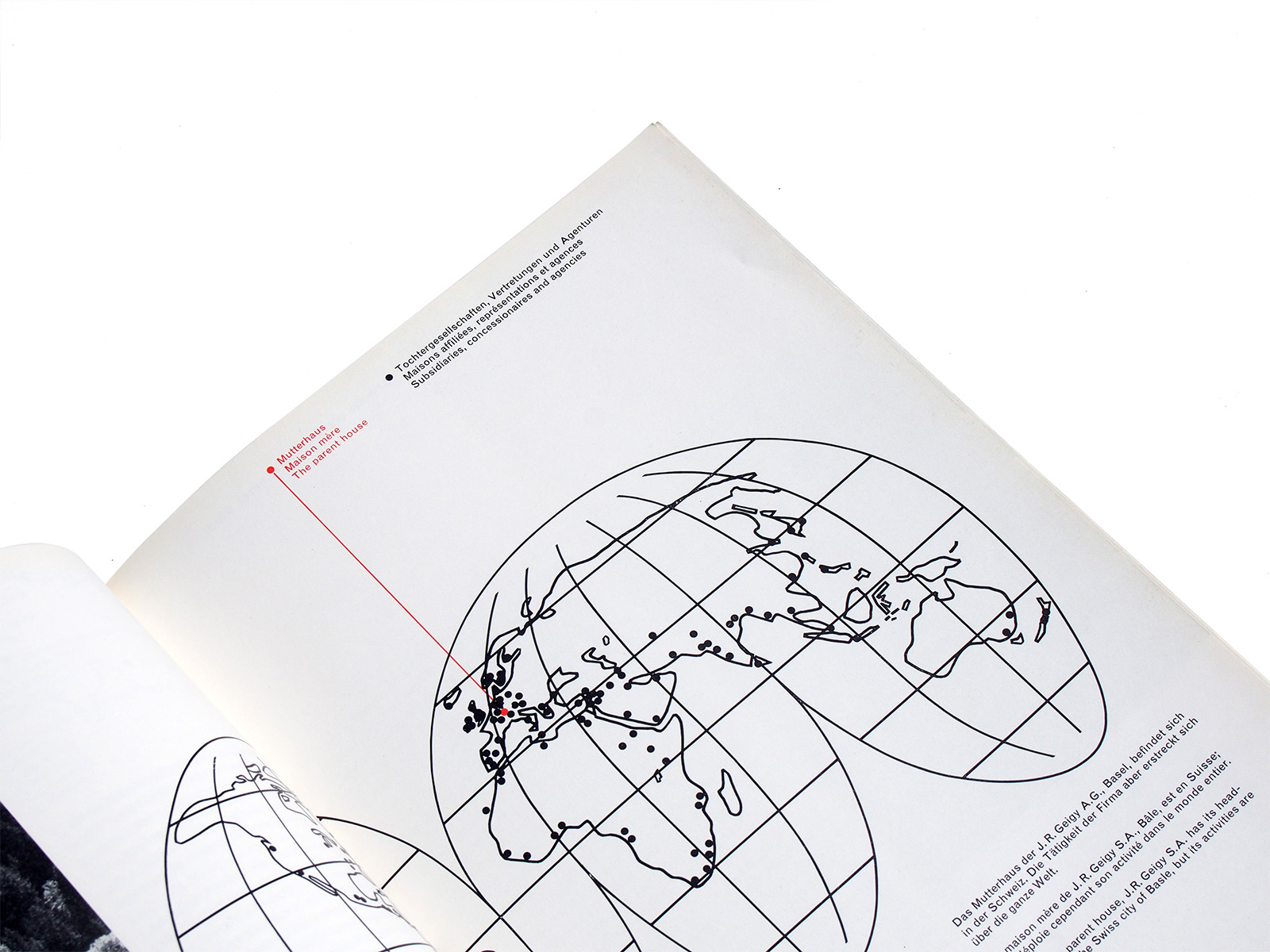
the book design is swiss style epitomized: multi-language, multi-column, grid-based layout with sansserif type set unjustified.
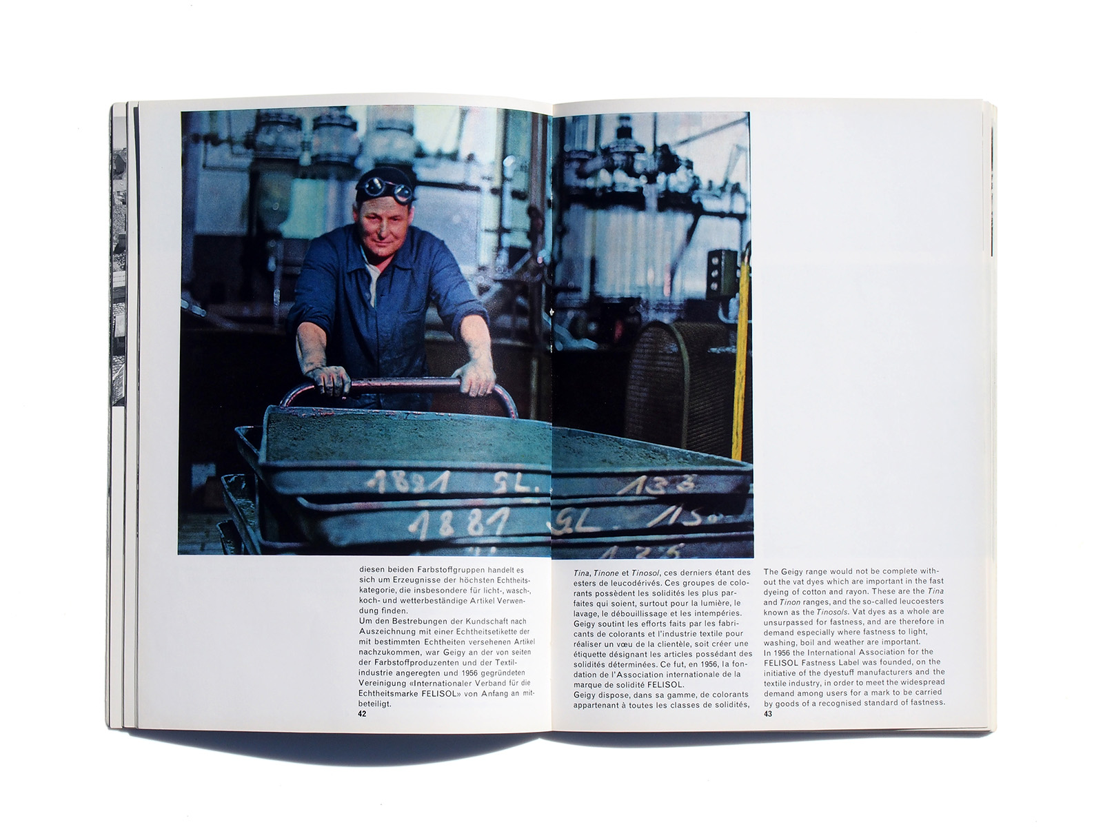
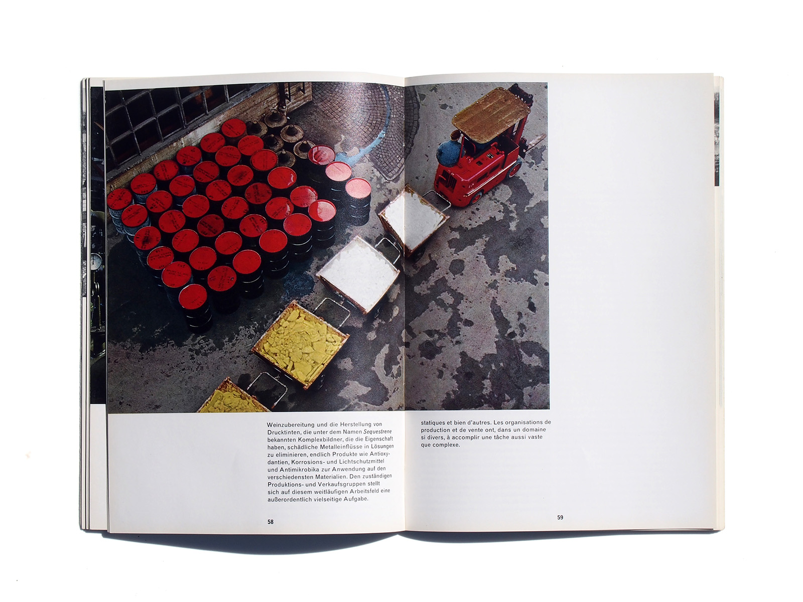
this booklet demonstrates how lively a grid-based photo direction can be.
the impressive colour photos are credited to rené groebli (*1927).
the booklet was designed by therese moll (1934-1961), a highly talented swiss graphic designer who had worked for studio boggeri in milan before teaming up with karl gerstner in basel.
after a year with geigy, she went to the u.s. to work at the massachusetts institute of technology (mit) in 1958. there she had a considerable influence on some u.s. designers (see e.g. this article in eye magazine).
text via wiedler.ch/felix/books/story/652
