


Paperback: 112 pages
Publisher: Museum Boymans van Beuningen
Language: Dutch English
ISBN-10: –
ISBN-13: –
Product Dimensions: 27.2 x 22.8 x 1 cm
Release Date: 1993
Price: $80 USD (¥8,800 JPY)
Free Worldwide Shipment from Tokyo
Condition: good (Pre-owned)
Design: 8vo
![]()
日本国内の方は下のボタンからご購入いただけます。
Payments in Japanese yen below are only available for shipping within Japan.
コンディション: 良い (背の上部に微細なつぶれがあります。写真参照)
![]()
*国内のみクリックポスト発送にて送料無料となります
銀行振込をご希望される方はこちらに直接ご連絡いただけるようお願いいたします。
info@page-spread.com
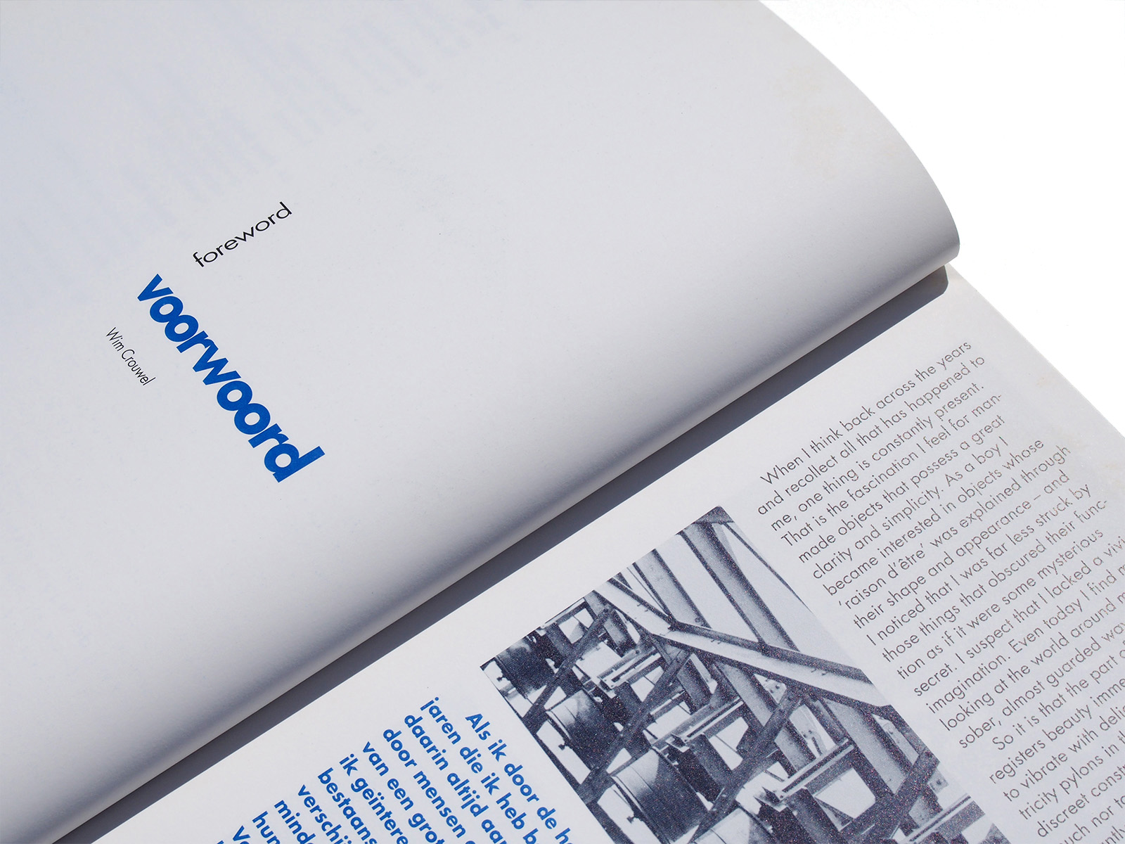
When I think back across the years and recollect all that has happened to me, one thing is constantly present.
That is the fascination I feel for man-made objects that possess a great clarity and simplicity. As a boy ! became interested in objects whose
‘raison d’être’ was explained through their shape and appearance – and I noticed that I was far less struck by those things that obscured their function as it it were some mysterious secret. I suspect that I lacked a vivid imagination. Even today I find myself looking at the world around me in this sober, almost guarded way.
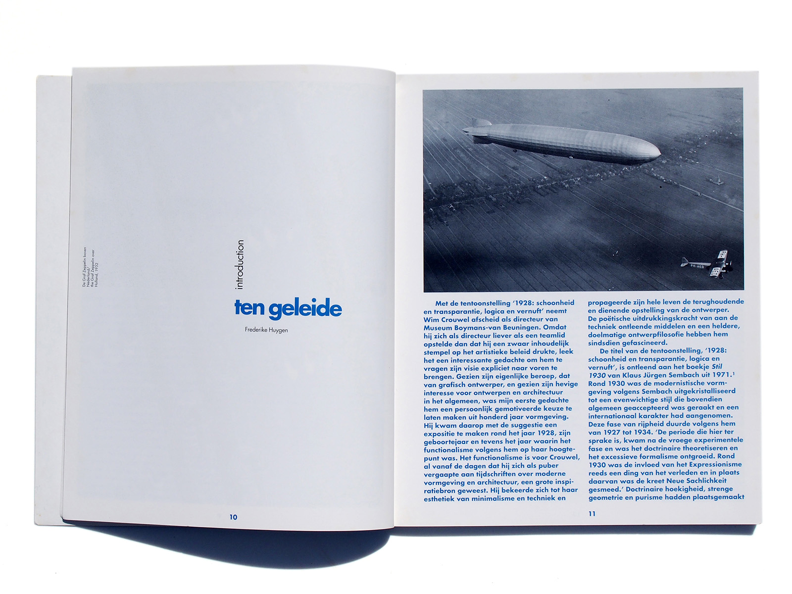
So it is that the part of me that registers beauty immediately begins to vibrate with delight on seeing electricity pylons in the countryside. These discreet constructions – neither too much nor too little – with arms that elegantly support the cables and lead onwards towards the horizon, appear to determine precisely the huge movements as if they were a choreography for electricity. I am also fascinated by railway yards with their gleaming rails crossing each other and the subtle network of overhead wires. For years I used to make drawings of this, at first realistically and then as time went on in more and more abstract versions. Even today I experience a thrill of pleasure when I think of the Zeppelin. Gleaming silver it glided over our city in the 1930s. Something of that excitement returned later when TV showed us journeys into space.
In architecture too, what I like best is those buildings that are quite transparent about their function, that have an entrance hall like welcoming arms, a floor plan that directs you from room to room as if it were all self-evident, and with an exterior that acts as key to the general layout. The school building by Wiebenga and Van der Vlugt (housing the art school Minerva in Groningen), an early example of functionalist construction, was literally a place of apprenticeship for me. The building inspired at first sight more even than the course I was studying at that time. It is scarcely surprising that, later on, my children attended the magnificent Openluchtschool voor het Gezonde Kind (Open-Air School for the Healthy Child) in Amsterdam, designed by Duiker. It seemed the only choice.
When I first saw the buildings of the sanatorium Zonnestraal, and of the Van Nelle factory, I was bowled over.
I have carefully guarded the photographs of Van der Leeuw’s house.
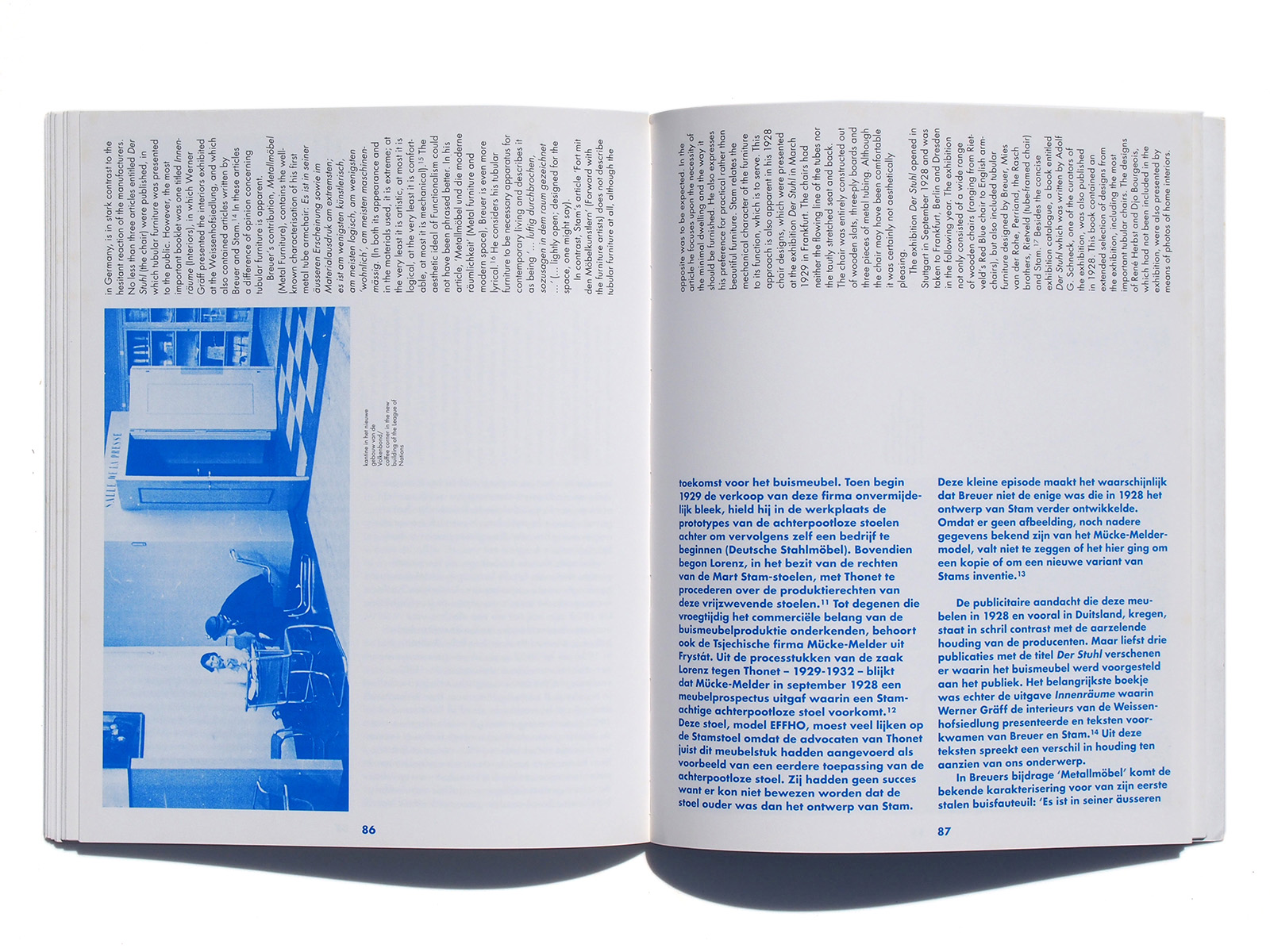
As a child I dreamed of steel furniture and I painted the door of my room an aluminium grey. Was it some progression from this that when I was a student at art academy I stitched together the first transparent plastic raincoat?
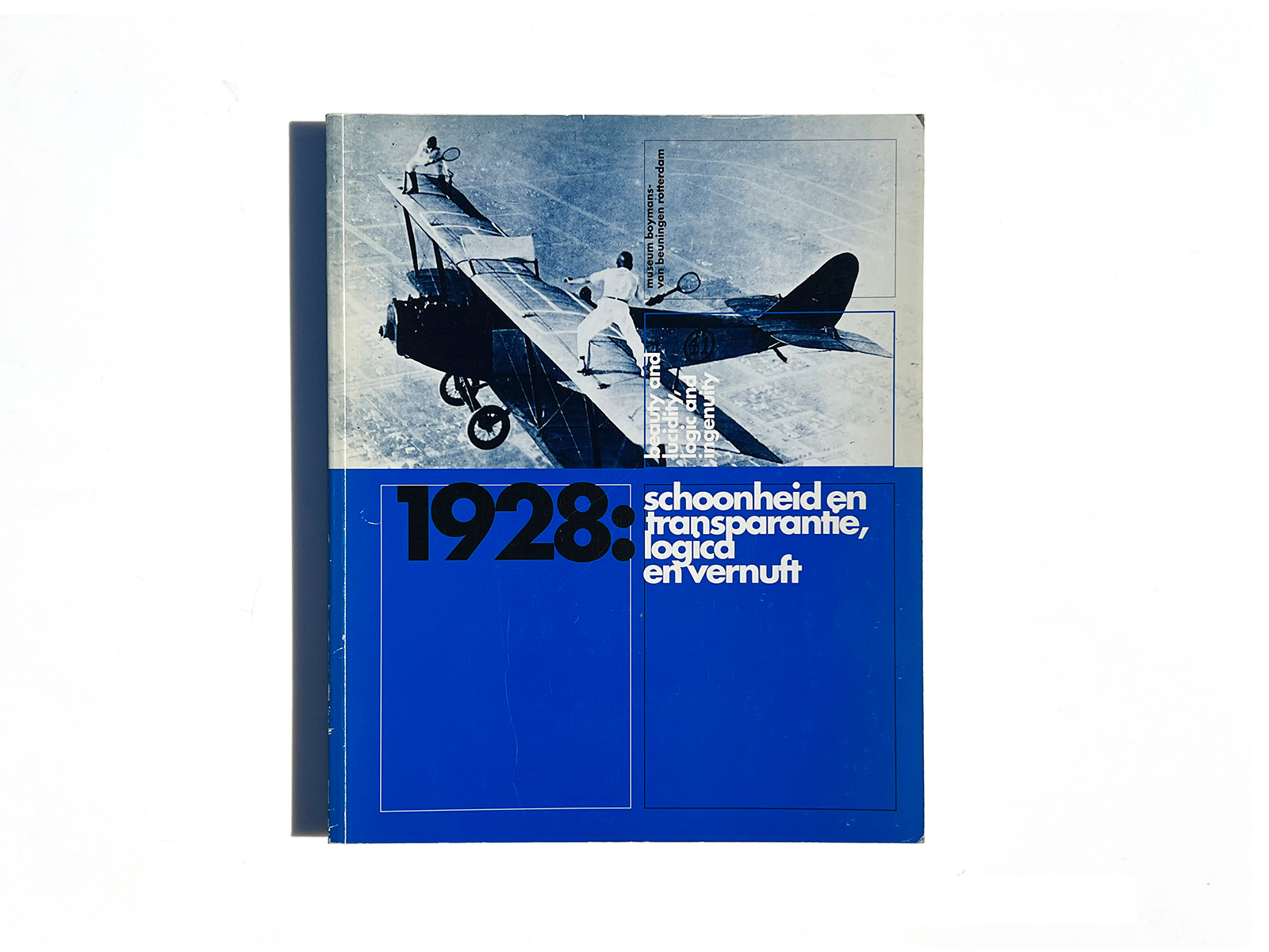
One thing is certain, I was converted to a spiritual functionalism for the rest of my life, to the service of beauty and lucidity, logic and ingenuity. The year 1928 was a good one as far as that was concerned.
The present exhibition aims to share all these experiences with others. ‘1928: Beauty and Lucidity, Logic and Ingenuity.’ It is thanks to a great many that this exhibition has been realized and I appreciate all their help most warmly. The list includes the lenders, the companies who have given us their financial support, the archives and libraries that have made their photographic material available, the authors, translators and designers of the catalogue and poster. I would also like to thank the staff of the museum who – for this final exhibition that falls under my directorship – have shown constant and enthusiastic support.
I should like to mention in particular Frederike Huygen and Iny Schlee-doorn, who took upon themselves the lion’s share of the work. It was invigorating; it was inspiring.
Wim Crouwel
director, Boymans-van Beuningen Museum
ロッテルダムのBoymans-Van Beuningen美術館エキシビションカタログです。デザインは8voによるもので、B-VBカタログ史上で最も実験的な一冊です。オランダ語と英語のバイリンガル併記となり、青色、Boldウェイトのカラムがオランダ語、黒色、Lightウェイトで90度回転したカラムが英語となり紙面が360度機能しています。