


Publisher: verlag karl werner
Language: German English French
Product Dimensions: 21 x 21 cm
Release Date: 1952
Price: sold
it was published around the time when bill became the first director of the hochschule für gestaltung (hfg) in ulm
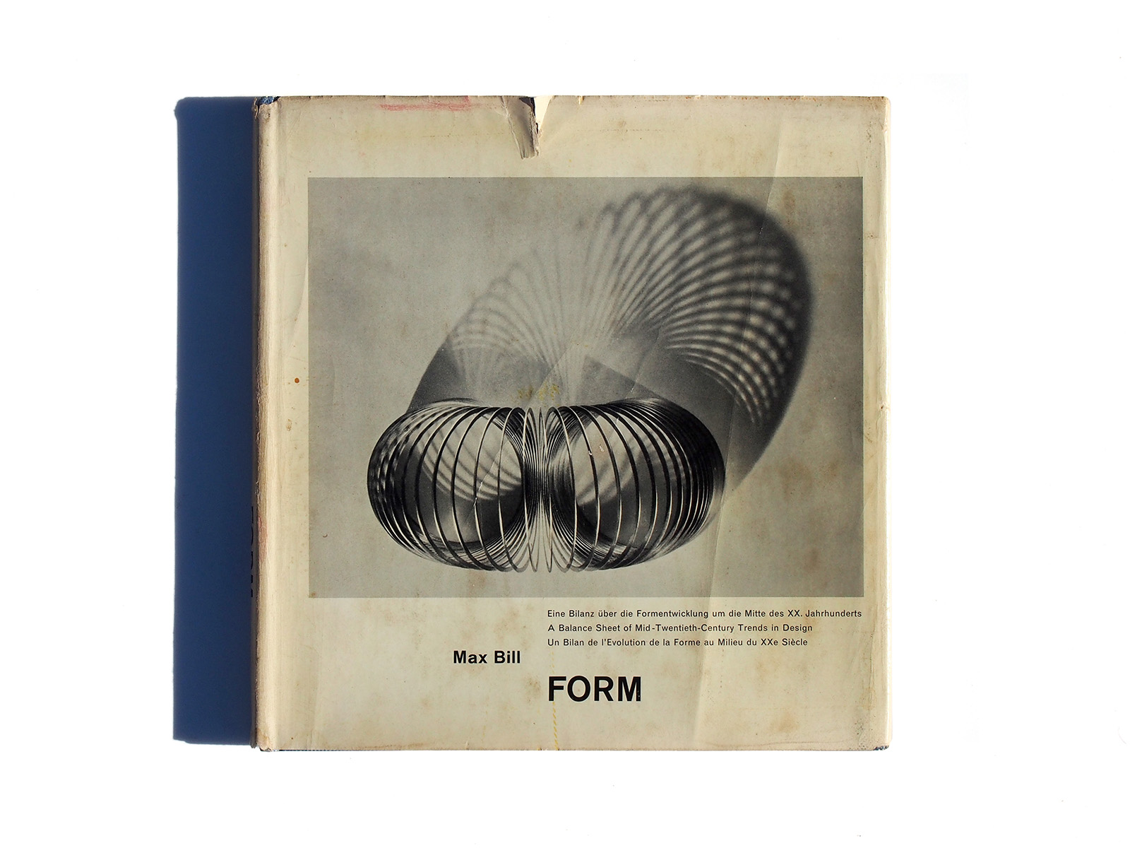
Max Bill organized design exhibition called “die gute form” that was shown in switzerland, germany and austria.
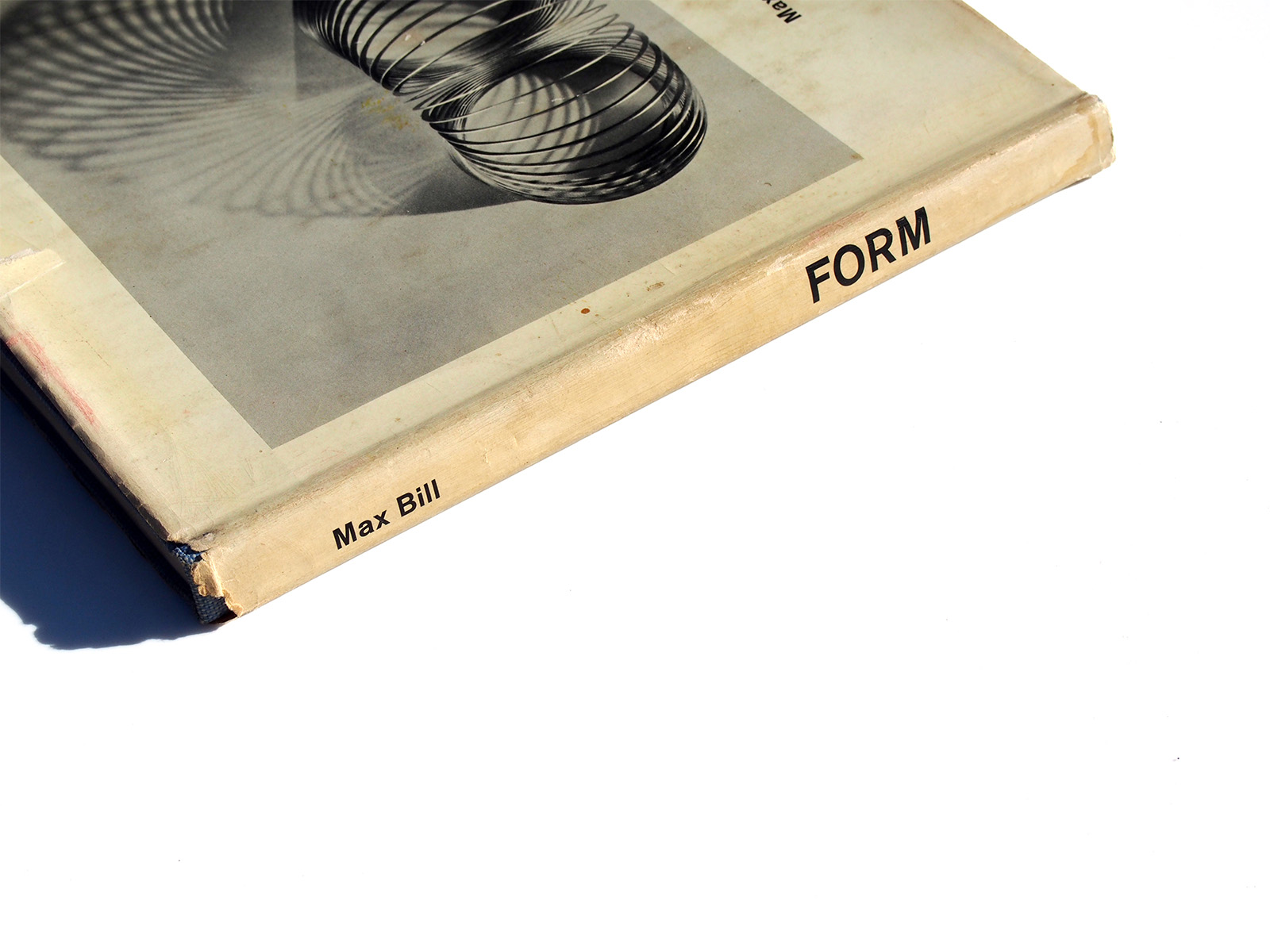
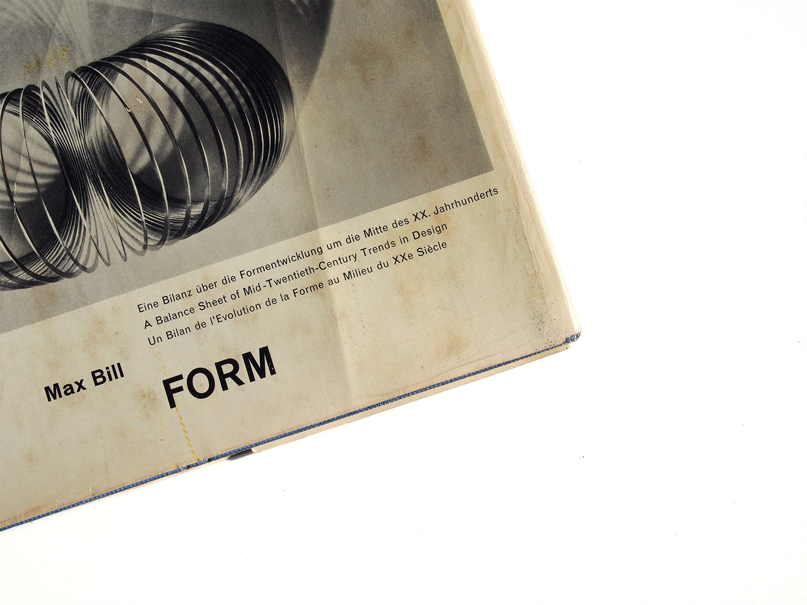
the book is a classic example of “swiss typography” with its sans-serif type, grid-based layout, multicolumn/multilingual text and square format. the unjustified, ranged-left setting of text is a style bill pioneered. the tiny, only 6 pt sized sans-serif – also used by bill in other books
Max Billによって編集、デザインされた著作であるFORMです。自然界から人間のデザインした建築からプロダクトまで、幅広い形をテーマに編集されたものです。本書のデザインはとても基本的なグリッドベースでレイアウトされていて小さなサイズのサンセリフを用いての組版はいわゆるスイスが世界に誇ったインターナショナルスタイルそのものでとても貴重な一冊となります。