

Publisher: Arthur Niggli
Language: German
ISBN-10: 3721202368
ISBN-13: 978-3721202366
Product Dimensions: 15.9 x 15.6 x 3.2 cm
Release Date: 2000
amazon stock for your reference in UK
amazon stock for your reference in US
amazonでの価格を参考にしたい方はこちら
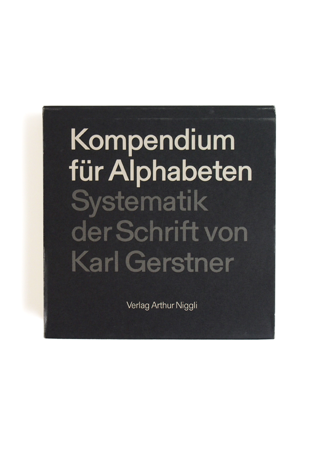
Karl Gerstner is one of Switzerland’s—and therefore the world’s—best and best-known graphic and typographic designers. His high ambition in this book, first published in German in 1972, is to provide a complete and systematic taxonomy of writing, a programmed investigation into the underlying structure of script and type; Gerstner writes that his book is meant to “encompass the aspects and possibilities of the alphabet in their totality.”
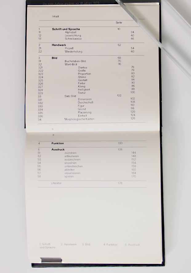
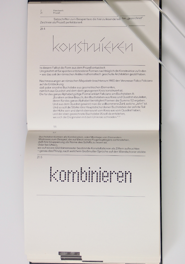
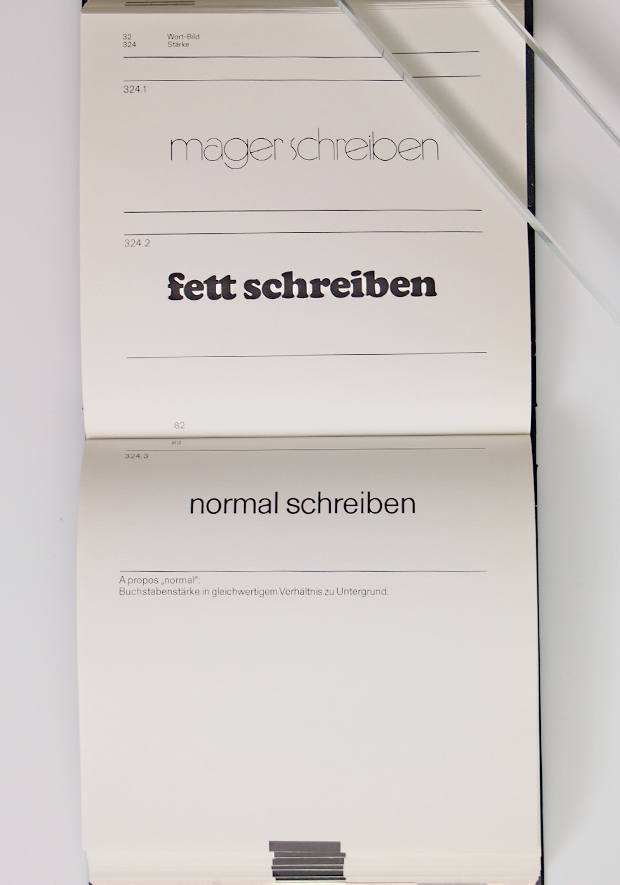
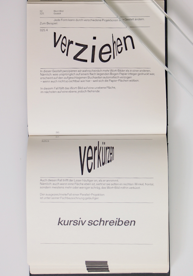
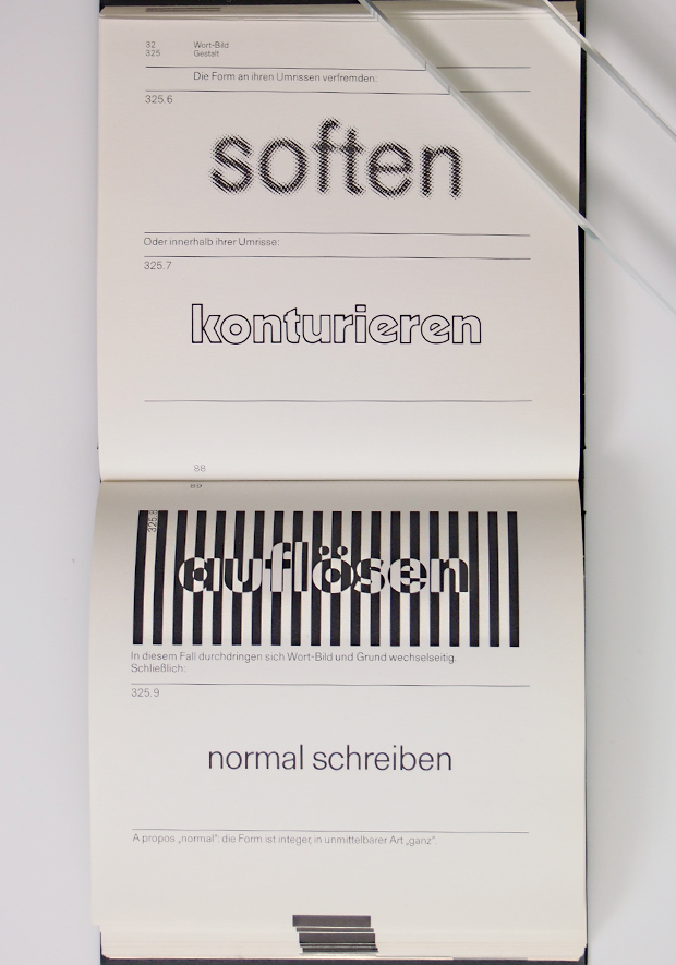
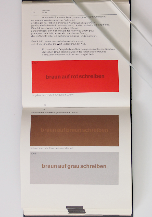
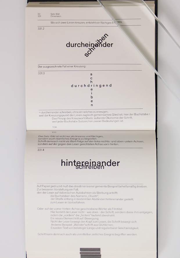
It is this systematic and programmatic approach that sets the book apart. Most studies of typography and its larger graphic setting and context are concerned with the history of the development of writing and printing, or are collections of typographic models or typical examples, or are textbooks on layout and design. This one is organized into five sections that take up, in turn, Script and Speech—the relation between writing and language, different alphabets, reading directions (the eye follows directions and moves in a direction), style; Manual Graphics or craft—materials, tools, methods, procedures, reproductive techniques; Images—letter pictures, word pictures, sentence pictures, handwriting, size, proportion, type weight, form, harmony, texture, brightness, color; Function—as effected through dimensioning, spacing, grouping, layout, integration; and Expression—as achieved through coordination, articulation, emphasis, diversion, and the spirit of play.
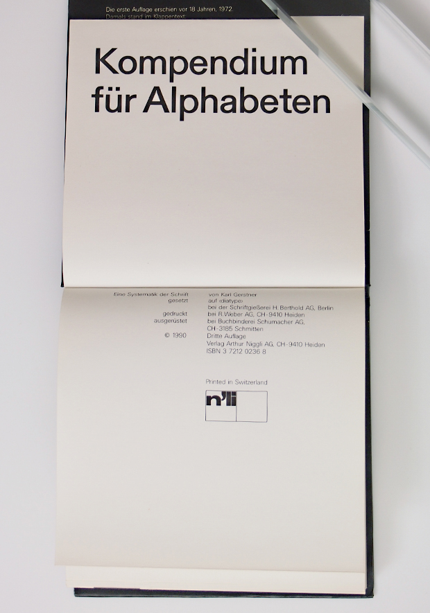
As a physical object, the book is more than a passive repository of examples of typographic display. It makes a dynamic and integrated typographic statement of its own and as a whole as it progresses and develops in accordance with its internal program. The book is nearly square and opens vertically rather than horizontally. Type is printed on only one side of the sheets, which are folded back on themselves along the outer edge to form double leaves, so that there is no distracting show-through “noise.” There are words printed in blind embossing and stencil cutouts. And color is used with an elegant restraint, appearing only at the book’s mid-section climax—its very sparseness amid the prevailing sharp black and white contributes a luxurious effect.
この本は、世界で一番知られているグラフィックデザイナーの一人であるカール・ゲルストナーによるものです。
文字に対する彼の徹底した研究調査内容を表したもので、ドイツ語版の初版が1972年に、そして英語版がMITプレスより1974年に出版されています。今回紹介しているものはドイツ語版となります。span>
本書は、文字の歴史的文脈を踏まえ手描きのものから様々なタイプのアルファベットについて、
誕生のための道具、技術、過程、用途等の解説があります。
その他、アルファベットを組むためのスペーシング、レイアウト、カラーやウェイト等、非常に幅広く網羅されています。
Karl Gerstner 1930-
スイス Basel生まれ
バーゼル工芸学校でEmil RuderとArmin Hoffmanに師事。1949年にGeigy社に勤めた後、53年によりフリーランスに。基礎デザインを近代的なグラフィックデザインの手法に展開。
59年、広告代理店を設立。62年、GGK (Gerstner, Gredinger, Kutter)に社名を変更。70年、GGKを退き、絵画とタイポグラフィに専念。第2世代スイス派グラフィックデザイン界にあって、理論書の著作も多く、世界的な影響力を持ったデザイナーの一人。
参考文献 20世紀のポスター「タイポグラフィー」