

These were just corrected for distortion by spread.
Hardcover: – pages
Publisher: Steendrukkerij De Jong
Language: None
Product Dimensions: 25 x 25 cm
Release Date: 1953
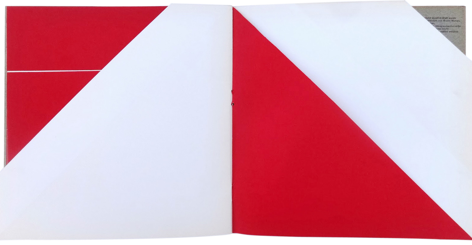
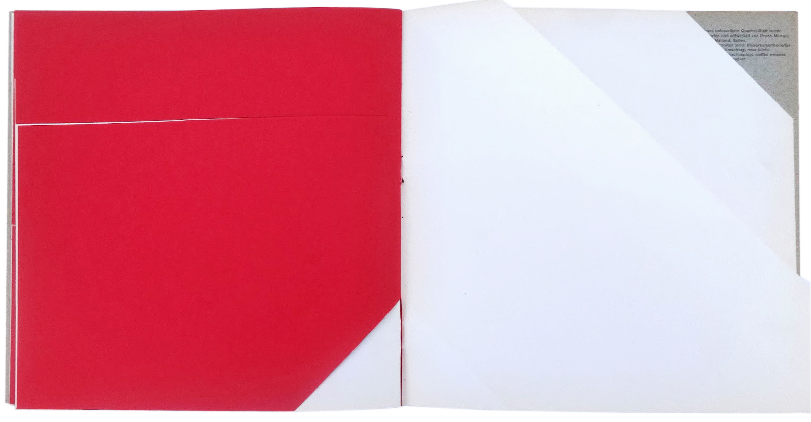
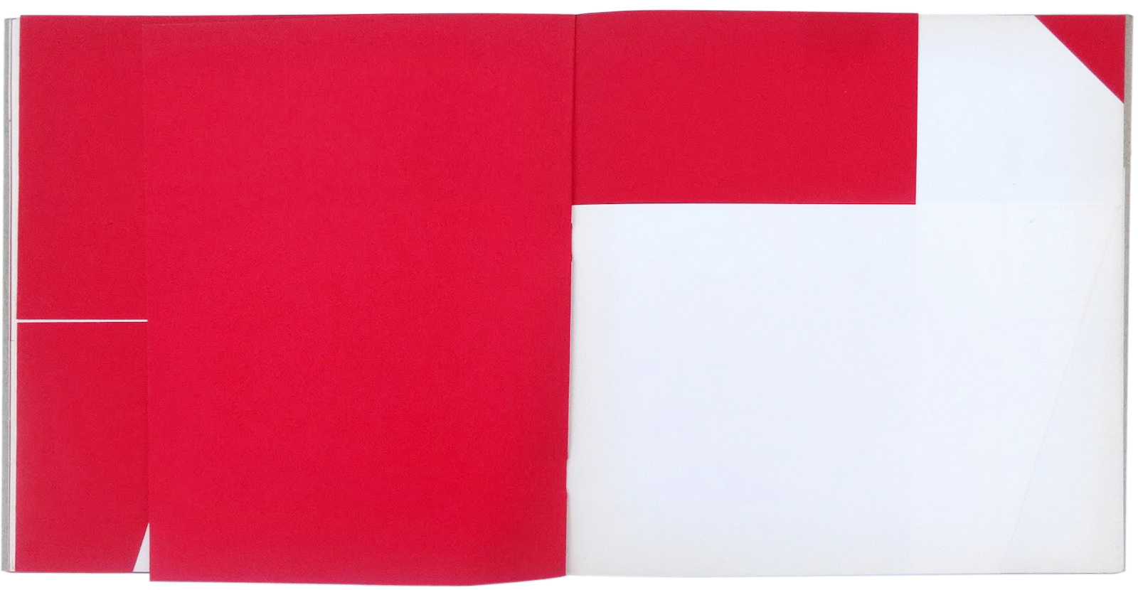
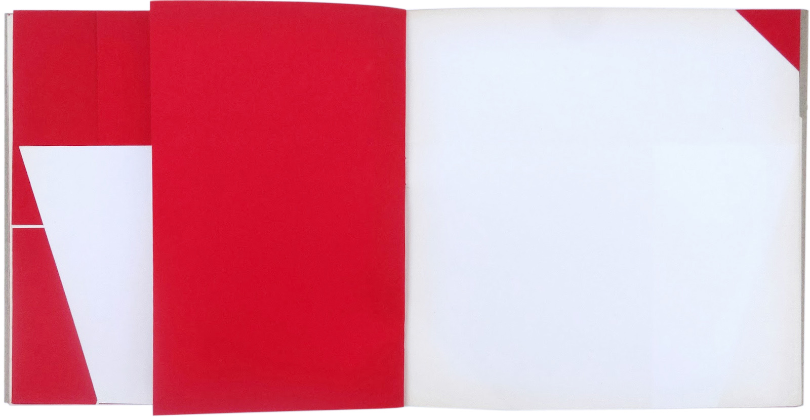
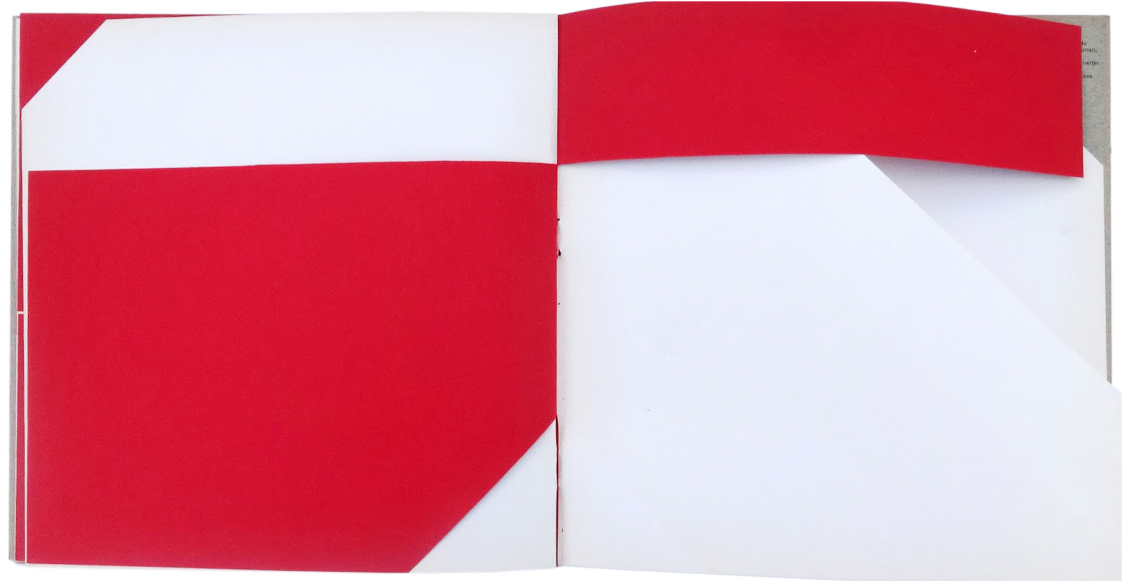
An Unreadable Book
The goal of this experiment is to see if it’s possible to use the materials that make up a book (excluding the text) as a visual language.
The problem is this: can you communicate visually and tactilely only by means of the editorial production of a book? Or can the book as object communicate something dependently of the printed words? And if so, what?
The problem, when recognized and defined, can be divided into its components. Normally, books are made with just a few types of paper and are bound in two or three different styles.
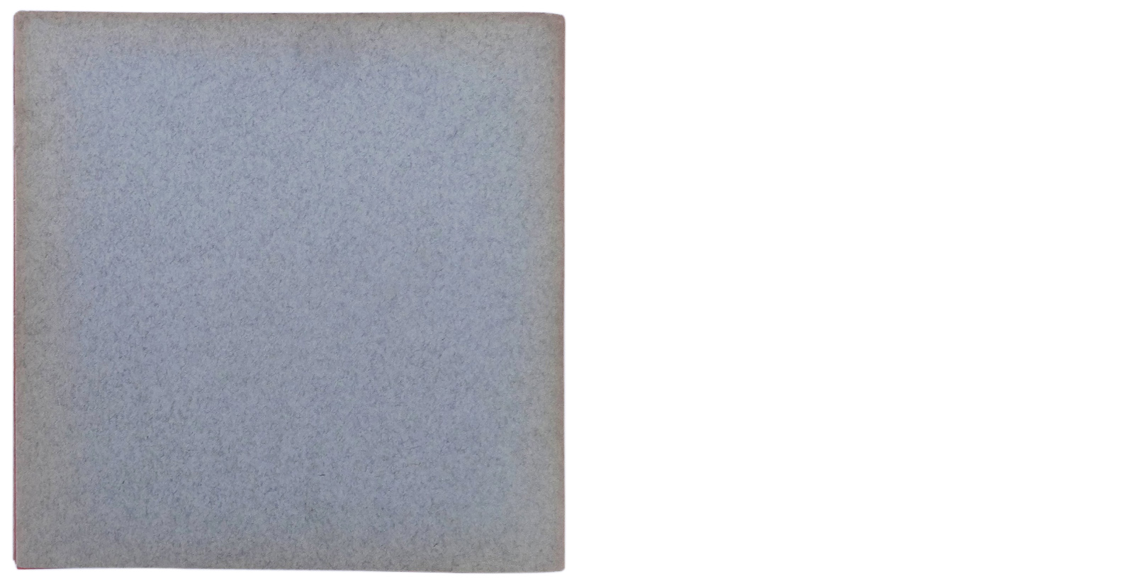
The paper is used to support the text and illustrations, and not as something communicable.
If we want to experiment with the possibilities of the visual communication of the materials from which a book is made, then we have to try all types of paper, all types of format, different bindings, sequences of forms (of sheets of paper), and papers of different materials with their natural colors and textures.
(…)
We should therefore look for all types of paper, from printing paper to packing paper, from semi-transparent paper to rough or smooth textured paper, recycled paper, tissue paper, wax paper, tar paper, laminated paper, paper of pure cellulose, rag paper, paper made from straw,
vegetal paper, synthetic paper, soft, hard, or flexible paper, and so on. In the process, we’ll already make some discoveries, because if a paper is transparent it communicates its transparency, if rough it communicates its roughness. A quire of shiny paper (the kind used by architects and engineers for their projects) has a sense of fog about it: turning those pages is like entering fog. I used this effect in the book Nella nebbia di Milano (In the fog of Milan), published by Emme editions in 1968. In short, every paper communicates its quality. And this is already something to be used as a communicable element. So the task, then, is to connect this knowledge with other knowledge outside the experiment.
Another experiment may be conducted on the format of the pages.
Pages that are all the same communicate an effect of monotony. Pages of different format are more communicative. If the format is organized in an increasing and decreasing, intersecting or rhythmic mode, you can obtain visual rhythmic information given that turning the pages is an action that occurs in time, and therefore participates in the visual-temporal rhythm.
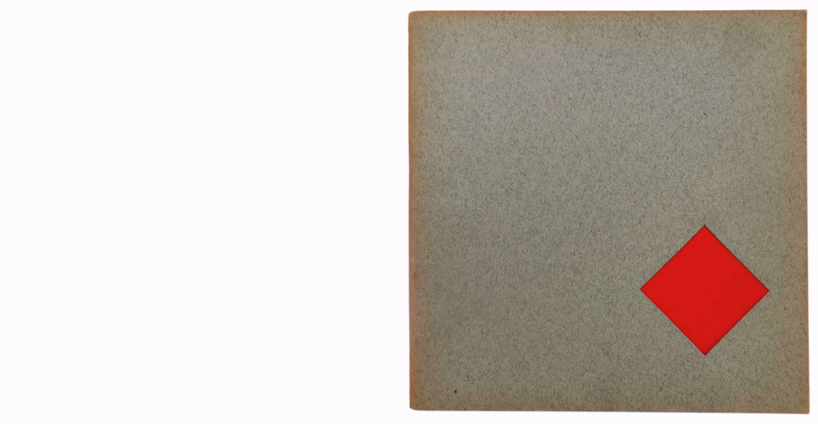
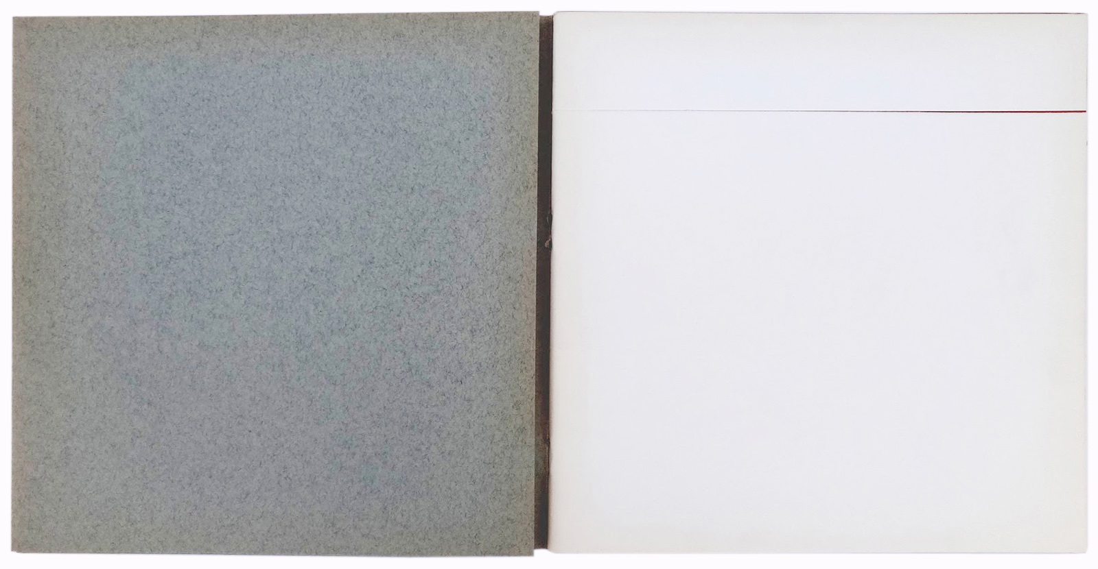
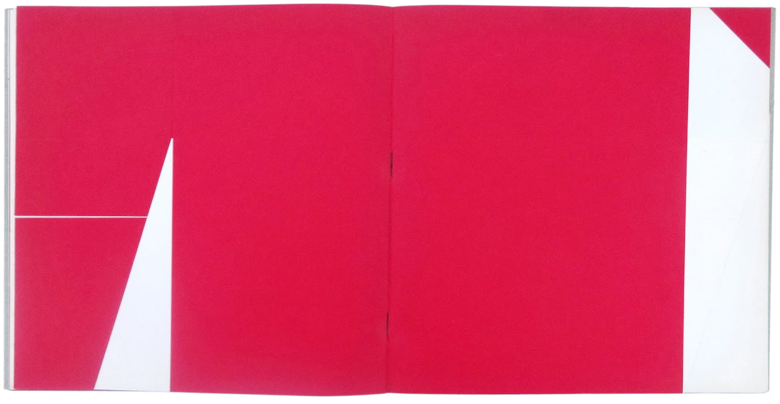
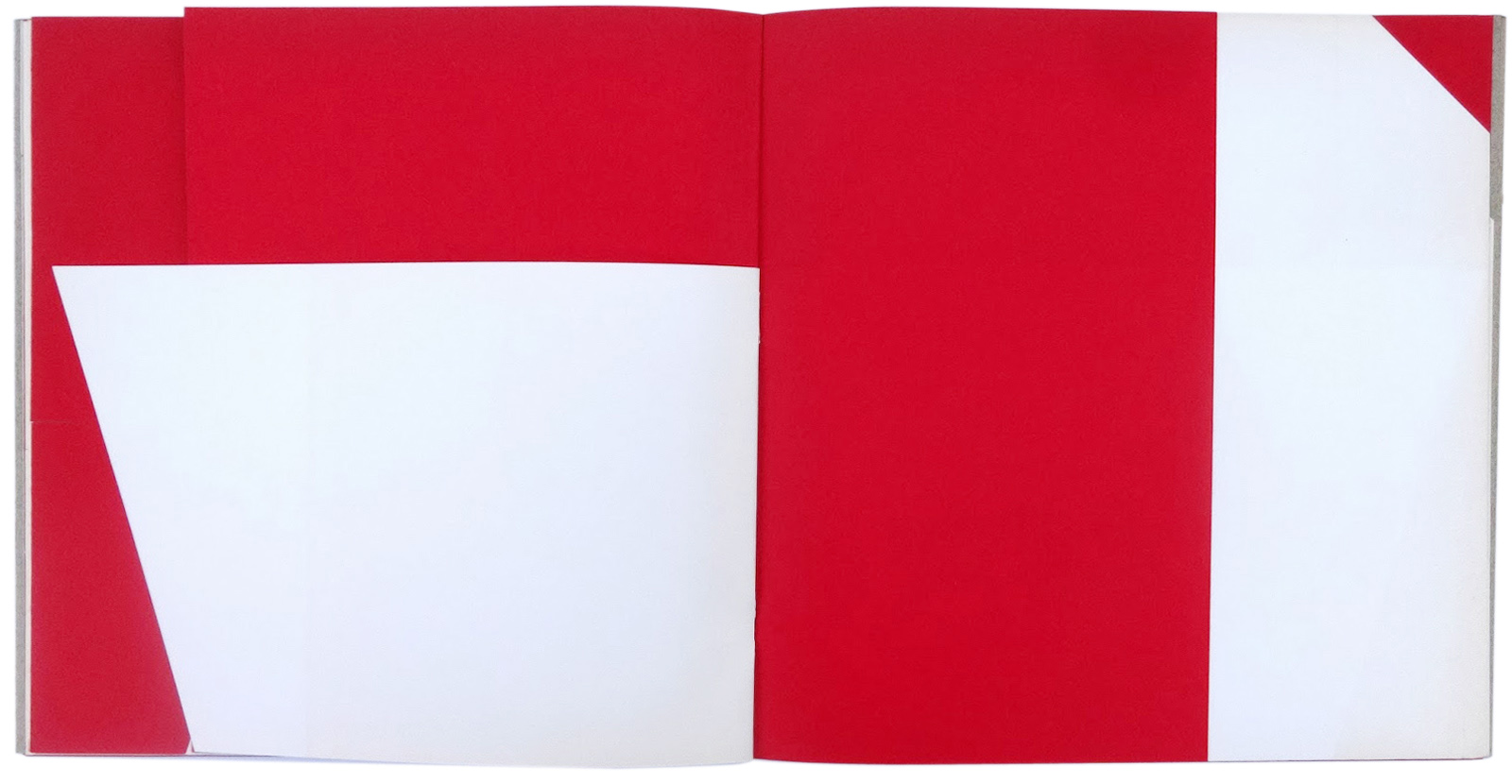
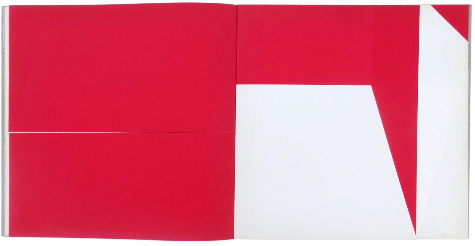
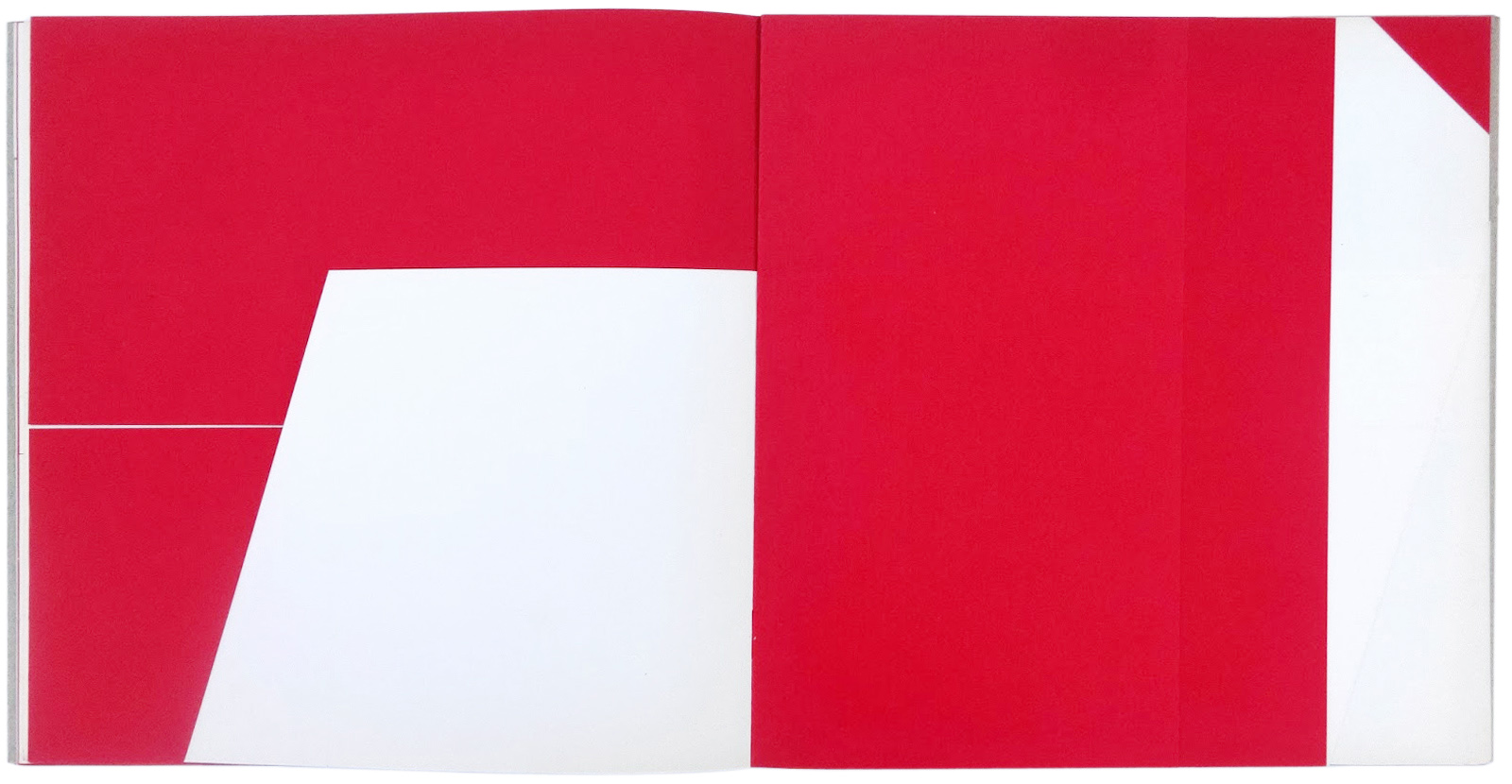
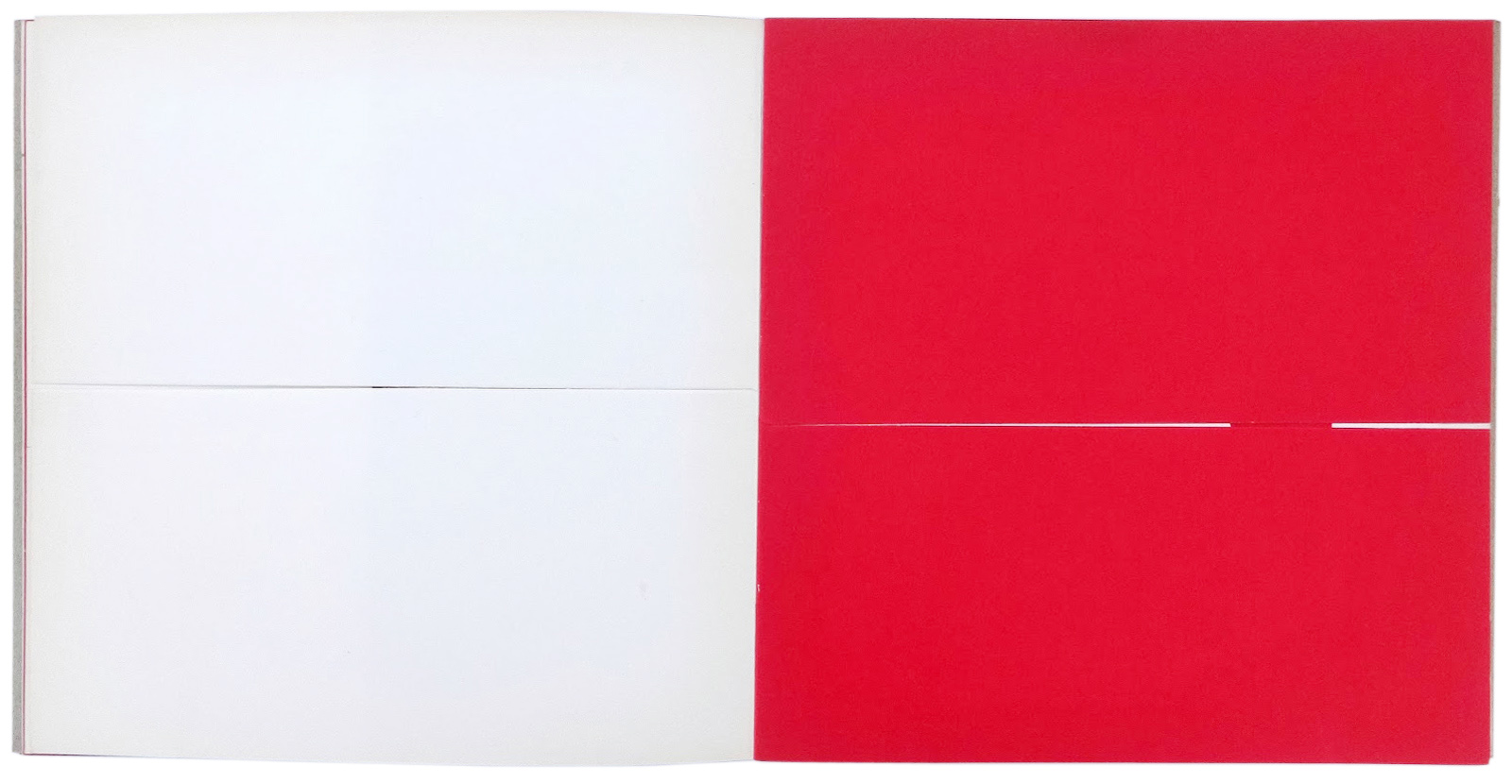
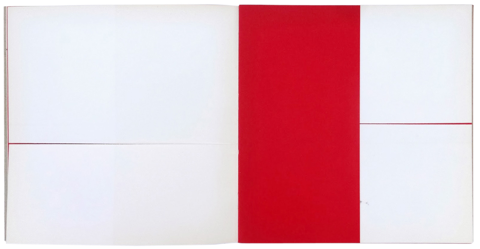
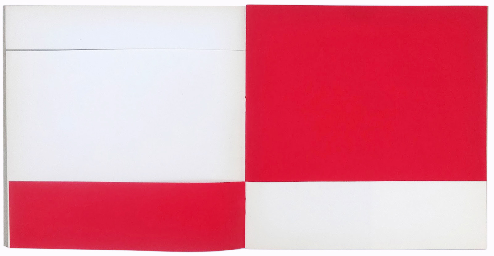
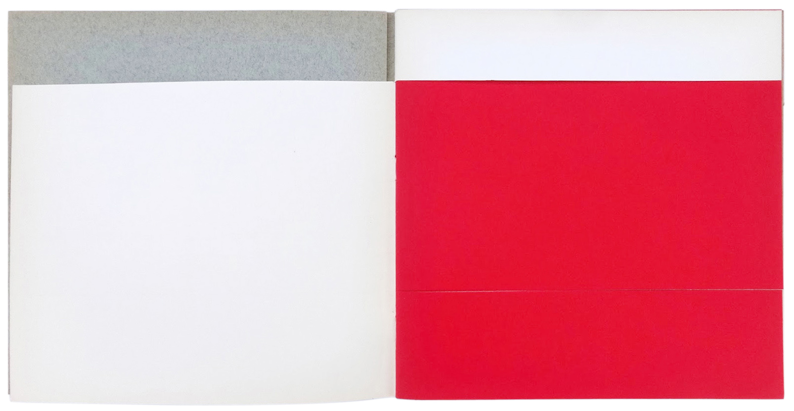
If you use two colors of paper, alternating a sheet of white paper and a sheet of black paper (or red), then the rhythmic effect is accentuated.
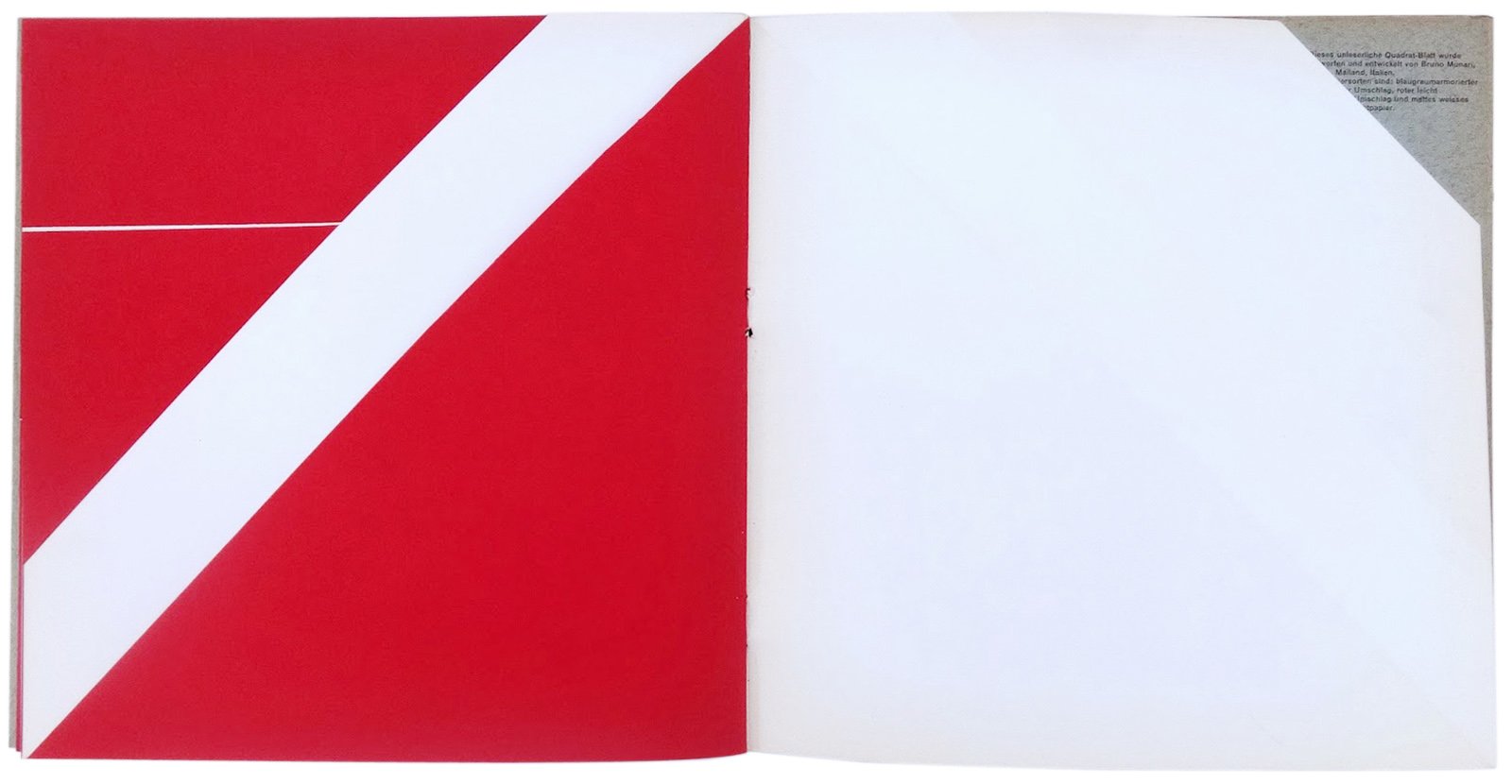
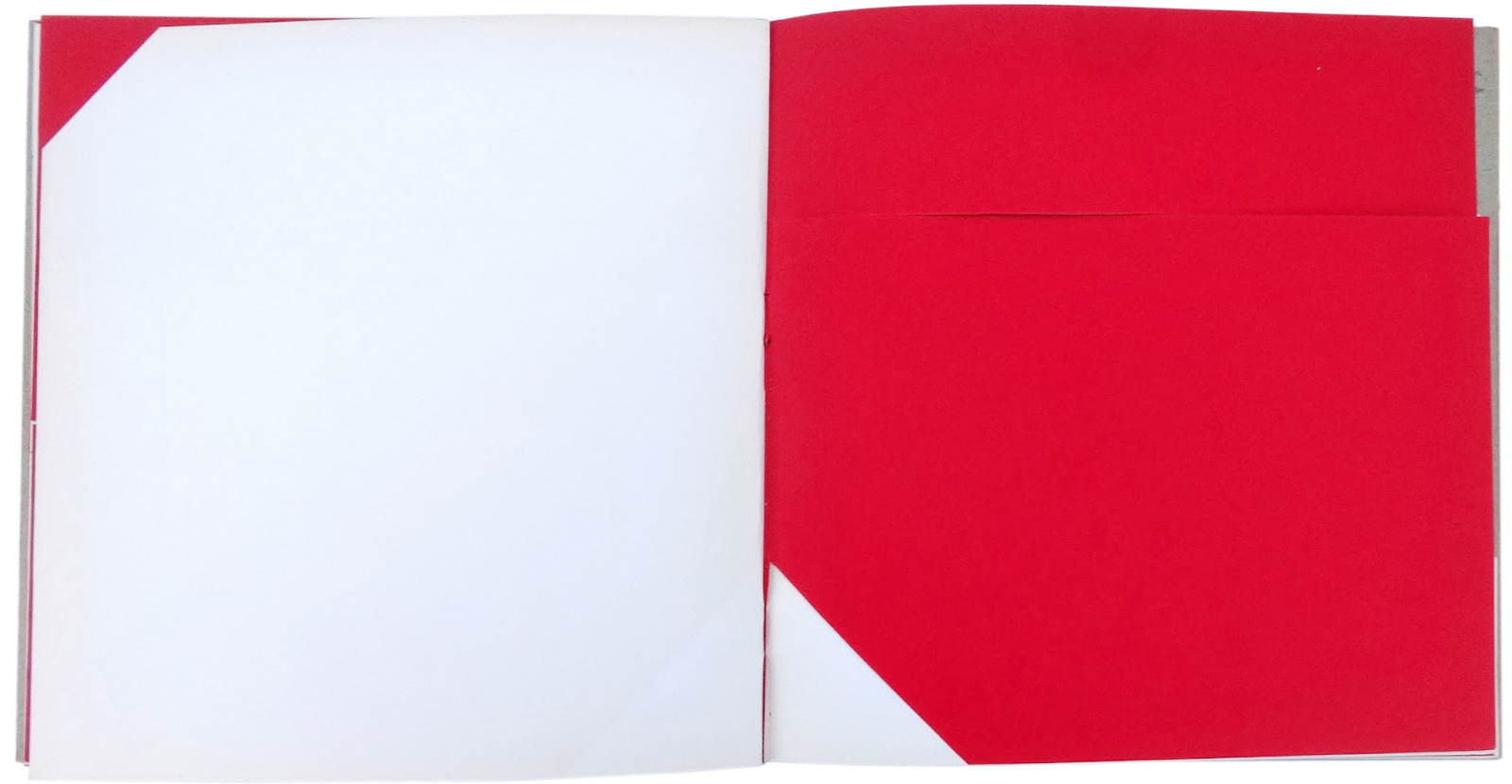
Make a model of this type, with white and black pages, cutting the sheets with horizontal, vertical, diagonal cuts in such a way that, turning the pages, you change the composition of the white and black surfaces, changing the quantity of white and black and the position and form of this quantity.
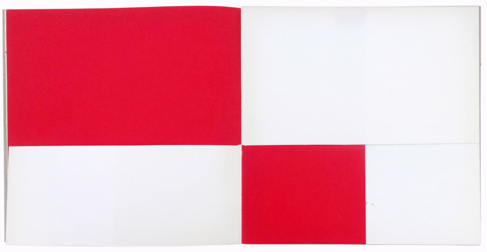
Thus is set in motion the progression of these changes, first with a few horizontal cuts that allow you to turn the same page twice: the first cut is at the top of the first page, the second is at the bottom of the black page, the third (always horizontal) is more toward the center of the page. Opening half the page you can already see a vertical section of the black page that follows. The black page, in fact, is only a half page, out vertically.
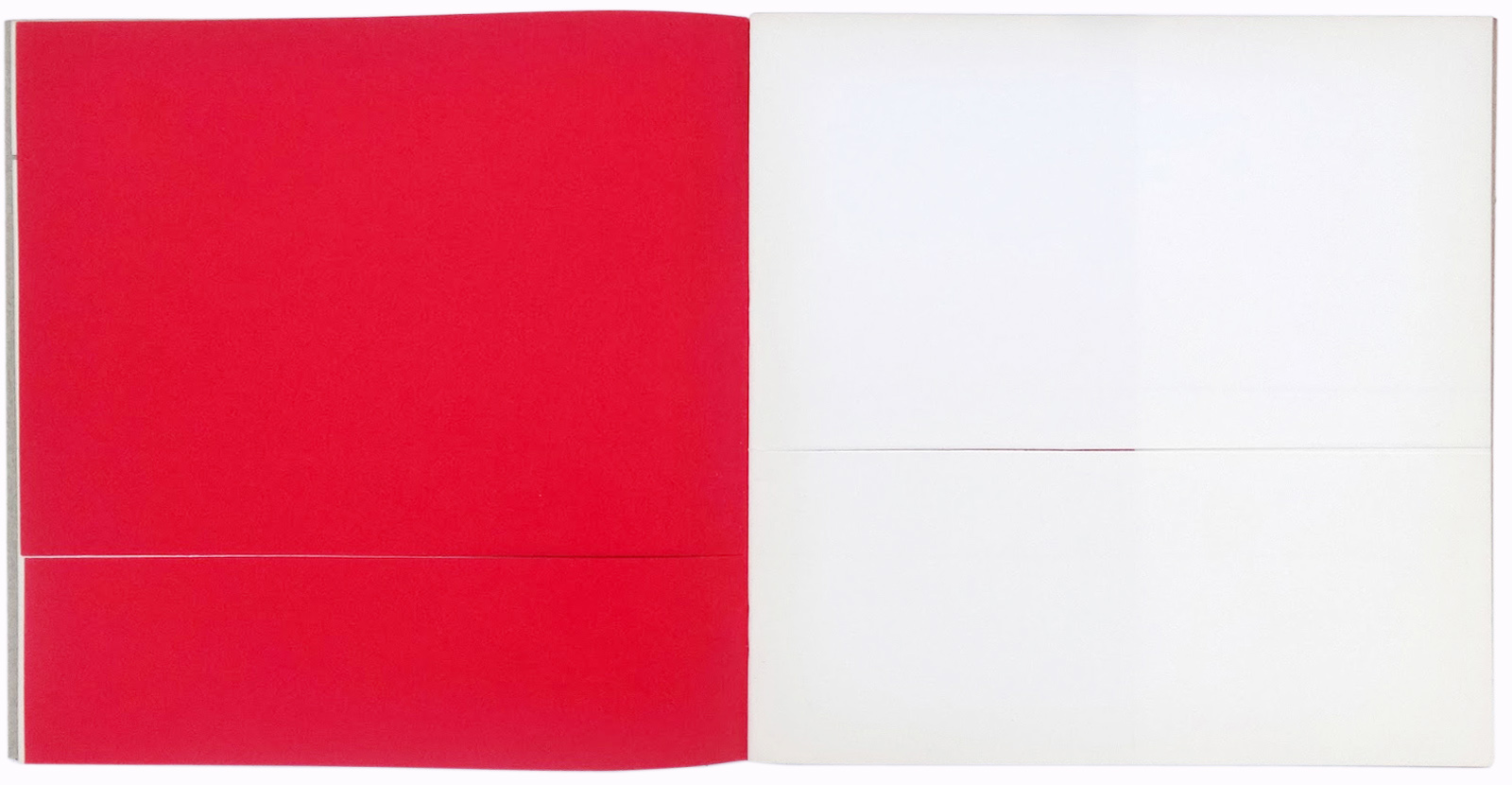
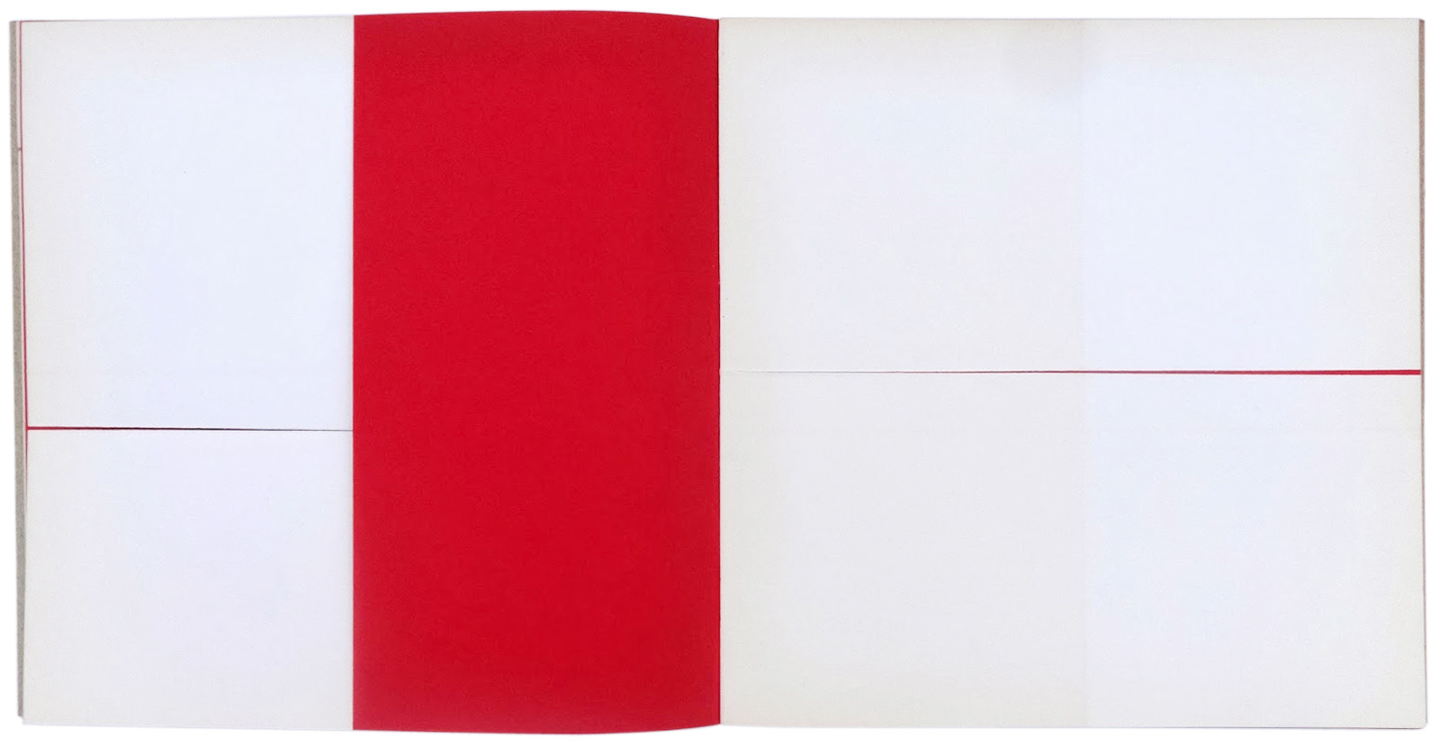
The following page, which is white, is out exactly in half, again horizontally. The diagonals enter, alternating with the vertical cuts, until on a white page you see only one small section in a corner at the right. The next page will have a larger cut on the lower left and another horizontal cut at the top, as on the first page.
The white page following has a decisively diagonal cut followed by another diagonal cut on the black page. These two superimposed cuts form a white band that diagonally traverses the whole page on the left. The white page on the right will have a small corner cut, and thus completes the rhythmic spatial-temporal composition of these black and white surfaces.
You can use this model of the unreadable book by choosing a page by chance, beginning where you want, going forward or backward, in order to compose or decompose every possible combination of white and black. In the photographic reproductions of the book reproduced here, you see some sequences, but others can be combined however you like.
BM, Da cosa nasce case (1981)
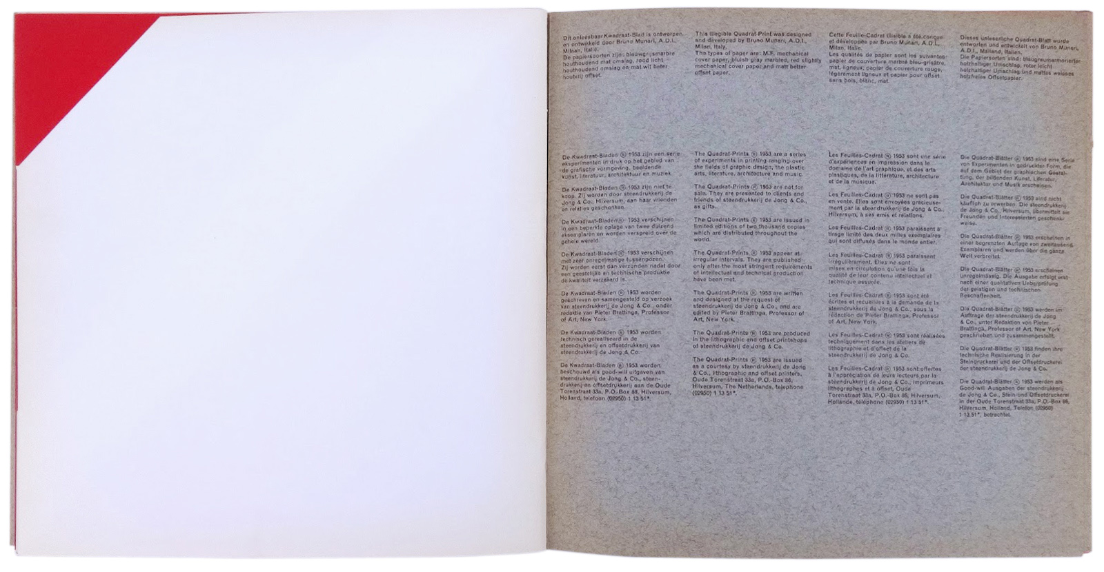
Quadrat Prints were a series of experimental graphic design publication edited by Pieter Brattinga and given away by the Hilversum printer de Jong from the early fifties to the mid-seventies. Each one was ten inches square, mostly several stapled pages but some were loose leaf sheets (this alphabet) in a box or folder.
This information is originated from the Air Made Visible: A Visual Reader on Bruno Munari in part.
It’s strongly recommended that if you will read a Air Made Visible: A Visual Reader on Bruno Munari thoroughly, you are able to understand with this information on a more than superficial level.
『Quadrat-Print/Kwadraat-Blad』はPieter Brattingaが代表を務めるオランダの印刷会社、de Jong社が広報用に制作し実験的な冊子です。各issueは2,000部ほど刷られていて、サイズは10″x10″で綴じてあるものもあれば簡易的に織り込まれているものもあります。
このコンテンツはClaude Lichtenstein, Alfredo Häberli and the Museum of Design Zurichらの編集によるAir Made Visible: A Visual Readerから一部引用したものです。
次のことをお勧めします、もしあなたがAir Made Visible: A Visual Readerを熟読すると、このコンテンツを表面的なレベルより深く理解することができます。