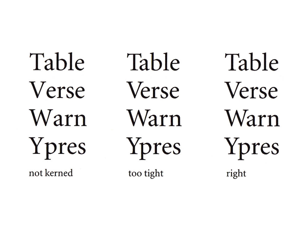
There are, however, combinations that require more or less space than is provided by standard setting. For such cases, if the type face is intended for setting continuous text, manufacturers develops kerning tables.
Kerning tables contain those letter combinations for which the standard spacings are altered. The space is usually reduced for such combination as
Manufacturers’ setting should not be trusted blindly. We still encounter inadequate spacing between capitals and the subsequent lowercase letters. This is a survival from the early days of non-metal composition when, in the sheer euphoria of being able to justify more tightly, much photosetting was far too tightly spaced. Capitals have bigger counters than their lowercase, and require an appropriate amount of space.
This information is originated from the Detail In Typography by Jost Hochuli in part.
It’s strongly recommended that if you will read a Typography: Detail In Typography thoroughly, you are able to understand with this information on a more than superficial level.
手を加えないでセットされた文字と文字の間のスペースは広げたり、狭める必要があります。
特に下記の組み合わせは、大抵スペースを狭めます。
大文字は小文字よりも大きなカウンタースペースを持っているので、
適切なスペースを考えることが重要です。
このコンテンツはDetail In Typographyから一部引用したものです。
次のことをお勧めします、もしあなたがDetail In Typographyを熟読すると、このコンテンツを表面的なレベルより深く理解することができます。
