Publisher: Steendrukkerij De Jong
Language: Dutch English French
Product Dimensions: 25 x 25 cm
Release Date: 1960
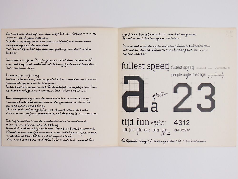
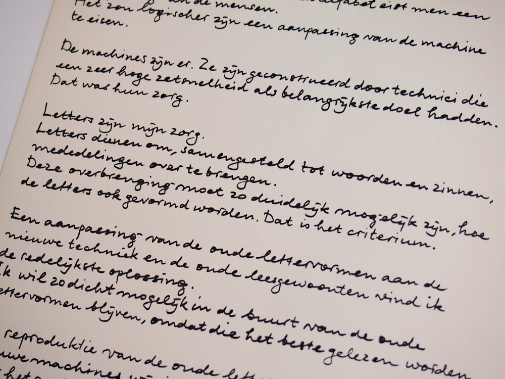
I see no reason in developing an alphabet which takes a totally new form.
The introduction of such a new alphabet requires an adaption of men.
It would be more logical.
Machines exist. They have been constructed by technicians, whose principals aim was to achieve a very fast composing speed.
This was their concern.
Letters are my concern.
Letters as elements of words and sentences, are used to communicate.
Such communication must be as clear as possible,
whatever the shape of letters. This is the main criterion.
An adaption of the old letterforms, to the new techniques and the old reading habits, is in my opinion the most reasonable solution.
I wish to remain as close as possible to the old letterforms, owing to the fact that these have the most readability.
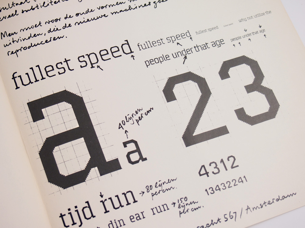
I reject reproduction of old letterforms by new machines. The rectangular pattern creates to o great disfigulation.
When a Garamond face is used, the printed results is no longer recognisable as a Garamond.
By doing so, the control of quality is lost, because the end result differs too greatly from the original.
Too many of finer points are lost.
It will be necessary to invent new refinements for the old forms, which can be faithfully reproduced by the new machines.
Gerald Unger
Quadrat Prints were a series of experimental graphic design publication edited by Pieter Brattinga and given away by the Hilversum printer de Jong from the early fifties to the mid-seventies. Each one was ten inches square, mostly several stapled pages but some were loose leaf sheets (this alphabet) in a box or folder.
『Quadrat-Print/Kwadraat-Blad』はPieter Brattingaが代表を務めるオランダの印刷会社、de Jong社が広報用に制作し実験的な冊子です。各issueは2,000部ほど刷られていて、サイズは10″x10″で綴じてあるものもあれば簡易的に織り込まれているものもあります。