Publisher: Zandhoven
Language: English
ISBN-10: 9071614107
ISBN-13: 978-9071614101
Product Dimensions: 30.5 x 30.5 x 2.4 cm
Release Date: 2001
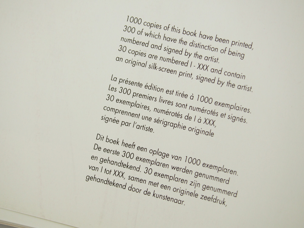
printed 1,000 copies
rrinred in Belgium
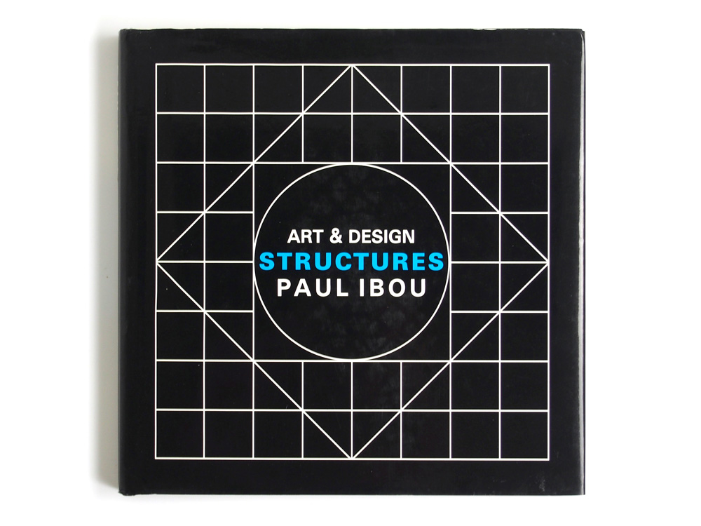
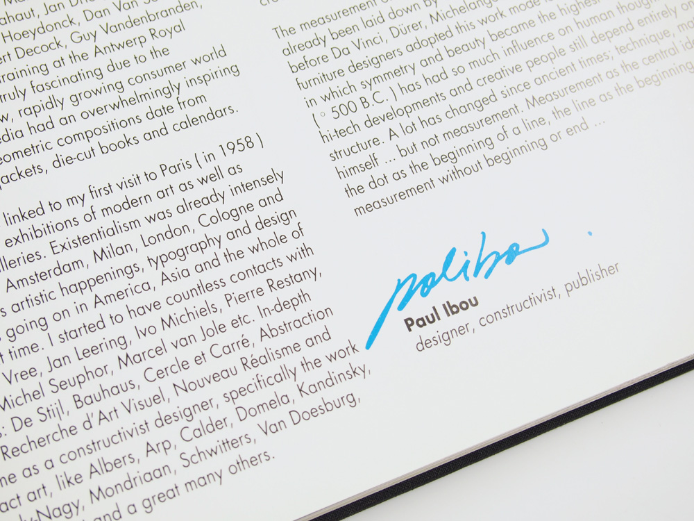
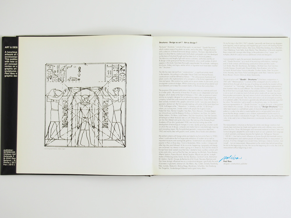
PAUL IBOU
Belgium, born 1938
“Ibou has design at his finger-ends.”
Hiroshi Ohchi

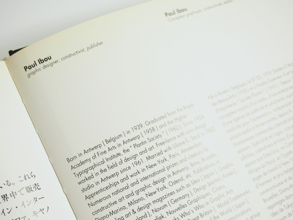
Paul Vermeersch was born march 7, 1939 in Borgerhout, Belgium. His father, who died at a very early age, owned a small printing house, though only for recreation.
As a young student he took classes at the Royal Academy in Antwerp and met important postwar teachers who have now become prominent figures. A few years later, in 1954, he had to help out his mother because of financial reasons. He was listed as an employee in an advertising agency and later at the photo engraving studio ‘De Schutter’. He gained a broad experience working as a laborer. During this period he was also assigned as an art director for dairy ‘Nutricia’.
The art studies, despite the heavy daily duties, were continued in evening-classes. He received his degree in publicity and letter design in 1958, after which he took an additional training at the Higher institute for printing art, established by the Plantin Fellowship.
At the age of 23, in 1961, he started as an individual free-lance designer. He gave himself the pseudonym IBOU, which meant ‘inventive book designer and publisher’. In French Ibou means owl, and so this was the start to a gigantic collection of owl-symbols.
Ibou is a flamboyant personality with explicit opinions. In 1967 Ibou left for New York, where he succeeded in acquainting with several pop-artists and designers, such as Warhol, Albers and Oldenburg. He received numerous assignments in the US, but still decided to return to Flanders.
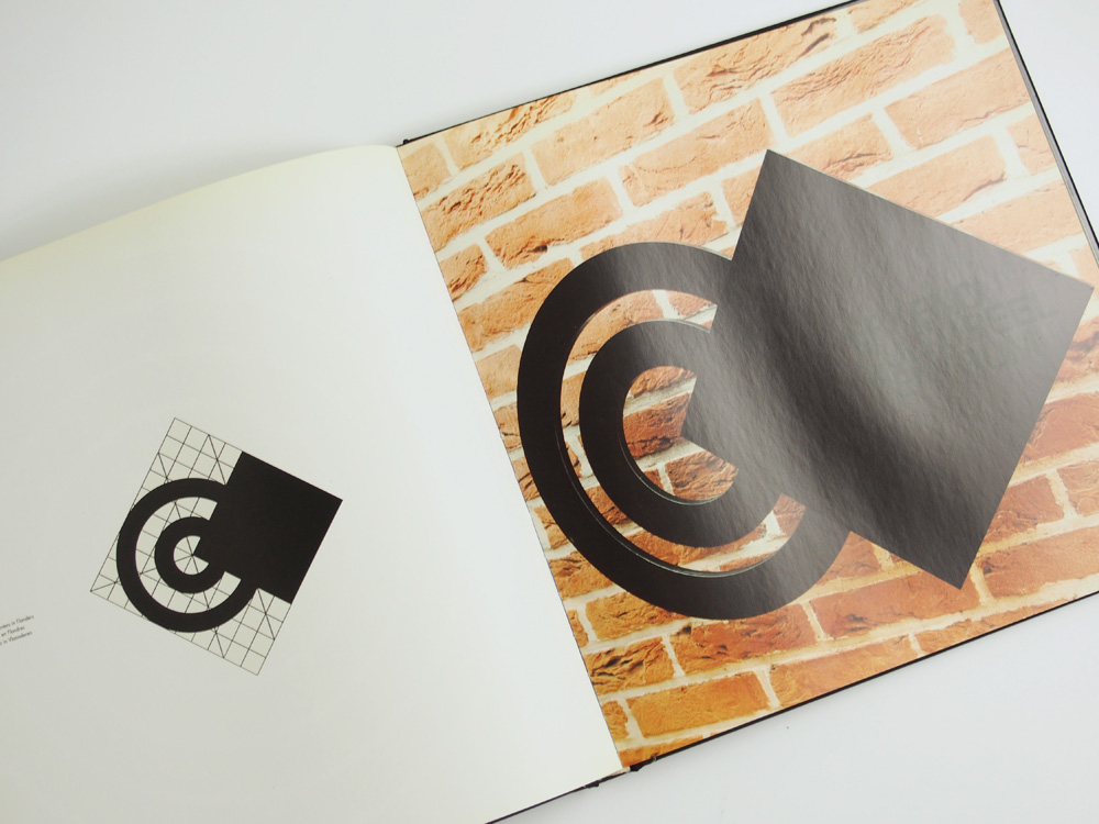
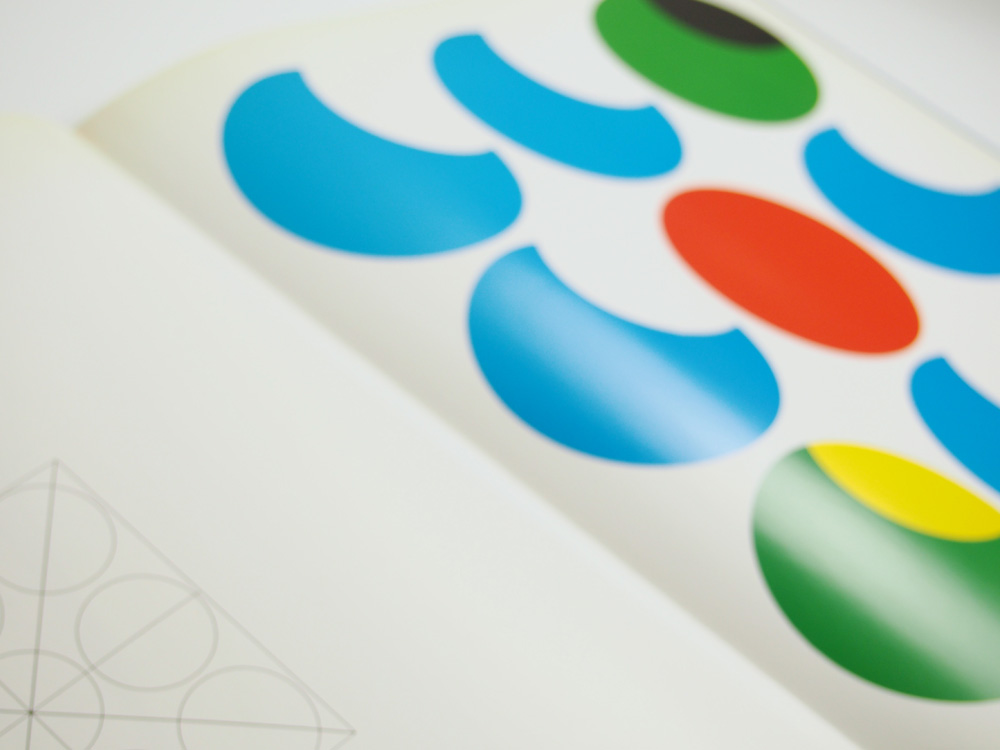
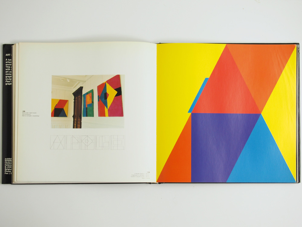
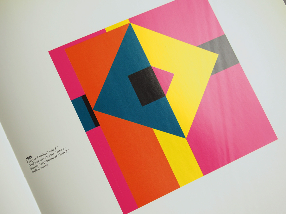
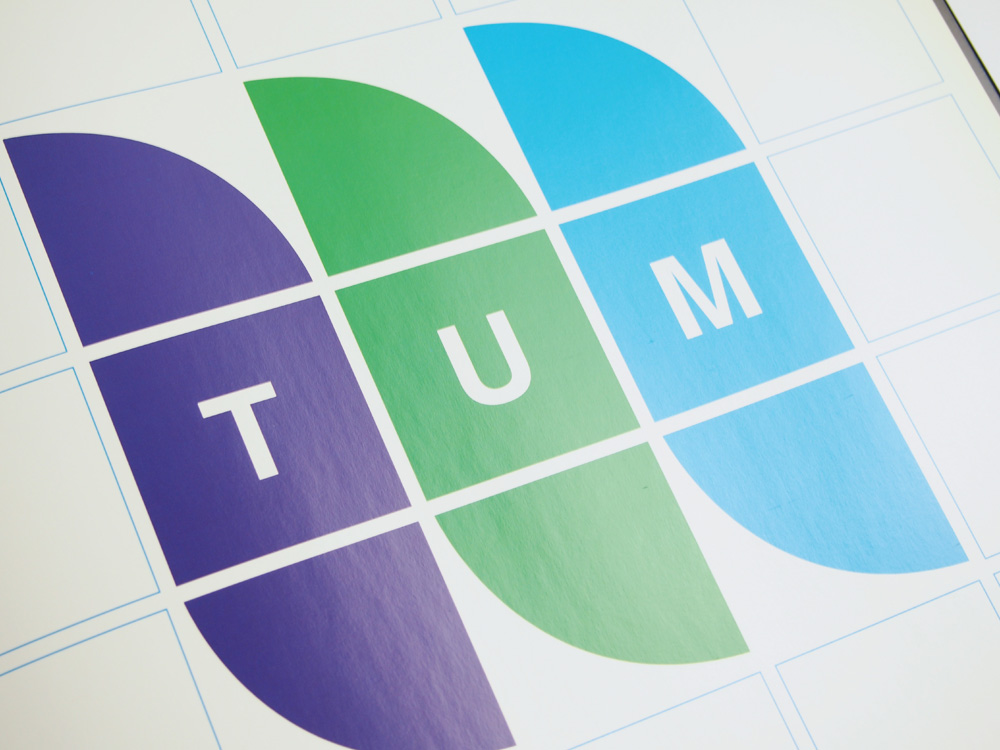
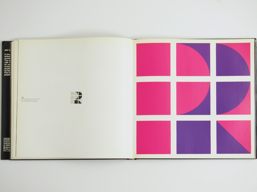
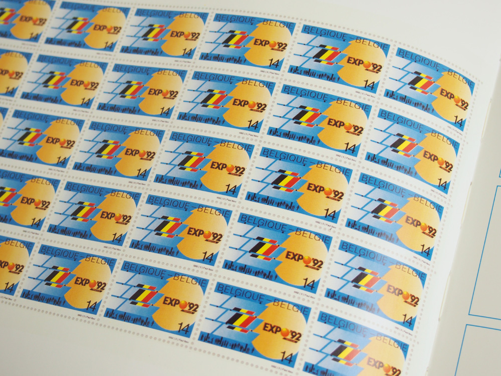
Ibou worked at a time when a concept such as corporate identity, was virtually unknown in Belgium. He can be seen as one of the pioneers in graphic design. During his career he designed more than 350 logos and symbols for large companies and public institutions, among which the province of Antwerp, Spaarkrediet, Ovam, Antwerp University, Cera, etc. His logos featured simplicity, recognition and an iconic directness. His terse line drawings in black and white still remain intact, retaining their graphic freshness. The basic shape of his logos usually took only half an hour to complete.
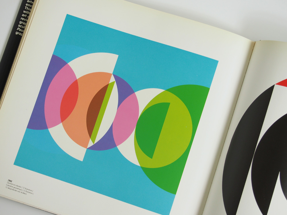
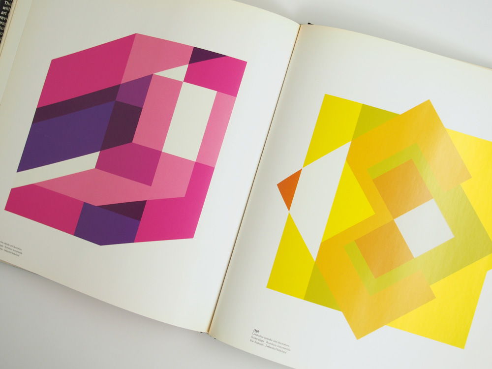
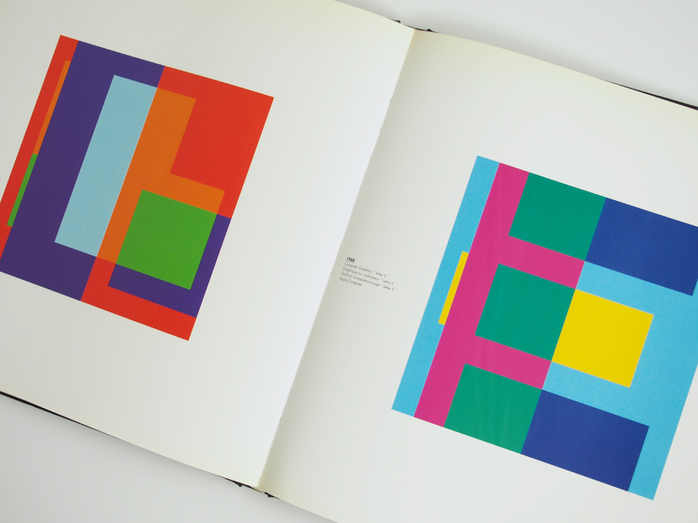
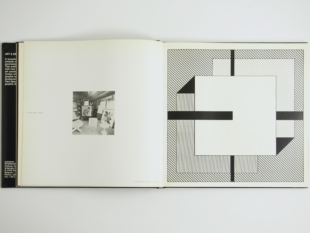
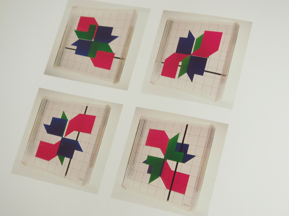
Besides his active career, he was intensely interested in paper art, molded and scissored works from which paper art objects are developed. Metamorphosis and 12 owl variations are two of his best known paper art booklets.
During his career Ibou has set up an immense number of initiatives, both in the graphic sector and the design world in general. He was the founder of the Flemish Graphic Artists Association (which didn’t last long) and established Multi-Art-Press, an art-gallery and publishing company.
In 1980 he started the publication ‘Vorm in Vlaanderen’ (Form in Flanders) of which 14 issues would be published.
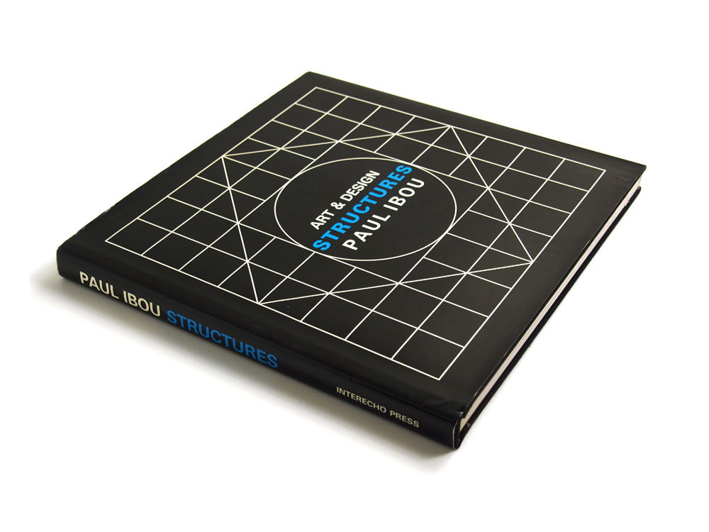
Ibou was seriously injured in a traffic collision In 1984 and forced to suspend his activities for some time. After his recovery, he founded Interecho Press. They published several logo and symbol books, distributed all over the world.
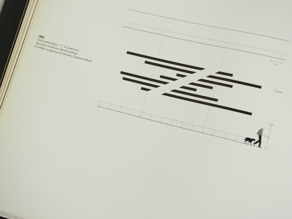
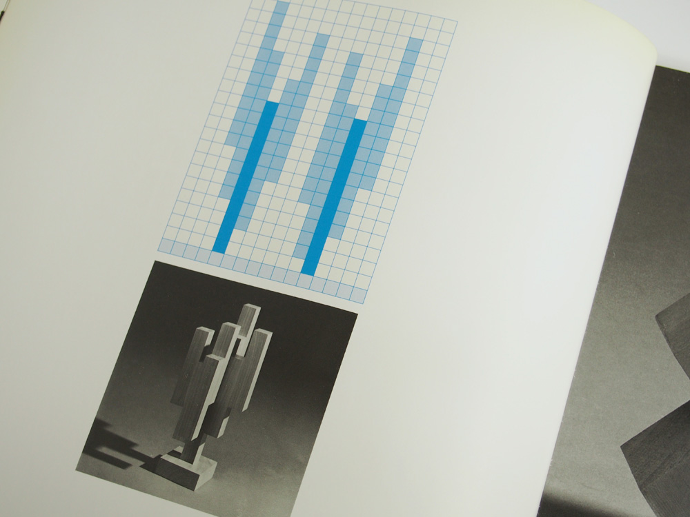
In 2001 he ceased his activities as a graphic designer. Today Paul focusses on his work as an environmental designer, constructivist painter and space sculptor.
text via iconofgraphics.com